|
Alessia Ganzerla, Illustration and Visual Media Coding and Design, a New Era begins What exactly is coding? Coding is related to computer programming and how we communicate with computers. The code takes all the information needed to give a computer an action. Coding can be called creative and I decided to focus on it this year. It has been a struggle since I started to code because I had to start from scratch to have a full understanding of what everything meant before allowing myself to write something and to start my project. Coding at the beginning can be complicated because if you don't have a strong background, it is hard to come up with a final design. At the beginning of this course, I have decided to take this path because I want to graduate in coding. I took this challenge so once I am back to school I do not need to learn the basics, but I can consider myself an Intermediate programmer. My self-initiated project allows me to have a better understanding of what a machine can do and how people can interact with it. I will define this "relation" as an odd one because I have never experienced this type of way of communicating something through code. Before it used to be “ open any Adobe Creative and start to draw or create a video to express yourself and send a message to people” but now it is more about “ open p5js and start to code something or try to code". With coding, it is easier to get stuck with my work if the code does not work, which does not help to speed up the process of my project, but it just creates more challenges to face every day. Coding is not like drawing, that you can, at one point, start from the beginning or add some details that allow your outcome to be nicer, in this situation if you don't have a clue of what is wrong with it and you have not taken a course before to understand what is wrong, your outcome can be incomplete until a tutor will explain what it went wrong and why. My project is about communicating to the public that everybody could be an artist as the media artist Anadol Refik mentioned. Refik Anadol uses architectural building spaces as canvases and collaborates with machines to make building dreams and hallucinate by using millions and millions of data taken from the Internet. This project is about showing that machines can interact with humans through art. I want to create an art installation that allows the viewer to interact and to create art himself. Through a Makey Makey, which is an electronic invention kit that allows you to take everyday objects and combine them with the Internet by simply attaching alligator clips to any conductive materials. In this scenario, you are in control of the keyboard which is connected to your laptop and it allows you to create interactive art. My idea was to connect this device with coding and create an interactive and fun panel where anybody could play and create his art by combining sounds and forms. For this project, I listen to podcasts and watch YouTube videos of coding and Makey Makey to develop ideas. The podcasts talk about Anadol Refik. I wanted to understand what type of work he is doing, what his insights are, and how he combines Machine Learning and Design. My Youtube videos were about “ The Coding Train” run by Daniel Shiffman, a YouTube channel dedicated to beginner creative programmers where each tutorial explains what, why, how of a code. Anadol Refik inspires me because he has the idea that art needs to show outside to permit the public to be part of it. One of his first projects was about involving the public in outside public space and allowing them to be involved in an experience. This experience was about connecting the public with the beauty of the city they are living in. The message was how elements, artificial intelligence, and people can be part of something. By using Anadol as a reference, I have a better understanding of what Data and Artificial Intelligence are. This authorizes me to elaborate ideas for a future project by using his knowledge and his examples as a reference for what will be my graduation project. The ambition is to create on a bigger scale my prototype. The other artist who inspires my project is Daniel Shiffman, who is a master in coding, which fascinates me a lot due to his high experience. Shiffman can transform a code into anything, from a design to a website and this creates a massive curiosity in me because I would like to be able to do what he does to create my art and apply my knowledge in my future projects. Like everything, we need to start from somewhere, usually from the basics, and I have decided to take this project as a challenge, in my head. I was thinking, “ Would I be able to code at the end of this year without using references and be able to understand my mistakes and autocorrect them ?”. So, I have asked one of the teachers from the Creative Lab to be my tutor and give me homework every week, so I can learn to reach out to my purposes. Shiffman and his YouTube Channel let me explore the coding insights and give me the courage to put myself into this new world as I would like to benefit from this expertise in the future. By looking now at what I gain so far, I am positive and more confident about coding and I am looking forward to starting this project soon, to see all my efforts coming to an end.
0 Comments
Eloise Atter - Graphic Branding and Identity - LCC My aim for my self-initiated project is to create a platform for my practice. During the COVID19 pandemic, I discovered pottery and the therapeutic nature of making something beautiful out of a piece of clay. This is a hobby I have continued, and I would like to take further, by creating a website to sell my products and showcase other work. The main task I have set myself is to create a brand identity that will carry the brand through other media such as Instagram in order to be recognisable and reach a wider audience. I will do this with a logo, colour palette and other graphic brand assets as well as photography and the clay products themselves. Through researching other pottery brands, I have found that creating short videos of the making process is very appealing to an audience, therefore I plan to make Instagram videos to show how a piece of clay can be transformed. I also hope to make a difference to people as I find the process calming and I hope they will too. This gives the project a purpose.  Creating a platform also gives me the opportunity to generate sales for my products, which will hopefully become profitable in the future. To begin with, I plan on making an Etsy shop. From my research, I have found the most successful clay product sellers on Etsy have a thought out and consistent brand identity, which I think reinforces the trust in the seller from the customer. I will also propose a website design that I could use in the future. The business side of my work is a new skill that I will be learning, something that I find important to take with me after university and continue in my future practice.  Designing for a purpose Some research I have conducted so far includes looking at similar brands, platforms artists have created to promote their work. Someone who I have been inspired by for a while is influencer and activist Florence Given, a radical feminist who illustrates. Her website includes prints of her illustrations and merchandise. Her choice of words and imagery tells her perspective on feminism, encouraging women to ‘be the love of their own life’. By looking though her website, I have noticed her brand is unique and has a recognisable style. This is something I think is imperative to success as a graphic branding student and designer. I have recently become the graphic designer for the UAL Women in Media society. Designing for a purpose, whether it is a rebrand or a campaign post, helps me to practice the skills I need to develop my own brand. I am constantly inspired by the way Florence Given presents herself as a female creative and her style has influenced the way I design for the society. Being part of a passionate community of female creatives has encouraged me to get involved with campaigns and think about design as a way to draw attention to social and political narratives.  Sales initiatives I have taken part in initiatives that will help my project such as being part of the UAL Not Just a Shop live brief to create an environmentally sustainable product. We created the UAL Crafty Pop-up Shop where I could sell my clay products for the first time and gain experience in creating a brand. I found this challenging at first because of the number of products I had to make in a short amount of time (which sort of took the calming nature of the making process away) however reflecting on this experience, this is something I can learn from with better time management. The project taught me to consider where to source materials from, considering environmental sustainability. This was a challenge at first as I had other commitments and finding the time to design packaging was difficult. However, as part of my research, I found some very interesting sustainable materials for packaging that I can now consider for my self-initiated project. It is important for me to work towards my beliefs in what I do, therefore by thinking about the environmental sustainability of what I am making, I am including my beliefs into my practise. Overall, this process was positive, and I made some sales and therefore experienced how my brand identity had an impact on my products as well as learning about the sustainability of materials I can use.
Following on from the Crafty Pop-up Shop, I also applied to Not Just a Shop open call to sell my products. The application process taught me a lot about pricing my products correctly so they would be appealing to customers (which I found difficult because my costs were high) however, I will resolve this by buying cheaper clay and materials. Following current trends, I have loved making animal plant pots for this application, which have an element of fun and humour to them. By speaking to tutors and experts about this opportunity, I learnt a lot about how to prepare myself; finding my target audience, how to price for wholesale and what designs are trendy and could become a series for future applications.
Community I was also approached by an air-dry clay kit company called Sculpd, who welcomed me into their Creators Club, a community of potters who create work every month for a brief which is advertised on Sculpd’s website and Instagram (100k followers). Becoming an ambassador for Sculpd has really encouraged my practise in this field and it has also inspired me with many ideas by being part of the community. I have also found that a key part of growing my brand comes from collaboration and advertising through a platform like Sculpd. I have learnt that using social media makes my work accessible to collaborators and clients and I feel part of a community of artists and potters. Sculpd’s tone of voice is friendly and down-to-earth, which has made me think about the importance of positioning myself in this way as a pottery brand. This experience has reinforced my passion for design and the many ways I can conduct my design ideas and creativity.
To conclude, as someone who practices multi-disciplinary design, creating a branded platform will help with my future practices as I add to my collection of work and therefore give my work distinction. Having an online presence will make my brand more accessible and position myself as an artist professionally. This will help me to become more confident in my abilities and show my work to a wider audience including future collaborators and clients. Reflecting on what I have learnt so far in the early stages of the project, I am setting myself goals to be more business minded and think about not only design as a product, but as a way to advertise and strengthen my own brand as a designer.
Florence Given Website (March 2022) https://www.florencegiven.com Sculpd Instagram (March 2022) https://www.instagram.com/sculpdit/ Pottdpeople Instagram (March 2022) https://www.instagram.com/pottdpeople/ JoannaClayDesign Etsy (March 2022) https://www.etsy.com/uk/shop/JoannaClayDesign Hi there! I'm Amy, a BA Design Management student here at UAL LCC. Since COVID-19 made its way into the global community, the elders have been more vulnerable than ever. With the rise of deaths amongst older people, many elderlies have distanced themselves from society to stay safe. Whereas this might be less of a problem for young adults who connect to the world through the digital world, I felt like it would be hard for the elderly to continue regular social interactions. While researching about 'older adults' and 'social interactions', I spotted a stream of articles encouraging people to spend time with their grandparents. A constant theme of these sources was that we should be spending more time with our grandparents because social interaction is necessary to maintain their standard of life. Research has shown that social isolation and loneliness in older people pose higher risks for both mental and physical conditions (Cacioppo, 2014). This project aims to encourage and facilitate grandchildren to spend more quality time with their grandparents. I decided to build the foundations of this project in my DPS year: gathering research and developing a name, logo, and branding. I will carry out this project in my final year, where I will create a series of deliverables, such as a documentary film, a series of posters, a new board game, or an app. See this Mindfulness Kit & Awareness Campaign by Jessica Yeap. Although it is not for the same target audience, it is similar to my project. It encompasses multiple deliverables (notebook, a guide, a pin) that help direct the user to do one thing: bring awareness to mindfulness.
The aim of this project, to encourage and facilitate grandchildren to spend more quality time with their grandparents, was derived from the 'cycle of change'. Behavioural change takes time and requires multiple stages. According to the Transtheoretical Model of Behavioural Change by Prochaska and Clemente, grandchildren who previously have not spent time with grandparents will go through pre-contemplation, contemplation, preparation, action, and maintenance and make the final exit. The various deliverables of this project will tackle each part of the cycle, motivating one from pre-contemplation to action, then to maintenance, and ultimately making it a part of their lives. I brainstormed a name for this project by listing and combining keywords like 'Grandparents', 'Bond', 'Generations'.
I decided on the name 'GRAND BOND', short for grandchildren's bond with grandparents. It also signals that this relationship between the two is essential and not something to be looked down on. The project's logo is GR&BOND, replacing '-and' with the ampersand symbol. The '&' symbol strengthens the ultimate theme of the project: bonding generations.  Brainstorming page:
(Samples only for a broad visual direction) The design has to be inclusive for all ages. I wanted to keep the modernness in the visuals to ensure that the project is very 'current' and relevant for grandchildren. After all, the project targets the grandchildren to act. It brings in 80-90s elements but keeps it current, just like the project's aim to bond younger adults with older people. See this project inspired by 80-90s perfume ads (Sweet Sixteen, À chacun son Parfum)
The colours were inspired by the '80-'90s, reminiscent for most grandparents. Inspired by the 90s slightly muted colours and colours like hot red, the Grand Bond's primary colour is Red-orange, symbolising willpower, youth, optimism, confidence, and boldness. A constant theme of gradients, inspired by printmaking, symbolises the project's aim to 'mix' and bond two very different groups of people. See Jerry-Lee Bosmans's Printmaking challenges.  A mix of sans serif and serif fonts was used to visually represent the old and new combination. The logo is GILL SANS, a popular font seen on public displays (notably the London Underground), which can be applied to versatile things in this project- from videos to product design.
Shape elements are round, organic shapes imagining the natural, smooth connection of the relationships, also parallel to the project's strategy of 'cycle of change. In terms of 'new agency', developing this SIP has allowed me to think more critically about what is relevant in this day and age. It's embarrassing to admit, but I'm guilty of not initiating enough communication with my grandparents. I developed a project that I can apply my practice, which I have expanded during my DPS year (design thinking, strategy, branding, video editing, etc.). I hope that the rich foundations of research, growth of my practices, and the brand identity that I develop this year will lead to a 'grand' final year project next year. Works Cited:
Milena Georgieva BA Graphic and Media Design In what follows, I will depict my self-initiated project (SIP) idea and explain some of the reasonings and challenges behind it. My SIP project is about collectively painting a wall in my hometown. The aim is to gather young locals with interest in art and design who would aid in creating a fresh new visual piece in the city. The volunteers involved, as well as all citizens, would have the chance to participate in the painting of the typographical mural, which would evoke in them a better sense of community. As a result, the message on the wall – “it is nice”* – will continue to encourage people to think more positively, to be more appreciative of what they have, and therefore, to live more happily and intentionally. That being said, the reasoning behind this project is very important. Firstly, through personal experience, I had noticed that young artistic people in the city struggle to find a community for themselves. They have a lot of questions and need of advice but since the artistic network is not well connected, they often feel out of place. Therefore, igniting a spark for an artistic community through this project is a primary objective. Secondly, people in my home country have been very polarised recently – partly due to political reasons, partly because of their seemingly lower income. This all leads to them often being frustrated and unsatisfied with their lives. However, I believe this is just one way to perceive things. On the other hand, for example, our nature is amazing and all foreigners claim that we are very hospitable people. Therefore, when I was choosing the message of the mural, I wanted it to challenge people’s standpoints, to provoke thought. In the process of concept generation, through considering the mural message, I also looked at the long-term aim for my design practice. It relates to what Rafael López – an illustrator and community muralist – mentions in an interview. “Instead of painting for companies, I was painting for people who smiled when they saw my designs and wanted to be part of the project” (Schuit, 2016). He then goes on to explain that through his work he has made many new friends and has realised that “art can be a powerful, compelling tool to make positive change”(Schuit, 2016). Ultimately, this is what I would like my practice to be about, to be purposeful and beneficial and this SIP is a step forward in this direction. 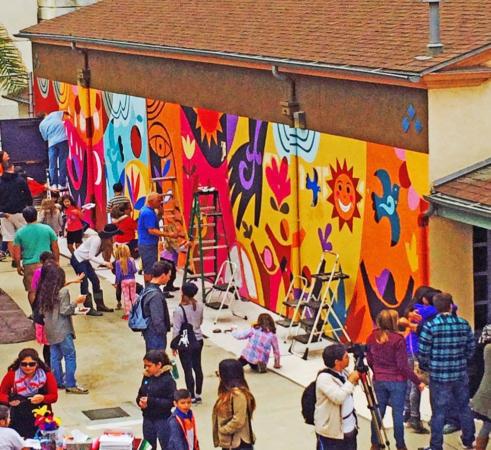 Maybe Something Beautiful Mural. Rafael López. Available at: https://rafaellopez.com/2016/05/02/maybe-something-beautiful-mura/ (Accessed 12 March 2022) Nevertheless, I am also facing many challenges in this project. I am completely clueless about this new-to-me medium, managing a team (even such of only four people), pursuing funding. As with all projects that put me outside of my comfort zone, I get a bit too fearful as opposed to brave and excited. I really strive to change that attitude. That is why, I was pleased to stumble across Lauren Hom’s blog in my research. She provides a lot of know-how on murals (which makes the new medium more familiar) and encourages her readers to view them “as a fun adventure rather than something scary”(Hom, 2020). Personally, something that helps me stay in control and overcome this fear (of failure) is research, as mentioned, and having a timeline like the one in my proposal. It always changes a bit from its original form, but overall it is a very helpful guideline. Additionally, something else that reassures me is teamwork. It soothes me to know that I have a group of people that I can count on. Even in the responsible managing role that I have now, I feel calmer to know that I work alongside the rest of the team. Furthermore, effective communication is key in such scenarios. As of now, we are seeking funding and we have an upcoming pitch meeting with the city’s municipality. If everything goes according to plan and we communicate effectively, we might get funded by them (it would only make sense that the municipality engages in a project about building a stronger community in the city).  Project Board. Milena Georgieva. Personal Archive. This is where all organisation is being kept. It is very useful to track thought process, research, sketches, meetings, among others. Another challenge is sustainability. It is something I strive towards in all my personal and professional undertakings, including in my thesis topic (sustainability in bookmaking) for final year. When it came to this SIP, I thought about various aspects. For example, not buying but reusing plastic containers, brushes and paint rollers. Bringing old clothes or fabric instead of buying new rags. However, paint itslef is perhaps the biggest resource needed. Therefore, I was beyond excited to find out about a great sustainable alternative to regular acrylic (essentially plastic) paint. We found a brand that produces air purifying paint that contains no toxic substances (European Commission, 2019). Airlite is perfect for our project and we hope we can get it delivered in time. All in all, what this SIP experience gives to me is invaluable. I find myself in a new artistic situation – I get to explore a new medium, work with new materials and test new styles – all of the visual research would definitely influence my future approach. Managing and working within a team is also enhancing my skillset. Furthermore, the subject of community building through art relates to my long-term dream of evolving my practice into a purposeful and beneficial one. *This is a direct translation. The meaning of the phrase is very broad and the idea is to make people think about various things to appreciate like their physical surroundings, their community, their overall situation and in general – their life. Resources:
European Commission (2019) Non-toxic eco-paint is a smart way to improve air quality. Available at: https://cordis.europa.eu/article/id/255161-nontoxic-ecopaint-is-a-smart-way-to-improve-air-quality (Accessed: 12 March 2022). Schuit, M. (2016) HOW RAFAEL LÓPEZ BROUGHT A COMMUNITY TOGETHER. Available at: http://www.allthewonders.com/books/rafael-guest-post/ (Accessed: 12 March 2022). Hom, L. (2020) Five Myths About Mural Painting that are Killing Your Dreams. Available at: https://www.homsweethom.com/blog/five-myths-about-mural-painting (Accessed: 12 March 2022). Megan Field - BA Graphic and Media Design I am a Graphic and Media Design student at the London College of Communication. For my Self Initiated Project, I have chosen to create items of merchandise such as; t-shirts, bottles and tote bags, for the Sea Life Aquarium gift shop. I am creating these designs for these items using a Cricut Joy machine, which is a vinyl cutter. I am also going to create a social media campaign, that will be based on the advertisement of the merchandise and the Sea Life Trust charity. I decided to do this, as I have a keen interest in sea life animals and how many creatures are becoming endangered due to factors like, poaching, pollution, climate change, vessel strikes, and fishing related incidents. The reason I have chosen to create merchandise and a social media campaign, is because of the experience I have gained working at my internship. I have been fortunate enough to create Facebook Ads, both still images and animations, and I have made social media posts, as well as design merchandise for real clients. The two companies who have inspired me to go into merchandising are, Skinny Dip and Cath Kidston, and I plan to see where they both started out as businesses and their first product drops and compare them to where they are now.  Examples of some illustrations I have made of the five endangered animals. Throughout my research I have investigated the different sea creatures that are endangered. I decided to pick out five different endangered and vulnerable marine creatures to draw and use within the designs of the merchandise I plan to make. The five marine creatures I chose were Sea Turtles, Whale Sharks, Blue Whales, Galapagos Penguins and Great White Sharks. The Sea Life Trust is a charity ran by the Sea Life Aquariums. They work globally to protect the world’s oceans and the marine life. The campaign, I will be utilising social media for, will advertise the merchandise, and the Sea Life Trust, as the funds from the sales of the items will theoretically go towards the charity.  Examples of T-Shirt Mock Up Designs I have made. Merchandising has always been a passion of mine, particularly the idea that I can create a piece of art, then put it onto a physical item and share it with others. I think there is no better feeling than sharing your work with others, and them liking it so much that they wear it! The two companies that I have grown up with and whom have inspired me to want to become a merchandise designer are; Paperchase and Skinny Dip.
SkinnyDip became a well-known brand back in 2011, when they released their first phone case design. It’s co-founders James Gold, his brother Richard Gold and best friend Lewis Blitz, started Skinnydip shortly after the Apple iPhone launched, quickly realising that fun phone case designs were incredibly limited. They had just the idea that was about to change that forever, and that is when and how the now popular brand was born. Since launching, they have expanded their products from phone cases to accessories, clothing, and lifestyle products . As seen from the picture below left, shows the phone cases they released in 2011, next to the types of phone cases they have released now in 2022. There is a large difference between how modern their cases have become and see how much they have developed overtime. The difference between the two products shows a lot of growth and reflects on the type of graphic designer that I would like to be in the future.
In conclusion my Self Initiated Project has given me the opportunity to discover my Newfound Agency. That Newfound Agency is the independence to create my own products and being capable of doing my own thing without having someone tell me what to do. Which is something I never thought I would be able to do successfully. Not only do I think this I think that I have also realised what I want to do in the future for my career and I have learned a lot through this project.
Hello, it’s me, Ariana Cowan, from BA Graphic and Media Design. It’s funny that that’s not how I’ve been introducing myself anymore. The transition and constant switching of roles I have had to condition myself to for the past 5 months has given me great clarity on the responsibilities and capabilities I have as a student and as a working professional. My internship at Deloitte Digital has been an eye opener and has exposed me to the depths of the ways of working in a corporate landscape that is demanding and ever changing. We work with clients from industries like health care, life sciences, pharmaceutical, finance, e-commerce, fashion and luxury and the likes; and your constant interaction with such industry professionals makes you realise as a 21 y/o design student that your perception of design that university has helped shape is ever changing and iterative. To put my understanding into perspective I’d say design is a language understood globally but spoken very differently depending on the context it sits in. And you have to learn to speak in every dialect. Speaking of language, I introduce here my subject of interest and the topic that my Self-Initiated Project is based on. Language has been a topic that I have been very keen on exploring since the past year. My dissertation proposal also surrounds the topic of language and linguistics in design and how language influences our visual perception and thus interpretation of the image. Last year, for my Self-Directed Portfolio, I explored the topic of sound visualisation and aural interpretation. During the pandemic, we have all had to maintain and create relationships virtually, this made me realise the power of the human voice in aiding the process of forging bonds between people. I connected with a person virtually who today, is one of my closest friends. Our friendship was built on the pure exchange of human voice. And that to me is beautiful. The human voice is so much more impactful than we give it credit for and thus I want to develop my studies around this topic with greater depth. My Self-Initiated Project is an extension of my Self-Directed Project from last year. The outcome of the previous project was a 3D printed representation of the recorded voice of my friend. It mapped the duration and number of conversations we had. I created a prototype of the data graph of our recorded conversations and used 3D printing to design a tactile representation of the intangible concept of the human voice. Here's what it looked like  Figure 1, Can You Hear Me? The aim of the above project was initially to create digital visualisations from the voice. I was looking into generative art and found a few artists that inspired me to great extents but keeping my timeline and deadlines in mind I went down the path of 3D printing resulting in a physical deliverable. I want to use my Self-Initiated Project however, to now expand on this idea. I had many ideas in mind, on how to explore the sound of language and visualise it. The team I work with at Deloitte is very diverse and has people coming from different parts of world, from different ethnicities and cultural backgrounds, it makes the team so rich in culture and there’s a shared understanding and knowledge of the same. Collectively we speak around 20 languages, and when I hear Italian, German or Swiss German which is very different from German (I had no idea) it sounds so pleasant to the ears, there’s a certain rhythm in every language and when spoken, sits on the ears so well. It got me thinking how I could visualise this to depict the beauty of these languages visually to the hearing impaired. Of the many artists I came across, a few stood out to me as related inspiration to fuel my ideas. Steve Haslip’s work titled ‘Dialogues’ which is a piece of art inspired by phonetics is featured in the book ‘The Triumph of the Commons: 55 Theses on the Future’ and visually drew my attention as it was so similar to my ideas and one way of visualising spoken language. The work does justice to the concept in a straightforward way, but the aesthetic of the visual representation is what makes it an organic, all-natural piece of work with a very biological and scientific undertone. The piece itself also calls the viewer to make the connection between sound and lip movement, i.e. lip reading. As detailed and representative this work is, Christine Sun Kim, a Berlin based artist, who was born deaf, focuses her work on sound and challenges the barriers to the deaf community through her art. Her work is mainly in charcoal based mediums but channels her feelings as a deaf artist in the community and makes a statement and demand to be treated just like any other. The piece below (figure 2) is called ‘Deaf Rage’ and so innocently yet firmly makes a statement about the feelings evoked in the artist.   Figure 2 – Death rage I chose to use this as an example because it highlights the importance of representation in the creative industries and showcases the creativity that comes from the lack of it. Inclusivity must be practiced more consciously in environments both personal and professional. Our personal experiences are not just ours; we are all individually part of a society and community and thus our experiences are shared. My experiences can include and exclude individuals based on the community I am part of. For instance, driving a car to work every day makes my travel experience easier but contributes to the pollution and impact on the environment that indirectly affects some individual/community somewhere. For my Self Initiated Project, as an expansion on the idea of the physicality of sound, I chose to explore origami as a form. An experimental study into the art of sound and sound visualisation. From frequencies to folds, the Self Initiated Project explores the technicalities of sound and its translation to a tactile piece of art. By using audio recordings of people speaking different languages, with the aim of visualising language for the hearing impaired, I sued inspiration from the digital visualisations created and extrapolated those to a physical form. Origami follows uniformity. Sound assumes irregularity. The act of folding paper and using origami made me realise that one can forge an ideal piece of sound and/or its visualisation but in its natural form, sound is dynamic in nature, and thus I wanted to demonstrate this juxtaposition in a creative way. As a designer, having worked with my team I have noticed we are all conscious of our choices based on our morals and values. And each viewpoint is respected. That comes with a sense of empathy and sensitivity to people’s opinions and thus generates inclusivity. My future ambitions may not be crystal clear to me now but what I know for sure is that I want to be a designer who creates for good, makes an everlasting impact that matters and be able to bring people together to express themselves but also on a more specific note, be able to use my creativity along with an understanding of business strategy, as I have seen in my professional experience so far. And I believe that will only come from a deep understanding and appreciation of the human experience and capability. This Self-Initiated Project will help me position these ambitions and prioritise them because I know I will become more appreciative of my subject and be able to streamline design processes within the realm of digital and UI/UX disciplines, by up-skilling and collaborating with relevant industry professionals and educators, not only giving me ‘new agency’ but also to generate the same opportunity of ‘agency’ to every person I now interact with as a better designer than the day before.  Amaya Crichton, GMD My SIP, Sea Jelly, is very much a passion project, one where I allow myself to make mistakes, and learn in the process, without the pressure of hitting arbitrary monetary goals. But it’s also one I wanted to do well, and honestly. I feel like the ultimate goal for any designer is to make something authentic and true to yourself Before starting Sea Jelly I was well aware of the concept of ‘greenwashing’- I think we all are: the blatant H&M ads and how words like ‘natural’ and ‘eco’ keep getting bigger and more prominent on packaging, as if the words themselves aren't murky and promise nothing. To be completely honest with myself, I think a small part of me almost encouraged greenwashing, the way that brands were somehow more focused on becoming more environmentally friendly even if it’s just for marketing, and some will do close to no change. And maybe it just made me feel better, or that I was doing something because the box of q-tips said it was made of cardboard or something, and 99% of the ingredients were natural. As if mercury isn’t natural and can give me brain damage. I digress. In a meeting with Rebecca Lardeur, a Materials Future lecturer in CSM, she completely changed my vision. She explained how there is a significant difference in ‘home-compost’, ‘compostable’, and ‘biodegradable’. That those bottles in Natura that say they are ‘biodegradable’, or the ‘I’m not Plastic’ straws and plastic bags can only decompose in industrial compost facilities and high temperatures. But here’s the kicker: very few exist in the UK, so probably all those ‘bioplastics’ are currently in those landfills we thought they wouldn’t end up in, turning into a toxic sludge. In an exercise with Kelly Hall for the NJAS brief, we began looking at competitors. While I searched up biodegradable accessories, the only thing I could find were these earrings made from a ‘biodegradable resin’, named PLA. However, on closer inspection PLA was one of these cases where they are only ‘biodegradae in special conditions’. And according to some, even if decomposed, PLA is essentiallyan acid, it will damage surrounding areas by changing the PH. Products I would have previously applauded for their eco-forwardness now left me feeling cheated. That If I scratched below the surface the whole product was a farce. It made me feel so disillusioned that we really weren’t improving our environmental impact, just lying to ourselves and others. Sea Jelly was the real test to see if we could implement these ideals. Spoiler: There were many, many frustrating dead ends, and will continue to be in the future. Even something as simple as pigments for the cardholders felt exhausting. After the initial tests with natural colourings not working, we looked at traditional pigments, which are made from rock & minerals. However, these cannot decompose into the environment, so cannot be considered biodegradable. Acrylic is melted plastic, so that was a no-go. Mica, a cheap and brilliant pigment seemed like a great solution, until reading into the production, the mining is being done mostly by children, creating a very problematic industry. We also looked into London Pigments, and although a promising lead, a lot of the pigments have metals, where we run into the original problem, but exacerbated since metal back into the earth can cause some issues. Even their fully biodegradable options were made from beetles, which meant we couldn’t consider ourselves vegan. When we finally landed on our biodegradable pigments (powdered beetroot, chlorella, butterfly pea tea etc.), the issue of sourcing came into play. Where do these companies source these products, are they responsible and ethical? Do they pay a fair wage and how far do they have to be shipped? Same thing with the choice of packaging, paper and inks we use. Even looking into the seaweed we used, we had to avoid sourcing from Morocco, where the overproduction had caused serious damage. The list of things to take into account and improve seemed endless and exhausting. It really put into perspective how easy it is to go for what’s cheap, easy and convenient and sprinkle a lot of green promisings on top and call it a day. And yet, I think we came to the realization that there is something vitally important in sharing that information and to try and be as transparent as possible. Truthfully, there will always need to be improvements: the science may change, the suppliers, data or cost. The importance of our own agency to showcase transparency on where we are and our goals to improve are paramount to change. To take responsibility and to be held accountable. I think this SIP has radically changed my view on business and design. The forefront of your work doesn’t always have to be perfected and spotless, because it rarely is, and by denying ourselves the space to showcase honestly where we need to improve, we invite compromise, looking the other way and inadvertently stagnate change. For future ambitions I hope I take this view with me, and not get sucked up into a soulless practice. It’s a habit I believe needs to be cultured personally to set the standard collectively. I truly believe that this transparent culture of communication, breeds a brighter future. If we are so caught up in trying to buy the perfect eco-product, and those companies are so keen on selling it to you, even if it’s not true, we’re not getting anywhere. Being environmentally friendly inherently is flawed- you’re friendly, not perfect, and we shouldn’t pretend that products are either. Refrences: Fairs, M. (2019) Bioplastics could be "just as bad if not worse" for the planet than fossil-fuel plasticsAvailable at: https://www.dezeen.com/2019/04/15/bioplastics-bad-environment-damage-arthur-huang/ (11.03.22). Muniyasamy, Sudhakar & Ofosu, Osei & John, Maya & Anandjiwala, Rajesh. (2016). Mineralization of Poly (lactic acid)(PLA), Poly (3-hydroxybutyrate-co-valerate)(PHBV) and PLA/PHBV Blend in Compost and Soil Environments. Journal of Renewable Materials. 4. 133-145. 
My name is Mara and I am a User Experience Design student. To dig right in, I'll shortly explain my idea for the self-initiated project I am working on. The aim of it is to raise awareness about well-being, a topic that is more and more popular every year. It can be argued it is because of many factors, one popular opinion with which I agree is, we developed in many fields that sped up our lives to a point we can't keep up with ourselves. People have this need to evolve all the time but not so much in quality as in quantity, with each year there are exponentially more shops, more apps, more technology, more series on Netflix… Essentially we created so much more than we need that there is no time or space left for us to look and see the world around us, which would make any social living being depressed. Writer Yuval Noah Harari mentions in his book that more people commit suicide than people get killed by soldiers, terrorists, and all criminals together. A few weeks ago I went for a walk around Hyde Park and accidentally came across „Speakers Corner“, which I have not heard of before, but later learned it is historically well-known. Besides spending two hours talking about my viewings of religions, a man with a big megaphone caught my eye, yelling to people not to have children. He challenged people to argue him and give one good reason why should anyone bring a human life on our planet today. At first surprised with such a serious statement, at the end I completely agreed with him (in my head), the world we created is disgusting in many ways, I won't enumerate the reasons, so I don't wander too much from the topic. I mentioned this not to discuss whether people should have children, but to point out the world has become such a place that some people question if it is worth existing. I think, for us already here, we should try to find positivity in life and remind ourselves of what matters to us and everyone else, that is the only way we have a chance to make things better. I don't think the world should be observed with pink glasses all the time, but to stay sane and motivate ourselves to change for the better, it is all right to put them on now and then. There's an elephant in the room. |


| CHAOS by Ariel is my personal brand that I formed in the summer of 2019, the brand started off with just stickers and now carries over 7 products including tote bags and weekly planners! CHAOS by Ariel embodies the idea of a small sustainable business, I have achieved this by working with companies such as @noissue. One of the main factors which have helped my brand grow was the continuous growth of its social media presence. With the self-initiated project, I have decided to focus on expanding my brand with the goal of launching new products and attending my first independent market. | |
Since the brand is up and running, the process of deciding the product line had to be well researched and this was done through market research from existing customers. Having a small business allowed me to build a close relationship with my customers, allowing me to receive primary data directly from my customers. With this, it was easy for me to note that based on my previous sales, my most popular products are stickers and planners. From this, I made the decision to carry out a new collection of stickers alongside a new line of planners. I focused a lot of my time on the design process as I plan to maintain these new products as part of my brand's collection for quite some time. Hence, it was important for me to create something that I felt confident in. Throughout the process, I maintained customer’s involvement by having polls on social media platforms and from asking their opinions.


 | While working on the design, I also had to focus on getting ready for my market. This was the first market I’ve attended and so a lot of preparation and research had to go into it. The artist Poppy Crew and her shop stood out to me because her product range is similar to mine. Her shop also recently started attending pop-up markets and so I was able to see what materials they used to set up the table and store. I was able to quickly learn that it is important to elevate and create height with the table. To help me prepare and further develop my understanding I researched to understand how customers interact with display products in a retail environment. This was important to the process because my business has always been based online and so interacting with customers in real life will be a new experience with lots to learn from. |
Being an independent small business everything fell under my responsibility and so I had to market and promote my own brand and products. I quickly learnt that I was my biggest promoter and I am the only person capable of expanding my brand’s reach. I focused a lot of my time building up my social media platform to help build a following. The artist Eva Malley has a strong social media profile as she promotes her products and business but still keeps it personal allowing her followers to build a closer connection. I’ve realised that many people purchase to support the dream and the person. The products are still important but how you present yourself and the connection you build with the people following you is what ties in the purchase.
| With the two goals of my SIP being to launch new products and attending my first pop-up market, this journey has been both educational and eventful. Reflecting on the past few months, I have grown as a designer by expanding my design base skills and also my networking skills. I have also learnt to organise my time to make my day the most efficient, it was difficult to balance my SIP project while working at Decathlon. The pop-up market gave me the opportunity and exposure to show me the foundation I can build with my degree in the future. It allowed me to realise a new form of motivation and determination. The in-person customer interaction allowed me to understand more about my customer base. This experience has also prepared me for next year as I am now confident that I will be able to balance my final year studies while further developing my brand. |  |
References:
Crew, P., 2022. Poppy Crew. [online] Poppy Crew. Available at: <https://www.poppycrew.com/> [Accessed 9 March 2022].
Malley, E., 2022. Eva Malley Art. [online] Instagram.com. Available at: <https://www.instagram.com/evamalleyart/?hl=en> [Accessed 9 March 2022].
Crew, P., 2022. Poppy Crew. [online] Poppy Crew. Available at: <https://www.poppycrew.com/> [Accessed 9 March 2022].
Malley, E., 2022. Eva Malley Art. [online] Instagram.com. Available at: <https://www.instagram.com/evamalleyart/?hl=en> [Accessed 9 March 2022].
Author
Write something about yourself. No need to be fancy, just an overview.
Archives
March 2022
December 2021
November 2021
May 2020
April 2020
March 2020
January 2020
December 2019
November 2019
October 2019
September 2019
 RSS Feed
