|
Hi, I'm Amy from BA Design Management. My first reaction to the topic of Anti-design was confusion. What is anti-design? What design are we talking about? But after some research, I learned that Anti-Design is a movement that started in Italy in the 1960s. Anti-design is the resistance to the novelty and minimalistic design derived from the rise of consumerism and technological advances. With the technological advances of the early 20th century, modern designers pushed for the form to follow function and be aesthetically pleasing with minimal shapes and colours (Martinique, 2016). But anti-designers rejected the traditional design and embarrassed exaggerated design that questioned the concept and taste of 'good design'. Anti-design vaguely reminded me of a design work I did during my work placement. Since August, I have been working as a Production Assistant for two Youtube channels. For one of the channels, I was asked to design a t-shirt that had a badly-photoshopped design of Josh in a mullet.
Although it wasn't exactly created with the same approach as that of anti-design, the process was similar in that I tried to break the rules of a good, clean design: composition, colours, typography, etc. From this, I realised that to create an anti-design design, one must understand the principles of creation. And this was frankly quite hard to do as a person exposed to and learned from a minimalism-centred design background. I thought about how I would typically design and design backwards. I used Comic Sans (yes, the designers' favourite font) and off-centred the text. So is anti-design on the rise now? I would argue yes. Anti-design trends can be seen in all industries, from interior to publications. For instance, it is prominent in magazines. As written by Jamieson on AIGA Eye of Design, there's been a growing movement of magazines moving out from the clean, crisp, white space and 'good taste' (Jamieson, 2016). But individuals and organisations started shaking things up because the clean, minimalist, luxury look was becoming a cliché, as Jamieson put it. She wrote, " In the sea of minimalism and luxury, these doing-it-wrong mags are the ones that stand out".   The trend became more popular during the pandemic, as people, not just professional designers, started designing and producing to kill the abundant time. Everyone can be creative. And that, mixed with the urge to create something different from the sea of 'good design', is what pushed this anti-design trend further. I have often resided to anti-design when designing something that has a lot of information but not enough space and time. For example, my DPS report, which I've started, has pages that almost look like a 'messy/ collage. I still tried to follow the general rule of what makes a design look nice, but I also experimented with abstract shapes and collaged backgrounds. I felt like this was a great way to signal that the work experience was busy, organised, and chaotic at the same time. Additionally, I didn't need to put too much thought into designing because having it messy was a part of the plan.  Now, anti-design can be seen everywhere. A quick search on Behance will show how many creatives pursue the style. I think that anti-design has now become too big, that it's no longer the minority. It's not the unpopular option that creatives once broke through with because they wanted to do something different. Instead, it's a living culture, a living design practice that is widely accepted and used by the young generation. Anti-design brings in elements from the past but is used in a messy and chaotic way in order to bring out a strong and bold voice. Thus, that explains why anti-design is so popular amongst the younger generation. It's bold, it has character, and it's loud. It doesn't look corporate and 'cookie-cutter', even though minimal designs are harder to execute.  In conclusion, is anti-design on the rise? Yes. It has been for the past decade, and I believe it will only grow as more people desire to express themselves- regardless of how 'good taste' their outcome is. I've come to respect anti-design more, and often, I prefer seeing anti-design works over clean design because it shows the creatives' character and voice. For example, this thesis journal by Beverly Ng was fascinating because it's not anything like the clean, crisp reports I'm used to seeing. However, readability is another problem which anti-design often overlooks. In this particular project, the author traded readability for character and uniqueness. However, for serving the purpose of a report, to deliver information through writing, one might argue that this project misses the mark.  But on the other hand, I was able to see how the designer used white space to balance out the readability with the messy handwriting.  As seen from the examples shown today, anti-design has a large spectrum of how anti-design or how non-traditional it is. Some mimick anti-design but still follow the general rules of 'good' design, while some miss all the marks on purpose. One thing is for sure. Anti-design has given more variation to the creative world and allowed for creatives from non-traditional backgrounds to express themselves. I think anti-design will rise even further as the current young generation, which is less hesitant to accept the look, will grow older and dominate the mainstream corporate world. However, I must mention a significant problem with anti-design in applying wider corporate use. It has a relative niche market, and as seen from Beverly Ng's Thesis Journal, it can fail to deliver information. It is also signals not-luxurious themes such as cheap, wild, and messy. https://www.widewalls.ch/magazine/anti-design-italian-movement
https://eyeondesign.aiga.org/the-new-wave-of-anti-design-magazines-will-question-your-sense-of-taste-and-thats-a-good-thing/ https://www.behance.net/search/images?similarStyleImagesId=569408713 https://www.behance.net/gallery/43205521/Thesis-Journal-%28201516%29
0 Comments
In response to modernism, a movement that infiltrated our daily ways of living; anti design offers more personalized options for how you want to be living. Starting in the 1960’s at a time where globally tensions could be felt, the Vietnam war was in progress as well as the civil rights movement. People were raising their voices, rebelling agains the norms, breaking the rules and making themselves seen. This attitude is certainly reflected in anti-design theories and pieces. “Design is an art form, and creativity is defined by curiosity, exploration, and experimentation” (Over, 2020) A leading designer that really pushed the boundaries, delving deeper into a world of experimentation and curiosity is Ettore Sottsas, the founder of Memphis design group (ofcourse). Through the groups design, a space where new ways of thinking about objects was found. For example, take your everyday typical lamp, an object found in the average home, worldwide. Sottsass presented a more quirky, bold and “out there” option. He created innovative works through his ability to communicate with the observer and free from the dictates of the typical vision of design linked to its functionality. (Mattavelli,2018)  Lamp Etorre Sottsass for memphis Lamp Michele de Lucchi for Memphis Although still revolutionary, Memphis design group place themselves a few years back in time, starting in 1980 and running for 7 years. In our current times, a new conversation can be had in reference to anti design, where its seen now, and what it could mean for us moving forward. Over the last decade, strict design methods have focused on usability above all else. Amongst many positive outcomes that this has brought, it has also led to homogeneity across the digital landscape. (99design team, 2021) and in contrast to Modernism, where the idea that objects should be permanent was loud, Anti-Design rebels felt objects should be temporary, constantly changing and being replaced by something more functional.(99design team, 2021) With the rise of digital technology, and the fast paced, constant remodeling it can offer, creatives can delve into corners of curiosity, exploration, and experimentation. For example, Hotdog, a magazine that aims to “challenge the gender discrepancy in literature and art, blurring the space between creativity and consumption, they publish work that pushes boundaries, bringing truth, pain and laughter to the page.” (Conery, Taylor, 2021) In doing so they break design rules, transforming into a visual emotional experience. “Readers and publishers are hungry for mags that challenge convention and offer a more authentic experience” (Jamieson, 2016)  Hotdog magazine issue one Swiss designer Boris Dennler has developed a playful, unique and personal form of design. Released through BorisLab, Dennler has transformed the functions of objects into new, unusual and outstanding pieces. The anti-trendy/anti-design object “is alive in the sense that it is made to develop in accordance with human life—by either being alterable or perishable” (Oro editions) with our increasing need to be more sustainable, designers are being pushed to think of materials and objects in new ways. Transforming the unusable old into the usable new, BorisLab reflects an attitude of anti design by embracing sustainability & upcycling.  BorisLab radiator chair & Radiator Vase  BorisLab Concrete & old Jaguar XJ40 table
I would say that in terms of digital art or printed matter that begins as a digital design, artists are thirsting for new, expressive, rule-bending designs and drifting further from clean design and the strictly measured. In terms of usable objects, furniture & architecture it can be seen as a response to our increasing need for revolutionary thinking in regards to our dying world; anti mass consumption & pro alternative functionality & aesthetic. But also serves as a vessel for personal expression in design and a range of choices expressing character for the consumer. Words by Adila Montijano (merXury) Bibliography Borislab.com. 2021. ABOUT. https://borislab.com/about/ Hill, B., 2021. The girl power zines to read this month. Dazed. https://www.dazeddigital.com/artsandculture/article/29843/1/the-girl-power-zines-to-read-this-month Madewithover.com. 2021. Over's 2020 Trend #6 Anti Design. Available at: https://www.madewithover.com/trends-copy/anti-design Mattavelli, C., 2021. Ettore Sottsass and his revolutionary design. Theinteriordesign.it. https://www.theinteriordesign.it/en/article/ettore-sottsass-and-his-revolutionary-design/1605 99designs. 2021. 12 inspiring graphic design trends for 2022. https://99designs.co.uk/blog/trends/graphic-design-trends/ Conery, M. and Taylor, M., 2021, hotdog magazine, The Dots. https://the-dots.com/projects/hotdog-magazine-306932 Jamieson, R., 2021. The New Wave of Anti-design Magazines Will Question Your Sense of Taste—and That’s a Good Thing. Eye on Design https://eyeondesign.aiga.org/the-new-wave-of-anti-design-magazines-will-question-your-sense-of-taste-and-thats-a-good-thing ORO Editions. 2021.Anti-trend. https://www.oroeditions.com/product/anti-trend Cited with the help of https://www.citethisforme.com/ Pixs Lamp michele de lucchini for memphis https://www.pamono.co.uk/oceanic-table-lamp-by-michele-de-lucchi-for-memphis-1980s/?utm_medium=cpc&utm_source=google&utm_campaign=PLA_UK_9503157503_98373141298&utm_content=421123749801_c_&utm_term=pla-318690695921___TJQ-433101&gclid=Cj0KCQiAzfuNBhCGARIsAD1nu-9s_UwpsiQnxjOJklf3UCVqC1J-gL8zNmBmd2wQmSut_5lkXoM4CDMaAk2dEALw_wcB Lamp etorre sottsass for memphis https://www.pamono.co.uk/table-lamp-by-ettore-sottsass-for-memphis-1980s-3/?utm_medium=cpc&utm_source=google&utm_campaign=PLA_UK_9503157503_98373141298&utm_content=421123749801_c_&utm_term=pla-318690695921___CXZ-1066964&gclid=Cj0KCQiAzfuNBhCGARIsAD1nu-9QIXBQctZggtjO1VkvnoLZRgooxat6e4CYBi3duM9eAbwPW4w3JMwaArlmEALw_wcB Hotdog magazine https://www.dazeddigital.com/artsandculture/article/29843/1/the-girl-power-zines-to-read-this-month https://eyeondesign.aiga.org/the-new-wave-of-anti-design-magazines-will-question-your-sense-of-taste-and-thats-a-good-thing Boris lab heater chair https://www.upcycledzine.com/heater-seat-chair-upcycled-radiator-furniture-by-borislab/ Boris lab vase & table https://borislab.com/portfolio/plaque-en-beton-sur-jaguar-ecrasee-2016/  What is Anti-Design? If seen as simply things made in opposition to design we must first look at what defines design. As a broad concept I’ve seen a few definitions but all seem to have the same core aim, which is to problem solve. Throughout design evolution we see trends of aesthetics develop, whether decorative or minimal they all have that same purpose of a found solution. Graphic Design, Defined as ‘a craft where professionals create visual content to communicate messages. By applying visual hierarchy and page layout techniques, designers use typography and pictures to meet’ visual needs. (1) We can understand and imagine the variety of ways this is achieved with that mutual purpose. However, Graphic Design is also where, since the pandemic hit, anti-design has grown the fastest. It is from the combination of an increased engagement on social media and accessible digital design softwares that Anti-Design Graphic Design has emerged. The nature of anti-design is to be visually jarring and disruptive, rebelling against the clear visuals created by traditional graphics to creates its own language of aesthetics. This is deeply rooted in irony. Irony, to convey the opposite of their literal meaning. So, an idea which is contradicted by its appearance or presentation. This is what Ant-Design is fuelled by. It requires first an understanding of traditional design, which it consciously repels, creating layers of satire below the initial surface response. It often looks to ‘ugly’ design and early 90’s digital aesthetics, where the design purpose was more functional than ornamental. However, how it is now being used is purely ornamental. Creating a semiotic that without contextual understanding has no purpose or meaning.  Another example of ‘Anti-Design’ is Mushpit. Wanting to rebel against traditional graphic rules and strict visual structures, the creators made the satirical women’s magazine.
In this spread you can see the playful mix of type and spacing which doesn’t sit so comfortably on the page. They use a cartoon comic sans style font, which if it had not been used ironically would be seen simply as poor design and difficult to read. So my critique. Irony in design holds a singular purpose, to react directly and humorously to design sincerity. But of course this is an expected development. As graphic design becomes more and more refined and exact, there would naturally be a reactionary movement to counter all the rules being made. Creating pieces which break the rules set by years of aesthetic study and developed craft. When you create too many boundaries of course there will eventually be a revolt. But where will this lead? Is there another depth beyond the Anti-Design aesthetic? I don’t think so. Surely the future of design should instead continue to be rooted in problem solving and communicating. On a personal level (being dyslexic), I look at a lot of the visuals created as part of this asteathetic and find myself disengaging. If you have to work harder to read and understand the visuals and text, whether it be in a magazine or for a poster, why would you engage further? So again I will say that I believe the future of design should still sit in it’s aim to problem solve, to create designs and visuals to articulate and engage with wider audiences and find solutions rather than narrowing down the audience to simply those who understand the irony. With anti-design how it exists today, I do not see how it can develop any further or be anything other than counter productive. Rosa Harter Interaction Design Arts 1 - https://www.interaction-design.org/literature/topics/graphic-design Poster- @trash.been Zine Spread - https://eyeondesign.aiga.org/the-new-wave-of-anti-design-magazines-will-question-your-sense-of-taste-and-thats-a-good-thing/ David Foster Wallace https://jameskasmith.com/category/david-foster-wallace/ https://www.metaphorandart.com/articles/exampleirony.html No more individualism, youth wants to collaborate, to work together, helping each other for visibility. Many have and are suffering from working under the shadow of one name. There is only one individual who is being praised for his work and achievements, at least that’s how the fashion industry would like it to be but new designers find this to be old-fashioned as the industry still rules under criteria from the 20th century. They are seeking to reformed the industry that changed towards a more product selling and garments focus; fashion is now a financial institution. (Edelkoort, L. 2017)
In the 80’s, Paris’ fashion didn’t see it coming with the arrival of the now-famous Japanese designers Yohji Yamamoto and Rei Kawakubo. Women wear worn by their untidy silhouettes with messy hair, flat shoes and no-makeup; the garments were the ones wearing the human figures. The two were said to be the ones that started the anti-fashion movements that went on until the 90’s with the Antwerp six. However Antifashion was nothing new, in the 1920’s Coco Chanel wearing trousers was already a hint to the movement. We could even go earlier in time with Elizabeth Smith Miller, an American advocate in 1800’s who is credited to be the first woman wearing pants. In the 90’s, antifashion was about deconstructions, constructions and disproportions but fashion is stagnating, Yohji Yamamoto, in 2012, states: “…Fashion is like air, we breathe air so naturally we will be influenced or polluted…”. Are the minimal deconstructed garments now a cliché? For Jeremy Leslie, it’s inevitable; trends are like viruses. Where the structure of a garment was explored in the past, we are now seeing young designers exploring textile, making their own rules, creating a new generation of antifashion designers which consequently took off during the first lockdown of COVID-19. As minimalism was its pick prior COVID-19; with its various moods over the years; fifty shades of beige, black and white, pastel, etc… which aimed for softness and calm atmosphere, we all ending dressing similarly. That sucked, didn’t it? Our clothes are meant to be reflection of our personality, some may also be a social, cultural or political statement but it felt like this was unachievable with brands that were all making look like items. On top of that let’s not forgetting the mass production, the ethical and environment issues that comes along those brands. Fashion house becoming conglomerates lost their independence to lead change. During the pandemic, people were isolated thus trying to find ways to keep busy, I could give you some examples, experimenting new hobbies, going through old stuff, cleaning their clothes,…and finally finding their grandma’s old dress. And then hits them, their grandma’s dress is now their new pants, they just created an unique piece that only them will own but moreover it’s sustainable which leads them to realizing the potential here. One thing that did not stop over the pandemic are social medias, on the contrary, they expanded, new accounts opened sharing their fun creation that were not following any conventions from the fashion industry nor any trends that were going on, the new wave of antifashion was created itself. Aside, from young designers recycling already exciting materials, some saw the potential in textile, a long forgotten craft in fashion. In the recent years, research on new materials that are environmentally and socially engage have been experimented with to design ne empowering garments that interact and embrace our bodies. An example of this would be the Rui Zhou working with knits and creating seductive pieces and states “love what makes you, you”, launched in 2019 Rui understand the cultural dispute about skin and nudity. Anti-fashion reflects on the current state of our world, on its current crisis whether they are political, social, environmental or cultural. The Vanilla issue, is another case that conveys contemporary antifashion. The online magazine promotes, with the use of Instagram, unconventional young designers making a fool of trends and fashion. Minimalism has not place at this instant, the audience wants ugly, provocative, cheap and nasty looks, a reflection of the population’s opinions on the current crisis the world was/is living. Colors are reintroduced, excessive and extravagant, goodbye to the “less is more” attitude and hello to “more is more”. Womenswear was discussed a lot but menswear is also looking at progression as well, with more playful silhouettes and colors that not only capture aesthetics but social engagements. The term “menswear” is actually wrong for me to use as we are now seeking for genderless designs, inclusivity is an inhouse rule rather than a requirement. Contemporary antifashion is not restricted to design; making fashion accessible to a wider audience; rethinking production methods; reinvent retailing; remove the classification of gender,… The pandemic had the population rethink their dependence, consumerism, and routine. Minimalism might have been mirroring these, where new designers might felt compel to produce over the top end product. We were on the look for distraction, they gave it to us. Their work are insightful, considerable and mandatory to our culture. We can give end note to Gucci is constantly reinventing its customers’ interactions with the brand, marketing and advertisements appreciably considerate, and noticeably expanding since COVID-19. by Elisa Jonckheere, BA(hons) illustration and visual media Ong, J. (2020). “Gucci is constantly in transition so the brand is open to anything”: Ivar Wigan on his sci-fi fantasy interpretation. It’s nice that [online], Available from: itsnicethat.com [accessed 4 December 2021] Porter, J. (2019). ICA opens major survey of maximalist art and design on June 26. Institute of contemporary art Boston [online], Available from: icaboston.org [accessed 2 December 2021] Edelkoort, L. (2017). BofVOICES : Anti-fashion: A manifesto for the next decade. The Business of Fashion [video], Available from: youtube.com [accessed on 3 December 2021] Nicklaus, O. (2012). Antifashion. ARTE France, Lalala Productions [video], Available from : distribution.arte.tv [accessed on 3 December 2021] Jamieson, R. (2016). The new wave of anti-design magazines will question your sense of taste – and that’s a good thing. Aiga Eye on Design [online]. Available from: eyeondesign.aiga.org [accessed 2 December 2021] By definition, Anti Design is design that rejects the clean minimalism of traditional Modernism, instead taking a more brash and maximalist approach. It’s roots can be traced back to Italy in the 1960’s, but a notable graphic reference would be David Carson’s work for Ray Gun during the early 1990’s. Carson had very little formal graphic education, but knew enough of the rules to know how to break them, this is important when making Anti Design in my opinion. Carson captured the spirit of the alternative music scene and created a graphic representation that essentially became the house style of the 90’s counter culture scene.  “Magazines don’t get produced in a vacuum - they refer to their predecessors but also other media” - Jeremy Leslie Magazines are almost always about other forms of culture, they don’t exist for their own benefit, but rather to talk about other topics. So as Leslie states, it is inevitable that they’ll garner influence from other forms of existing media. So when talking about the rise of Anti Design in the contemporary graphics scene, we need to consider other media that has rose in prominence over the last few years. Meme culture has had a huge impact, for better or worse, on Graphic Design. The way we consume media has been potentially irreversibly changed due to the meteoric rise of social media over the last decade, so this has naturally affected the way designers work. They’ve had to adapt, or at least acknowledge the change of pace media has undergone as attention spans have invariably slumped due to the constant bombardment of new media online. A designer who I think has incorporated elements of meme culture into her practice in an interesting and thoughtful way is Charlotte Rohde. Pictured here is a typographic piece she designed for her 2021 show Hot Mess.  “I like to play with masculine materiality such as metal and wood, while expressing flirty vulnerability in words.” - Charlotte Rohde
Rohde uses her formal tuition to create playful and irreverent work that encapsulates the current internet zeitgeist while referencing societal issues within her field, specifically female representation and femininity within Graphic Design. Apart from Rohde’s obvious intelligence and personality, I think the reason her work is as interesting and conceptually strong is because of her formal tuition. As I touched upon when talking about Carson’s work, you need to know the rules if you want to break them. In a recent YouTube video, Satori Graphics breaks down why were seeing such an increase in anti graphics, and if it will become the prevailing form of Graphic Design. He talks about the availability of software meaning people without formal design education can make graphics. The accessibility of the practice has lead to a lot more young people becoming practitioners, which I think explains a lot. Anti design seems to be a youthful practice. As a side note, the rise of Y2K aesthetics seems nearly indistinguishable from the rise of anti graphics, particularly in independent print publication. Amelia Thorpe writes “there is an undeniable childish aura to this trend, which explains why many Gen Z’s might adopt this style due to the nostalgia that surrounds this era…” Although she’s talking more about fashion in this article, there has always been an intrinsic link between fashion and Graphic Design, and the point she makes still stands. This element of youth has triggered a real sense of sometimes false nostalgia for the youth of the 2020’s. Maybe it’s an antidote to a troubled time, recalling memories of a ‘simpler time’, (although most people who indulge in the aesthetic probably aren’t old enough to properly recall the early 2000s), or a more cynical view would be the graphics world is following the repetitive drumbeat of fashion’s cyclical nature. Anti design may have started as a form of rebellion, but what happens when it’s commercially fetishised? In summary, Anti Design is neither good nor bad. It’s a style. I think in the 21st Century it’s definition has changed, and it’s too commercially viable to be considered truly ‘rebellious’, however this isn’t necessarily a bad thing. Ultimately people rebel against systems that need to change, and because of designers’ rebellion against traditional Modernism, there is now a viable place for Anti Design. However, like all styles and genres there’s a time and place to use it. Anti Design is based on what were once considered ‘distasteful’, however this doesn’t mean that anything goes. There’s a definite difference between intelligent irony and bad design. Written by Matthew Diggle For the time being, all the cases of anti-design that we can find around us happen to have one characteristic in common: they all stay out of the clutches of capitalism, they are not a belonging of the capital, a commercial weapon. At least this is how it was conceived originally, and how I still see it nowadays, even though it might have been turned into a trend within the paradigms of the market. We can understand anti-design as a movement in art and design history. Nonetheless, in this context, I conceive it as the opposite to corporation, an antonymous of capitalism. In the most contemporary sense of the concept, I see it as a response to the highly art-directed and designed work which has been produced during the last centuries, but essentially during the last decades, where the aesthetics can be identified under certain guidelines. All this visual content was designed to generate a desire from us towards a product or service. Anti-design is not just a visual reaction to the socially accepted imagery we consume daily, but also a political statement, which challenges the visual culture and languages that have been established during the past times, and the ideas associated to them. Not only taking the consumer’s eye out of their comfort zone, but also training their capabilities to read new formal rules, out of any social nor political references or understanding One of the most rellevant case of study within the cultural and artistic context of Barcelona (Spain) is Sociedad 0. Sociedad 0 is an art, up-cycling design, research and industrial design collective born in Barcelona formed by alumni who graduated at Elisava Design School. Sociedad 0’s work is based on fine artwork, research, design objects, and exhibition making (space design, display structures...). Some of their projects include the space design and art direction for Paloma Wool’s pop up store in New York, and recently the exhibition production of the show ‘Our garden needs its flowers’ at Tecla Sala, in L’Hospitalet, Barcelona. Their work essentially recycles materials found around them, and their productions are characterised by the low budget they have and a touch of humor or irony in the compositions of their objects, usually breaking the aesthetic standards and even structurally, challenging our understanding of spaces, furniture, objects and materials. Their work processes are also translated to their lifestyle. Once the collective graduated, they moved to an empty office floor, living an alternative lifestyle based on community, low resources and a radical position towards economics and politics. Garudio Studiage. 2021. About. [ONLINE] Available at: https://www.garudiostudiageshop.com/pages/about-us. [Accessed 6 December 2021]. NEO2. 2020. Sociedad 0: ¿Utopía o realidad?. [ONLINE] Available at: https://www.neo2.com/sociedad-0-utopia-o-realidad/. [Accessed 6 December 2021]. Widewalls. 2016. The Cultural and Political Role of Design. [ONLINE] Available at: https://www.widewalls.ch/magazine/anti-design-italian-movement. [Accessed 6 December 2021]. Wikipedia. 2021. Archigram. [ONLINE] Available at: https://en.wikipedia.org/wiki/Archigram. [Accessed 6 December 2021]. The Art History Archive. 2011. Anti-Design. [ONLINE] Available at: http://www.arthistoryarchive.com/arthistory/antidesign/. [Accessed 6 December 2021]. Pau Geis These are some factors in my opinion that contribute to anti-design, the fact that anyone can make a design using high-end platforms (like adobe) without evening learning the principles of design that works so well. Another reason could be that designers become bored with rules after years of training and begin to resell again the Industry standards and attractions. With the use of internet and over crowded space of design, the younger generation scope to exploit the ‘unexpected’ through design (anti-design). Recent social events have played a part in this anti-design movement, the world is completely different from years ago, with feeling changes in society, an example of this is Climate Change. Designers of all fields have a responsibility to contribute to helping the climate change crisis in some way. The coronavirus pandemic has reshaped how we think about product packaging, as a graphic design discipline. To cut the damaging effects of Single-Use Plastic on the environment foe example the edible water bubbles to replace plastic bottles, are created by encasing a blob of drinking water within an edible membrane made from a natural seaweed extract with nothing going to waste. Dissolvable Packaging offers an exciting experience for customers that goes beyond the packaging, seeing as they will be consuming the packaging, however, there is no advertisement or branding becoming a part of the anti design movement. Reusable and refillable packaging examples have increased, notably over the last 18 months as brands, retailers and suppliers look at ways of tackling single-use and difficult to recycle packaging. Big food suppliers, like Asda, have implanted sustainable stores to cut even more plastic, partnering up with some of the UK’s most popular household brands, The store is designed to help shoppers reduce, reuse and recycle with ease setting up refill stations. selection of different cereals, tea bags, coffee beans, rice, pasta, shampoo, conditioners and more. However this will eliminate all the brands extension for advertising strategy, packaging plays such an important role in building brand recognition. The future of shopping at places that have adopted the idea of recycling, a way to eliminate waste before it’s even created. This comes at a cost for designers as the primary function of packaging is to protect the food inside, the main importance of food packaging design is to attract consumers. The ideal design not only conveys what the brand is, but what the brand stands for. Having a strong brand identity combined with excellent packaging can help attract consumers and help to communicate information about your product clearly and concisely. Although you’ll never need to sort through recycling, separating glass, cardboard, plastic, and metal due too the refill station concept means that the power of packaging will be eliminated. In this modern day food marketing and quality packaging designs are important to influence the decision of consumers to point of sale by being attracted by the packet, becoming part of the marketing process for a way of beating the competitions I the market, but due to the launched the push of sustainable shopping, this will leave a huge gap for branding designers in the food industry. References: Just Food. 2021. A lot to unpack – supermarkets trialling refill stations. [online] Available at: <https://www.just-food.com/features/a-lot-to-unpack-supermarkets-trialling-refill-stations/.Design = Wastefulness: ‘Waste is where design can effect the greatest change.” ‘Waste has gone from a by-product of our cravings for novelty and easy living to the defining material of our age” Chief Curator of Design Museum “Waste Age: What Can Design do?” October 2021 2021. [online] Available at: <https://corporate.asda.com/newsroom/2021/10/07/asda-opens-uks-largest-refill-store-in-york> Oxford Reference. 2021. Anti-Design. [online] Available at: <https://www.oxfordreference.com/view/10.1093/oi/authority.20110803095416737> [Accessed 6 December 2021]. designboom | architecture & design magazine. 2021. the ooho! edible water bubble gets set to replace plastic bottles. [online] Available at: <https://www.designboom.com/technology/skipping-rocks-lab-ooho-edible-water-bottle-04-12-2017/>. Johnsonbanks.co.uk. 2021. Unexpectedly everywhere | Johnson Banks. [online] Available at: <https://www.johnsonbanks.co.uk/thoughts/coping-withirrelevance> Charly Sargent   Hostile Design in Camden, London.  Basic luxury aesthetics branding. Source: https://99designs.co.uk/logo-design/contests/aesthetic-medicine-logo-897986 Basic luxury aesthetics branding. Source: https://99designs.co.uk/logo-design/contests/aesthetic-medicine-logo-897986 Joanna Krystyna Nowicka
Graphic & Media Design @jesusdetonator Design without Hope ‘It is hard to say what today’s dreams are; it seems they have been downgraded to hopes—hope that we will not allow ourselves to become extinct, hope that we can feed the starving, hope that there will be room for us all on this tiny planet.’ (Dune & Raby, 2013) Modernism, the design without hope. Aiming for functionality, simplicity and the reduced colour palette, it was meant to fit in with the modern lifestyle and be useful, but unobtrusive. It asks us to shrink ourselves, or sometimes even erase ourselves – everything has to be neat and readable and make sense and have a grid. Everything needs to black and white, maybe with a hint of red or pink for some spice, to throw people off. Everyone needs to be clean and have a 9-5 job, have a mortgage, two kids and a house. Everyone needs to be neurotypical. Even in design, that is supposed to reward creativity, only the very specific, minimalistic type of creativity is rewarded. Hope is all we have left – and although design is about problem solving, like many people say, the problems that are fixed with modern design are not the ones that need fixing. As Micah Bowers said, ‘Design impacts humanity. It affects our spaces and places, professions and pastimes, friendships and families’. By shrinking ourselves and adjusting to those design norms, we lose ourselves and others in the process. I recently joined a an integrated medicine and biohacking centre as a graphic design intern. Although health is not really one of my main interests, I did it mainly because of my liking of their branding. It was bold, colourful, had nice textures, amazing futuristic fonts. Unfortunately, I quickly found out that what the Head of Marketing wanted was simple, like every other luxury medical company. White and gold, black and silver, toned-down pictures, luxury aesthetics. With each day passing the visual aesthetics I was drawn towards started disappearing when I was working on them. My passion for the brand started sinking and I started seeing it for what it actually was: another luxury company getting money out of people for treatments that barely work. Company with employees renting in South Kensington and not liking their flats as they’re so close to work they can’t drive their nice cars. Design, instead of showing the negatives and conforming to what was already established is supposed to be the opposite of that. ‘Design’s inherent optimism leaves no alternative but it is becoming clear that many of the challenges we face today are unfixable and that the only way to overcome them is by changing our values, beliefs, attitudes, and behavior.’ (Dunne & Raby, 2013) We are meant to adapt, face those challenges and change the way we think – not conform. Not fight against each other. Not create another luxury medical brand with white and gold branding. To summarize, we need to go beyond modernism. We need to go beyond conforming, back to the designers that solve problems that actually need solving. Back to helping people, back to standing out, back to having colours and funky forms. Back to fighting for hope with every drawing and every design. SOURCES: 1. Micah Bowers, ‘Design Ethics’ https://www.toptal.com/designers/design-director/design-ethics/ 2. 99% Invisible Podcast, 2016, Episode 219 ‘Unpleasant Design & Hostile Urban Architecture’ https://99percentinvisible.org/episode/unpleasant-design-hostile-urban-architecture/ 3. Anthony Dunne & Fiona Raby, 2013, ‘Speculative Everything. Design, Fiction, and Social Dreaming’ https://readings.design/PDF/speculative-everything.pdf 4. Elena Martinique, 2016 ‘Anti-Design Italian Movement’ https://www.widewalls.ch/magazine/anti-design-italian-movement 5. Joshura Comaroff, 2017, ‘Defensive Architecture’ https://artreview.com/ara-winter-2017-opinion-joshua-comaroff/ Milena Cywinska, User Experience Design As cliche as this sounds, the global pandemic has shaken up every field of life and had a huge influence on all of us. So why would the design go through all of that unharmed? As we all suspect, it did not. Also, it is not a surprise that the anti-design trend was brought back to discussion, but we will get to that. The pandemic has questioned everything that felt so certain and revalued it in its own way - which I actually started to like. In a blink of an eye everything was gone, everything was different. We finally began to value things that we had always taken for granted. These were such fundamental things as family, health, security. The social aspect of life was completely frozen, we were left alone with the new and unknown, in isolation and uncertainty. It felt like the world suddenly stopped. It all has taught quite a few important lessons. Dressing up fancy to classes in a modern building in central London - you wish, not anymore. Get used to pyjama pants and a random, at least proper-looking shirt with a laptop in your bed. That was the new normal. And there was no way to impress and even if, then no one cared. As the whole social life completely froze only the core, most important values survived. In the new circumstances, the ‘pretty’ has completely lost its value. We began to care more about comfort, functionality and usability, as that was all that was actually left. Our commercial sides were not as easily tempted anymore. All the shiny and decorative was not in place in the face of such hard circumstances. Additionally, we finally started to appreciate the role of a community. In the face of a threat, we had to work together but separately in order to prevent the spread of the disease. We lacked social interactions and started to appreciate the value of having people around. We have finally started to realise that all of the environmental threats and problems that we so easily ignore are about to happen. We have finally brought social problems back to the discussion. And even though we still do not care ‘enough’ about all of those, we did make a baby step in the right direction. People became more aware of their role in the community, excellent proof of which is visible in the agenda of the 2021 Dutch Design Festival, where all topics focused around sustainability, ecology and loads of other exhibitions I have recently visited, most of which touched on the socially relevant topics such as activism, war, local heritage, healthcare, identity, and a variety of others. Even me, technically a UX designer, ending up working for a social design studio shows that something has changed. Leave and Let us Go, Alexandra Rose Howland, FOAM Museum, Amsterdam 'Howland presents an intimate portrait of Iraq, a country that is often misunderstood and misrepresented.' Piet Hein Ek - Sustainable Furniture Design, Dutch Design Week 2021  The whole world became humbler, our priorities have shifted into the most fundamental values. We really enjoyed working from home, dressing up comfortably, not having to impress anyone. But we did get bored quite quickly. As we generally became humbler and more considerate, it does not mean we did not get tempted by the ‘pretty’ at all. We did get a new view on what really matters but from time to time we desperately craved the luxurious and crazy. We started to miss all the fun and entertainment. And when we did, we went extreme. That is when the anti-design comes in, which stands exactly for all of those. ‘Anti-design embraced various exaggerated and expressive qualities to undermine the purely functional value of an object.’ As for me, the design of today has become more purpose- and usability-oriented. We do prefer simple and accurate solutions, but do not mind adding an anti-design twist to those from time to time. Questlove wears gold Crocs to the Oscars red carpet. ‘I’m definitely seeing people taking more risks, in terms of color choices, prints and patterns, even shapes and silhouettes that they wouldn’t have worn before, says Sydney Mintle, a fashion industry publicist in Seattle.’ The world went from one extreme to another, but that taught us it is not so one sided, we do need both. We do need comfortable, practical, easy and humble but we also need crazy, fun, bold and exaggerated. The pandemic is going to leave us with a crazy mix of both - sweatpants with a twist. And as fashion is the most clear way to reflect that, those changes have influenced the whole design world. ‘Comfort has remained an important fixture in our wardrobe and that’s something many will find hard to relinquish anytime soon, says Forbes-Bell.’ References:
Attardo, K. (2021, June 8). A Fashion Psychologist on What Post-Pandemic Dressing Will Look Like. Marie Claire Magazine. https://www.marieclaire.com/fashion/a36321088/post-pandemic-fashion/ Dellatto, M. (2021, May 4). Why ugly-cool Crocs have stood the test of time. New York Post https://nypost.com/2021/05/04/why-ugly-cool-crocs-have-stood-the-test-of-time/ Korducki, K. M. (2021, November 18). The sudden, uncomfy fall of the biggest pandemic fashion trend. The Guardian. https://www.theguardian.com/fashion/2021/nov/18/sweatpants-pandemic-favorite-slubby-trend-over Over. (2021). Over’s 2020 Trend #6 Anti Design. Made with Over. https://www.madewithover.com/trends-copy/anti-design Martinique, E. (2016, June 25). Anti-Design Movement - Aestheticism of the Modern Era. Widewalls . https://www.widewalls.ch/magazine/anti-design-italian-movement 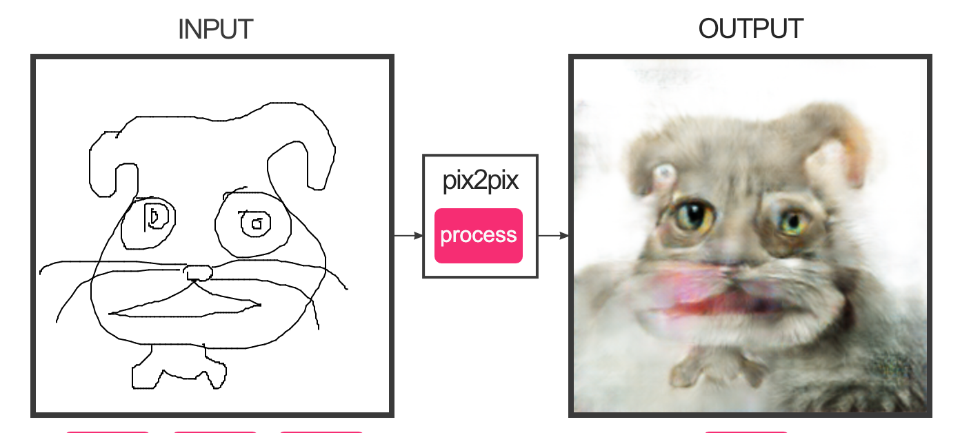  In recent years machine learning technologies have been advancing rapidly and they are getting more and more accessible as well. These factors enabled artists, designers and just curious individuals to experiment and create with these technologies. There's a multitude of different technologies and usages for machine learning algorithms but in this context I will be talking about image and video GAN’s (A generative adversarial network (GAN) is a machine learning (ML) model in which two neural networks compete with each other to become more accurate in their predictions.). These algorithms generate images or videos based on different inputs such as text, a database of images, video or many more. The images and videos generated by these algorithms all have a common AI aesthetic to them which inspired me to connect it to Anti-design. The classic traits of the anti-design movement can also be recognised as a pattern in modern ML generated imagery. Elena Martinique in her essay defining the roots of the anti-design wrote “Anti-design embraced various exaggerated and expressive qualities to undermine the purely functional value of an object.” if we look at ML generated furniture for instance you can see definite resemblance to the style she mentioned. But these similarities are not only limited to the final products of these but also the processes they create, Dr Marcus Bunyan defined that Modernist designers were often treated as heroic figures, Anti-design tried to challenge this by allowing the owner to participate in the design to some extent this involvement is a core process in ML generating processes especially with openly available accessible algorithms anyone can play the part of the “designer” by using a publicly available pre trained model. Bunyan also wrote that “Anti-Design often suggested that form doesn’t have to be invented, but also recycled.” which can be connected to how most GAN models work, they are trained on a huge database of images for instance if the desired output is to generate images of chairs programers would train the ML model on thousands of images of existing chairs thus “recycling” these chair designs and creating new ones from them using ML tech. I believe that Machine learning technologies are a new tool that inspires and enables a fresh wave of anti-designers of the future. References: https://www.serpentinegalleries.org/art-and-ideas/aesthetics-of-new-ai/ https://creative-ai.org/ https://www.widewalls.ch/magazine/anti-design-italian-movement https://artblart.com/tag/calvin-klein-party/ http://antiaiai.info/ https://www.youtube.com/watch?v=ohmajJTcpNk&ab_channel=MatthiasNiessner https://toretei.com/work_aimobili.html https://www.cadalyst.com/%5Blevel-1-with-primary-path%5D/industrial-design-team-turns-ai-quickly-generate-form-studies-43711 https://affinelayer.com/pixsrv/ David Varhegyi |
AuthorWrite something about yourself. No need to be fancy, just an overview. Archives
February 2023
Categories |


 RSS Feed
