|
“Art has the lovely habit of ruining all artistic theories.” Marcel Duchamp ANTI-DESIGN is on the rise! The art form that breaks all the rules. Whether its dodgy colour palettes, completely ignoring alignment, typefaces that disorientate, anti-design is becoming more and more popular and can be seen more regularly in the design scene. But why is it happening? Let's look back at history. Anti-design has always been around, but there have been times where the art phenomenon has stood out. Almost every great cultural movement in history began with an intuition to purposefully go where you’re not supposed to go in the art world . I’ve picked out 2 key examples.
Developed in response to the horrors of WW1, Dadaism, was a reaction to the slaughter of the trenches in the war. The movement essentially declared war against war, countering the absurdity of the establishment with its own kind of nonsense. Dadaism rejected reason, rationality, and order of the emerging capitalist society, instead favouring chaos and nonsense. Creating art that was rebellious and striking imagery that gripped people in the 1920s. Also, for different reasons, in the years between 1966-1980 Italian designers created a new anti-design movement. The movement emphasized striking colours, scale distortion and used irony. It was a reaction against what many avant-garde designers at the time saw as the perfectionist aesthetics of Modernism.  At these moments designers were either bored of design or wanted to rebel against what was happening around them. Rules are made to be broken and the artistic spirit will always wriggle away from safe spaces. This is happening now! The pandemic has created designers that are detached and angry at the world. Young designers especially have had their communication torn apart, hiding behind screens, seeing no faces, voices muffled by poor internet connection. Finding it hard to express themselves. These young designers are being rebellious with bold designs, creating strong messages. Now with ever evolving technology, design software is more accessible and has become easier to learn, it's no surprise that more and more designers are breaking the boundaries within a simple click. The work can be so striking that it stands out from the rest, with a hard hitting presence. Social media platforms allow anyone to show off their design so it can be so easily shared, creating an instant trend. As a UX design student I was always told to stick with the rules, listen to the audience and keep it simple. Simplicity in design is always pushed, but simplicity doesn't always work. Even when some designers say, if it's not simple you're not doing it right. If it's too complex, go back and do it again. If you make people think too much, you need to come up with something simple. Simplicity has become an assumption that this is what every user wants and needs and something that always needs to be followed. Yes, it’s good to follow the rules but design can become repetitive and stale and I do understand that this art form can be very difficult to sell, breaking the norm is sometimes seen as a bad decision for companies, but users need to be challenged, to explore and I’m sure they don't want to be hand held through every experience. Design is an art form, and creativity is defined by curiosity, exploration, and experimentation. Both users and designers want this. Anti-design is all about that! I’ve found a great example of when it works. The conference site for Bloomberg Businessweek Design had truly outrageous anti-design and can be perceived as edgy and provocative. These designs were criticised by peers but the publicity led to a successful campaign. Any publicity is good publicity.  So, does it help me, the answer is yes. In my previous work at university I love to try and break the boundaries of UX design and the briefs that are put in front of me. Now that anti-design is now on trend, my designs can be more experimental while still being accepted. NICE!
References https://www.siteinspire.com/websites/6041-bloomberg-businessweek-design-2016 https://www.widewalls.ch/magazine/anti-design-italian-movement https://www.dadart.com/dadaism/dada/020-history-dada-movement.html https://uxplanet.org/top-3-visual-design-anti-trends-9e73fb9e2da9 https://www.creativereview.co.uk/anti-digital-graphic-design/
3 Comments
My name is Davinia Clarke, studying BA Illustration and Visual Media. I was unfamiliar with the term Anti-design and I believe this was my first time hearing it. The first thought that came to my mind was that Anti-design describes an individual that doesn’t value a designer's work even though design is everywhere. From researching the term I found that Anti-design was a movement used as an expression of rebellion by re-interpreting the rules of graphic design. It started in Italy from 1966 to 1980 and the movement consisted of using bold clashing colours, scale distortion, incorrect alignment, ‘bad’ font choice and/or illegible typography. This was in response to Modernism that was heavily focused on style and aesthetic. However, in order to successfully break the existing rules they need to be learned in order to challenge them. This made me think about colour theory, composition, rule of thirds and other fundamentals of art that artists and illustrators learn. Leisure turned into research I was online browsing on the Boohoo app then switched to Pretty Little Thing. At some point I had forgotten which brands app I was on as they both look identical, from the logo design to the overall structure design (see image below).From that I then checked both brands' webpage to see if there were still any similarities between the two, which there were. The only thing that helped me differentiate between the two were the brand’s name at the top of the page. This is something I’ve consistently seen with brands recently not limited to fashion but as food, tech and social media. Recently, I’ve paid close attention as an multimedia designer intern for a skincare brand. In this role I have to create and design content for social media, that includes images and videos. This has challenged me as an illustrator as graphic design and brand identity isn’t a familiar area for me, as one of my tasks is to essentially rebrand the company’s style. One of the tasks is to find appropriate fonts to see across their platforms that communicate and give a sense of who they are. I researched existing skincare brands and noticed that most aren’t distinctive or everyone is playing it safe by recycling ideas. Brands are “Blandling” The article by ‘whatson’ used the term ‘blanding’ to describe how companies' rebrands are conforming to existing trends, the bold, san serif fonts that are minimalist looking. The purpose of branding is creating an element that is identifiable and recognisable. However, top luxury brands like Balenciaga, Burberry, Dione Von Furstenberg have all removed special quirks about their logos to black and white uppercase sans serif fonts. Some would argue that due to the new technology that these logos appear on sans serif fonts make them more legible and easier to read. (Refer to image 1).  Graphic designer Gavin Day talks about how the original logos wouldn’t have been designed for these technologies but now in the present time “It's all about reusability and perfection, and less about individual quirks.” - Prospectus Magazine
This makes sense as simpler and clean designs are easily-transferable and universal. However, I believe another reason for this conformity in redesigns is accessibility. With the rise in popularity of street wear style perhaps have made brands rethink their target market, to a younger generation like gen-z. Whilst these brand price tags are unattainable for most, the appearance, style and overall feel of the brands feels accessible. As the clothes they market aren’t the daring designs you see on fashion catwalks but more so any average person could wear (even me). They are portraying an image of accessibility and the style of these fonts I think plays a role in that. Adding on, I would argue that established brands can get away with conformity, redesigns and revamping as they have the money for PR and marketing that smaller brands do not. Also, they've built up a loyal audience and space that contributes to them being universally recognised. I personally think it made it more challenging for smaller brands to stand out, especially if they conform with current brand identity trends. Especially on Instagram, where everyone is almost fighting for each other’s attention. To counteract, there's also the pressure for reproduction and how it leaves little time to come up with something new. So the safe option is to recycle and reuse ideas that other brands are using but adding a twist. It leaves me with the question of what does it means to be ‘original’ or perhaps distinctive as nothing is completely new. This is where anti-design should re-emerge to encourage designers to take more risks. Although, I believe that they will always be designers out there challenging rules and bringing in new ideas that can inspire existing brands to become more experimental (or just copy their design without credit). Written by Davinia Clarke References https://www.careerexplorer.com/careers/questions/51/what-is-the-difference-between-a-graphic-designer-and-an-illustrator/ https://designbuddy.com/what-do-worlds-top-brands-logos-have-in-common https://www.prospectmagazine.co.uk/arts-and-books/when-did-every-brand-start-to-look-the-same https://www.nngroup.com/articles/brutalism-antidesign/ https://www.creativereview.co.uk/anti-digital-graphic-design/ Hi, this is BA from the DfAD course. Since my DPS year started I have been working as a design intern and creative producer for a plant-based food brand with a wide audience target-reach. I realized since the beginning of the placement that their visual branding approach is very rigorously minimalistic. Plenty of white space, mostly no colors, black and white compositions – avenir and lato font families, easy, minimal, so called by many working there a ‘no brainer’. Broadly speaking, in the world of marketing and commercial brands that want to do well, minimalism is pretty much the synonym of having good taste: the perfectly centered logo, the aligned and simple captions at the bottom of a perfectly cut video, the examples are many and predictable, once you get the hang of it. Less is more rules. The common idea, in my experience, is that in most commercial environments the cleanest your visual communication is, the better that the message is conveyed. Generally this kind of brand doesn’t mind being similar to many others in the same sphere, they instead encourage it. While working on perfectly centered and aligned graphics, photoshopping to perfection a poster that will make its way to a newsletter or an Instagram portrait size pic, I’ve started questioning whether our predictable, clean and easily replicable brand communication would be able to stand out. How are we different than many others? Do we want to be different? Is this the time to stay safe and produce understated visual matter? The new wave of anti-design matter in the last couple of years such as magazines, album covers but also brands who have decided to be less predictable and to have more character have been showing that anti-design as a concept can be as successful in provoking engaging reaction with its audience, if not more. As designers who work in commercial and non-commercial environments, how do we expect others see the value in what we do? Is the clean, good looking, perfectionist good enough now? This is perhaps what anti-design as a response comes in with something to say.  The infringement of graphic rules and boundaries has now by many been associated with anti-design practice, a visual communication that is not currently valued by many non-designers. It may be overlooked because of the overly decorated, maximalist designs that ignore any kind of ‘good taste’. Most of the visual language evokes somehow the early days of the internet, almost as a parody of the oversaturated clean graphic design rules perpetuated up until now. This is perhaps why the movement has been gaining more exposure and became trendier since the start of the covid-19 pandemic. The pandemic was a shocking, frightful and unprecedented (at least in this century) event, while most of our life and lifestyle as we knew it changed drastically. I believe this played a substantial role in making the anti-design movement grow as it is now. Our visual communication can’t be as quiet and subtle as it was before the pandemic, it being a representation of a lifestyle that we are not able to sustain anymore, nor we are desiring, while it’s lacking touch of reality and currency. The chaotic feel of an anti-design poster or the indie magazines that AYGA in his blogs mentions, where you can barely read the characters, the colors are clashing between each other, seems the reflection of the period we are going through now as a generation. The engagedness of the anti-designed matter relies in its shock factor and its unpredictability, but also in its clear refusal and criticism of old and almost obsolete look. However, when talking about any current trends one must ask whether the trend of the moment/period could take-over and become the new norm or end up in the pile of cyclical design and aesthetic trends that get pushed around and have their beginning and end. Will anti-design see its more mainstream days? Could anti-design become the new norm? This discourse translates in my practice, in the search and query of new venues and new forms of designing, by exploring and researching where my practice hasn’t wandered before. The anti-design movement shows an unpredictable development in design practice and needs to be considered in its various forms. Sources: https://www.joostkoster.com https://eyeondesign.aiga.org/the-new-wave-of-anti-design-magazines-will-question-your-sense-of-taste-and-thats-a-good-thing/ https://cecile-roger.com/ https://www.behance.net/gallery/11829025/Gus-Van-Sant-Ciclo-Aturdido https://muchwow.graphics/post/169677454626/jack-warne/amp https://www.creativereview.co.uk/anti-digital-graphic-design/  Fig.1 Google Evolution Logo Fig.1 Google Evolution Logo Belle Junput BA Graphic & Media Design Design is constantly changing over time as it's influenced by society, trends, political issues and a need for change. As a Graphic & Media Design student, we were taught about the fundamental rules in graphic design which ranges from the grid systems to visual legibility to colour theory. Since the pandemic, there have been a number of articles surrounding anti-design vs minimalism which brings to mind the question is one better than the other? And what is correct design? Firstly, we’ll need to know the history of anti-design and minimalism as well as when it became popular in the design world. Anti-design was actually inspired by an architecture movement, Brutalism, known for its geometric, unusual shapes and style which emerged in the 1950s. This form of anti-design can also be seen in furniture and fashion. Before web design, websites ‘had no concern of design’ as it was simply just all about ‘information, HTML and blue hyperlinks.’ While Minimalist design started in the 1920s which also comes from architecture. Its popular for its strict grid layout, white space and less colour design. In the early 2000s, websites were mainly influenced by minimalism movement after a need for change from the Brutalist style in the 90s. Recently in 2019, Brutalism style has become widely popular within graphic design influenced by 90’s web design and pop culture. Anti-design is about stepping out of the rules of graphic tradition. It’s a way for people to be expressive, chaotic and experimental with its clashing and bold colours which is often seen as ‘ugly’ but in a way makes it unique and human. Not a lot of people know that the ‘ugly’ design requires skill as stated in an article about anti-design, ‘anti-design requires real confidence and skill, ironically. It's good to know the rules before you break them’. I agree with this extract as it requires basic graphic design knowledge to create good anti-design pieces intentionally. From an article, ‘Embracing what is disliked and considered incorrect. Mistakes become virtues, create authenticity and humanity.’ -Tom Banks The evolution of anti-design to minimalism can see be evident in the Google logo seen in figure 1. During the earlier days of the internet, the Google logo had striking colours and bold typography compared to the present-day logo which is minimal with simple edges and dimmed colours. In my opinion, I prefer the 1997-1998 logo as it had more character and style. Comparing anti-design against minimalism, I found an example of an Oreo advert which was advertised during covid-19 lockdown of last year. The design is clean yet straightforward that communicates the slogan ‘#stay home stay playful’. Its more formal which suits the situation because of the pandemic. Whereas the other poster is a lot more crowded and bolder. I believe that the anti-design poster is more effective than the minimalist one because for the Oreo advert, you could walk past it but for the anti-design poster it makes the audience engage longer because of its unique look. Bibliography: Banks, T., 2012. Pretty Ugly: Visual Rebellion in Design. [online] Design week. Available at: <https://www.designweek.co.uk/issues/may-2012/pretty-ugly-visual-rebellion-in-design/> [Accessed 4 December 2021]. DISKO. 2017. Brutalism design: trend or revolution? - DISKO. [online] Available at: <https://www.disko-agency.com/thoughts/brand-content-blog/brutalism-design-trend-revolution/> [Accessed 5 December 2021]. Niemann, M., 2021. Is AI killing creativity in film? Or fuelling it?. [online] Creative Review. Available at: <https://www.creativereview.co.uk/ai-film-directing-unit9/?cmpid=crnews_23733725&utm_medium=email&utm_source=newsletter&utm_campaign=cr_news> [Accessed 4 December 2021]. Obirek, S., 2017. Let’s talk about anti-design.. [online] Medium. Available at: <https://blog.prototypr.io/lets-talk-about-anti-design-ea59798e0791> [Accessed 6 December 2021]. Scacca, S., 2018. Brutalist Web Design: Where Did It Come From and Why Is It Back?. [online] WPMU DEV Blog. Available at: <https://wpmudev.com/blog/brutalist-web-design-where-did-it-come-from-and-why-is-it-back/> [Accessed 6 December 2021]. Nielsen Norman Group. 2020. The Roots of Minimalism in Web Design. [online] Available at: <https://www.nngroup.com/articles/roots-minimalism-web-design/> [Accessed 6 December 2021]. Williams, M., 2021. [Blog] THE RISE OF ANTI DESIGN, Available at: <https://www.creativereview.co.uk/anti-digital-graphic-design/> [Accessed 4 December 2021].   Klaudija Micheleviciute Design for Art direction student.
Anti-design vs Modernism Looking at the discourse of Anti-design, is better revealed and understood within its juxtapositions. The term Anti-Design originated in Italy in the 1960s. A movement that represented a reaction by Avant Garde artists who were tired of the dull language of modernism. Which was simple, an act of focus, pure function and form, and prioritised removing any unnecessary decorative elements. With the understanding of matching societies developments at the time, in technology and speed, were objects that represented the new modern lifestyle. Anti- design created a radical opposition to this consumerist and capitalist venture and was critical of the modernist design function. An Anti-design vs Modernism mentality. Modern design was seen as heroic with the goals of extending the bodies armour and limbs as an object, making life easier through everyday activities. Although this seemed to embody human like capabilities of design, the Anti functionality came through a more energetic approach. One that highlighted participation of the viewer and increasing social thought processes through there engaging, questionable features. Rather than conforming to the easy comfortable lifestyle of wealth and good taste, these Anti- designs created risk and simply symbolically unique pieces that could stand on their own. What brings us back to current times is the resurgence of social awareness, as the Pandemic had influenced. As overwhelming constructions of capitalism and time were over powering daily routines, anti-design became noticeable as a turn of societal re-evaluation. This cycle of reinvention and possibly reverse engineering just like in the 60s, bringing us back to the core functions of objects and shifting perceptions to what design can be. To an iterative process of design evolution.  Gufram Pratone lounge chair, Pietro Derossi, Giorgio Ceretti and Riccardo Rosso, 1966 Landscape Thinking and politics The innate reaction from my perception of this movement was of a spatial landscape. Thinking about critical theory like an architectural space for design. That re-introduces cultural and political values with connecting systems of ideas, objects and humans. With the use of manifestos and design, a new space holds speculation that is up to the designer and the uses of this tool of reaction and their audience to interpret. A cross-disciplinary approach to the movement of idea psychologically and anthropologically, these themes are naturally relevant and are incorporated within designer’s work, acting as a ‘Master builder’ (Foster et al., 2002).  Furniture items by Superstudio on show in “Superstudio Migrazioni” at CIVA in Brussels, featuring the grid pattern from “Continuous Monument.” Kristien Daem The Anti-design landscape has many platforms to fall into such as publications and exhibitions which both prove to embody radical future values with architectural grids and designs. Making a "big splash in the global pond of spectacle culture today" and "display in all sorts of spheres" (Foster et al., 2002). That opposes the “narrowed protocol of medium specificity of modern art and institution” and seems even ‘oxymoronic’, because of its contradictions of combined values explained by Half Foster in Design and crime. We not only start to re- imagine objects again but now designers are re-structuring organizations within law and the economy. A re-inventive quality, that acts on behalf of a sustainably aware mentality of social problems today. Representative of the movement during the 60s/ 70s of modernism, aesthetic autonomy and the Avant Garde and the reliance of all the iterative features of design. Radical ideas and well communicated blueprints. On the one hand, some Anti-design work does exactly this. With reliance on both Modernism and anti-design, functional autonomy is still present through symmetry and proportion but slightly subverted through sublime or large gestural figures like the ‘Nova’ lips sofa. On the other hand, Buffalo zine is a current example of where Anti-design may be headed in our time due to its rule breaking and experimental designs. Creating an open classroom landscape of free thinking today. Especially when approaching large topics in need of large ideas, like capitalism. Ideas are expressed in every ornament with the hopes of not reaching an Art Nouveau interior, 1899 of " life living with one’s own corpse” (Foster et al., 2002). Meaning having a cultural understanding of critiques but also how art can still speak on its own. The cultural design world right now is the playground of experimentation and conversation.
Something constant about design is ambiguity. Its ever-changing form and purpose are what makes it unpredictable but also adaptable. The complex ideas of “today's aesthetic and political practise”(Lutticken, 2017) talks about new habits and new ways of identification. Freedom within Anti-design allows this, but what could continue to be questioned is how we will ground these fluid ideas through balancing of scale and communication and perception. Whether or not design can be independent or still require slight structure? Klaudija Micheleviciute, 2021 Anti- Design, Charles Moffat, August 2011, The Art History Archive Bohman, James, "Critical Theory", The Stanford Encyclopedia of Philosophy (Spring 2021 Edition), Edward N. Zalta (ed.), URL = <https://plato.stanford.edu/archives/spr2021/entries/critical-theory/>. 2014. Speculative Everything. [Erscheinungsort nicht ermittelbar]: MIT Press. E-flux.com. 2016. PUNK. Its traces in contemporary art - Announcements - e-flux. [online] <https://www.e-flux.com/announcements/45533/punk-its-traces-in-contemporary-art/> E-flux.com. 2021. Learning Laboratories - Announcements - e-flux. [online] Available at: <https://www.e-flux.com/announcements/68961/learning-laboratories/> LUTTICKEN, S., 2017. Cultural Revolution, Aesthetic Practise after Autonomy. Berlin: Sternberg Press. Foster, H., Herrmann, G., Jacquet, C., Manceau, L., Vieillescazes, N. and Lahache, F., 2002. Design & crime. Verso. Nytimes.com. 2021. Architects Dreaming of a Future With No Buildings. [online] <https://www.nytimes.com/2021/02/12/arts/design/superstudio-civa.html> My name is Georgina Power. I am a spatial design student studying Design for Branded Spaces at London College of Communication. Keep your distance. In 2019, the world saw a huge change, a scary change and a change that fuelled many emotions. We were frightened to leave our homes and to see the ones we loved the most. As previously seen in the art world, change strikes new movements, the emotions channel into new design styles, and new art movements are born or reintroduced. Anti-design became a breakthrough in a world that soon became entered around rules and restrictions. Be bold be noticed. For the majority of the 20th century, the most present art movement was modernism. An article about anti-design describes modernism as a movement that “managed to strip down decorative elements and focus on the design of the object to save time, money, material and labour.”. Simplicity became the backbone of the design world and society of that time. In my opinion, I don't find modernism inspiring, but I appreciate the functionality and the simplicity of the movement.  Image 1: https://www.studiohazeldean.com/matte-magazine/cool-modernism-cutting-edge-furniture-design Introduced in the 1960s, anti-design was a criticism of consumer culture, with the rise of mass consumption and capitalism. The anti-design movement made people think about what they were buying. Before researching Anti Design, I understood that the movement breaks the rules, involves colour clashes, and is designed to be noticed. Elena Martinique defines anti design characteristics as “Instead of the integrity of material properties, they embraced ornamentation and decoration.” movement based on decretive properties.  Image 2: https://blog.prototypr.io/lets-talk-about-anti-design-ea59798e0791 Be bold be noticed. I wanted to look back at history to gain perspective on the discourse. After WW2, we saw an increase of Abstract Expressionism, characterised by “gestural brush-strokes or mark-making, and the impression of spontaneity”. Observing the artwork makes me feel a sense of anger and frustration, which echos society at that time, similarly to what happened after the pandemic. It makes me wonder if/when another major global disaster occurs, the movement style will be reintroduced or perhaps a new style will be born. Having researched the history of anti-design and the societal and political influences which was the catalyst for the design movement. I can now understand why after the pandemic, the rise of anti-design reflects today's current affairs. Anti-design in s p a c e s I have mainly seen anti-design examples in graphics, an art form that initially relies on alignment, carefully chosen colour palettes and legible typography. I spotted a recent example at CSM encapsulates anti-design and a current societal crisis.  Image: Own image I was drawn to the poster in a dimmed lit library with an absence of colour. Anti design works. But does it only work in a bland, dull and monotone? Would I have noticed it in a sea of posters about the climate crisis? Maybe not? But the placement of the campaign and the bold, striking colours and imagery works. Is anti-design just a marketing tool? If it is, it works. This made me think about how anti-design is relevant in physical spaces, specifically retail spaces. While we see many magazines, posters, and online websites using this style, I wondered if it is widely used throughout the design or just used in graphic design and computer art. Retail spaces and the high street face a considerable challenge due to the online growth of e-commerce. As I am interested in retail spaces and visual merchandising, I wanted to find recent examples of anti-design in retail. I came across a striking window installation at Selfridges, which I think portrays characteristics of anti-design. The installation for New Order “ a window to the future” is a combination of retail and technology. “By using digital art in the windows, we’re engaging with the rise of the New Aesthetic, which is the visual language of digital technology and a reflection of our information-saturated age,” says Lea Sorli, Creative Researcher at Selfridges. The article speaks about the future of window displays and how “customers expect more now”. Moving away from traditional mannequins and props, window displays have become a new art form. I believe this is an example of anti design in retail spaces, the bold clashing colours, the computer art style gives a refreshing and captivating look. It works. As a consumer I would be drawn to the windows, and take a picture. Similar to the poster I saw in CSM. It works. It works because it is different.
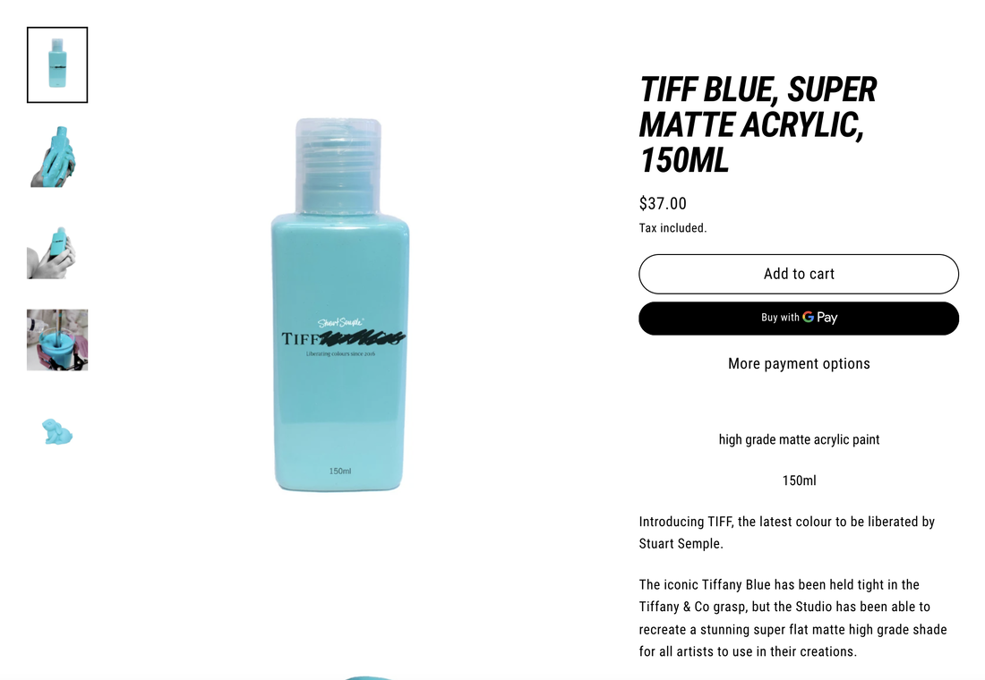
Anti-design is refreshing and in many ways challenges the status quo; like everything it becomes a challenge to remain different. A perspective that is contradictory of mine would be chief of design of Apple Inc said “It’s very easy to be different, but very difficult to be better.”. Even though anti design is different it does project a lot of sameness. To me what Ives is saying is when everyones trying to be different they’re all being different in the same way. Which makes them the same as everyone else that’s trying to be different but in trying to be better, you’re even more different than different which is harder to achieve. Applying this to anti design, in todays society especially amongst millennials it is considered “trendy” to be “different” which is another reason why anti-design has become so prominent. To me it works. I believe anti-design is a successfully used movement throughout the design and reflects today's society. It has a purpose. While modernism purpose was arguably more important, my perspective of anti-design remains. It throws the rule book away, it has something to say, it speaks volumes and it is refreshing. I think it would be naive to think anti-design can be used in all realms of design but more so take it as an influence that elements can be extracted and applied to different areas of design. Design has a purpose to communicate, look decorative, and show emotion towards specific affairs. I recently designed Christmas windows as part of my DPS, I am now reflecting on the design. Perhaps I played it too safe and take elements of anti-design next time? I admire the fact the movement questions taste, ignores the rules and gives people a voice. When continuing my journey on DPS, I will now use elements of anti-design to enhance the visual appearance of my work. In a world where we don't know when we may be stuck inside for months on end again, we should design without rules. John Baldessari's quote, "I will not make any more boring art", has never been more fitting. Sources: Article: https://www.widewalls.ch/magazine/anti-design-italian-movement Article: https://www.selfridges.com/GB/en/features/articles/the-new-order/the-windows-of-the-future/ Youtube video: https://www.youtube.com/watch?v=Bv7a3TcxugQ Image 1: https://www.studiohazeldean.com/matte-magazine/cool-modernism-cutting-edge-furniture-design Image 2: https://blog.prototypr.io/lets-talk-about-anti-design-ea59798e0791 Image 3: Took myself Image 4, 5 and 6: https://www.selfridges.com/GB/en/features/articles/the-new-order/ Ke Yue BA (Hons) Graphic and Media Design Since the global outbreak of epidemics around March 2020, I have been back in China and taking remote courses. For my DPS year I am now working at a small studio for media and space design in Shanghai as a graphic design intern, and even though I haven't been working too long, I have found that for today's market, minimalism has really come to be defined as a symbol of premium and luxury. I am currently working on a project for an exhibition which BURBERRY cooperates with several avant-garde artists. My colleagues are mainly designing the space design and curation, while I am responsible for the VI design of this exhibition. As an intern who joined the project halfway through, I needed to design the logo and layout that could satisfy with as soon as possible. Based on the artists' works provided by the client, I discovered that almost all of the artists I was working with were known for their bold and avant-garde surreal style, and there are also some of electronic and futuristic works. I used this as inspiration to design the logo for the exhibition using pixelated styles and exaggerated colours, and it fitted in well with the design of the space provided by our studio. However, after the presentation with the BURBERRY team few days ago, they didn't like this version of the design and requested to change all the wall to white with black letters. Personally, this kind of change this exhibition from a special one to an ordinary exhibition which I didn't really understand their thoughts. So I wanted to explore the question, does minimalism represent premium? I don't think so. Minimalism is a popular and safe style for design. Nowadays, even some brands which with unique style in the past are starting to come up with minimalist products. Why has this change occurred? Because for a brand, a design that is easily accepted by the public and less prone to mistakes is the perfect design, and minimalism is the perfect style of this, so this trend of minimalism has grown so strong that it has become a stereotype of design. Actually I don't hate the minimalist style, because I know it is what the public likes, but there can't be only minimalist design. But nowadays, this style is really taking over the whole market and is wearing down many designers who use to have their own style and ideas. Like all resistance movements, anti-design symbolises the embrace of freedom and ideals, the breaking down of stereotypes and traditional rules. Design and anti-design are battling but also rely on each other, and when a phenomenon takes over a large part of the market and gradually becomes taken for granted, then anti-design needs to emerge. It adds new blood to the field of design and opens the eyes of the public and designers to more possibilities. I know that Neville Brody, who organised the Anti-Design Festival in London in 2010, said in an interview "The London Design Festival has been going on for 9 years. More broadly, the ADF is a response to 25 years of cultural deep freeze in the UK. hitherto deemed out-of-bounds by a purely commercial criterion" (Neville Brody, 2010) and Stuart Semple, one of the participating artists in ADF, is a very typical artist against rules and injustice for art&design area. He was a persistent and successful resister in the revolution against Anish Kapoor's monopoly on Vantablack and Tiffany's monopoly on Tiffany Blue by inventing a similar colour for all to use. For anti-design I also thought of a strange design style that became popular a few years ago, called the New Ugly, which is popularised by Japanese designer Yui Takada, this style is the exact opposite of minimalism. The sloppy, distorted typefaces, crude images and careless layouts are not to be associated with Japanese design in the usual sense. This graphic designer's works are a break with the existing design paradigm: complete and meticulous. Instead of this taken-for-granted design style, Yui Takada's graphic design is a unique interpretation of Yui Takada's style, with seemingly crowded and cluttered typography, highly saturated colours and exaggeratedly simple graphic designs. But is this style not capable of high-level design? I know of a series of posters for the 10th Beijing Film Festival in China, which designed by Chinese designer Zhizhi Liu and his team, it used the New Ugly style as well. As the festival is also a public and authoritative event, so this design could be considered premium. So for me, anti-design is positive, exited, and inevitable for current design areas, design cannot and will not be uniform, it always need to be different, recognisable and interesting, even if I am not as a designer, as an ordinary person, I'm tired of seeing minimalist brands and advertising everywhere, it's time to break this quiet and boring minimalist world with something different. It's time to break up this quiet and boring minimalist world with something different.
Bec, A., 2021. Neville Brody: The Anti-Design Festival. [online] Itsnicethat.com. Available at: <https://www.itsnicethat.com/articles/2931-neville-brody-the-anti-design-festival/> [Accessed 1 December 2021]. I am Mara, User Experience Design student, which is why I wanted to explore the topic of Anti-Design on the web, primarily. The movement known as Anti-Design first appeared in France in 1966, the movement created designs which were weirdly sized, weirdly colored and weirdly shaped, whose main aim was „to create objects and living quarters that were unique rather than embracing style, mass production, consumerism, sales and greed.“(1) Even thought that movement ended in 1980, it is still more than ever present today. Unfortunately (in my opinion), we still live in the time of mass production of both material and immaterial (by which I mean information overload). Most actions and activities we do are connected to the Internet, so most websites are focused on users and appealing to them, so they can profit from it in various ways; from users paying for products, subscriptions or just being attacked with ads. That need for a simple, easy to navigate and also fast to make website, gave birth to templates. So, similarly to the movement in 1966, Brutalist (Anti-design) websites started emerging, in contrast with the minimalist designs and layouts. Example of an engaging website I most recently came across is Doja Cat's website(2), which lets you code her music video as you watch. It has its limits in terms of users creating their own code, but still it is unique and far more memorable than most other music videos or websites. 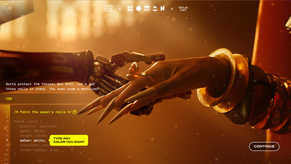 Doja Cat website/music video Somewhat interesting, most businesses want to surprise people and achieve that effect of being memorable, but are uncomfortable having a brutalist style website. At the start of this year, while trying to find a job, I came across many companies looking for a UX designer, wanting them to create a „great“, easy to navigate and to understand website for their users (it was easy to see they didn't want a creative employee). As finding a first job is pretty hard, I decided to apply to some of those positions, even though they weren't as appealing to me. When I sent my portfolio to apply for a UX position in a company I won't name right now, they replied with: “ Thank you for sending over your portfolio. Great works! Love it personally. But as you say, very creative and therefore quite far away from what we do here right now professionally. I am a bit worried that your style is too creative for us right now / our current „branding“ is too far from being creative.“ I didn't take that job, obviously and ended up working at a far more creative place, but what surprised me is some people think design can be too creative and therefore lack professionalism. Moreover, I don't like creating minimalist, simple web content because you wouldn't be able to tell the difference from it and a layout with which you can create a website in only a few minutes. I like brutalist design and had my attempt to create it for my portfolio and for my studies. While making the websites, I was surprised how hard I found it to make a good brutalist website, even though it has no rules. That is when I realised, to be able to make a brutalist website you should know classic, minimalist web design, something like: „know the rules so you can break them effectively“ (Dalai Lama XIV), for example many artists first learnt to paint realistic to later be able to paint abstract, like Pablo Picasso or Oton Gliha (famous Croatian painter).  Picasso (first and last self-portrait) Interesting online gallery featuring all kinds of brutalist web designs(3), gave me the opportunity to understand what the brutalist design means to other creators. Next to each website link there is a short Q&A with the website owner, one question they were all asked was:“ Why do you have a brutalist website?“, the answers were very interesting, but mostly varied from either wanting to be able to create a unique, self expression website or on the contrary, create a website which had bigger clarity and focus on the content rather than the layout. I guess the magic in brutalist websites is uniqueness and freedom of both users to explore and creators to create whatever they want, as one person said they created a brutalist website because they like large buttons. Bibliography: http://www.arthistoryarchive.com/arthistory/antidesign/ (1) https://dojacode.com/ (2) https://brutalistwebsites.com/ (3) https://www.youtube.com/watch?v=s1CLA2MgvrA Megan Cox, IVM real | imaginary Real = existent, factual or authentic. Imaginary = fictional, pretend or fabricated. As an illustrator, animator and visual storyteller, I believe that narratives, being stories and the way in which they are told, are the most influential part of design. Whilst contemporary storytelling as a design, is the worldwide sharing of new knowledge, ideas and perspectives, I believe a good design should make a positive impact on communities or individuals. Although what is considered a ‘good’ story is subjective, we can compare how positive change results from the design of real and imaginary stories, communicated through advertisement, social media and illustrated narratives. I find charities display the greatest willingness to create positive change. ‘WaterAid’ has strongly expressed their targeted issue and goals facing lack of access to the basic human rights of sanitation and clean water, through advertisements including ‘No Choice’ and ‘The Girl Who Built A Rocket’
The ‘No Choice’ ad greatly impacts the audience by showcasing the daily struggles of the community, the deliberate inclusion of the people’s names and the urgency in their slogan. The intention of these factors are to build sympathy from the audience. However, the method storytelling through ‘guilt-tripping’ is considered an unappealing design, especially in western countries, where it has becoming normal to believe that the realities of these adverts are exaggerated or staged and people will therefore dismiss the truth of problem and forget the original purpose of the advert. Furthermore, I think ‘The Girl Who Built A Rocket’ presents a mixed reality. Animation is a form, or anti-design, in itself that requires the fabrication of characters, setting and style, yet it still succeeds in conserving the original purpose of inspiring positive change. By highlighting the campaign in a positive way, it encourages audiences to get involved and allows them to empathise rather than sympathise with the character. I feel although the creative ownership of the animation is choosing to hide much of the real suffering that takes place, this imaginary narrative would more likely encourage a western audience into wanting to make a positive difference. education | entertainment “Good design is honest.” – Dieter Rams “Good design motivates.” – Otl Aicher Aicher’s quote intentionally distinguishes the idea that good design should motivate rather than inspire. Relating this to storytelling, we can understand that the best narratives should provoke action over thoughts alone. In correlation with Rams’ quote, I think real stories are more likely to do this, because people will strongly empathise with honest experiences faced by those living in their same reality. Social media is a space that holds constant conflict of what is real and imaginary, or in other words, honest and fake. The article, ‘Welcome to the TikTok Economy’ in Fortune Magazine, describes TikTok as ‘something radically different’, because the platform and the type of content shared within this space, can be viewed as a design system that opposes the negative effects of social media. Instead of feeding the cycle of false self-expression leading to and from perceptions of social standards, the article emphasises that TikTok is a space for anyone to be their authentic selves and not be ashamed or judged but rather feel like they are part of a worldwide community of diversity and acceptance. The ability TikTok users have by taking part in trending content and ownership of sharing their own stories, doesn’t require one to go against the crowd, as anti-design and most social platforms employ, but instead celebrates authenticity and brings about more positive mental wellbeing. Furthermore, trending content is also greatly affected by stories from entertainment industry. For example, the recent fictional TV series, ‘Squid Game’, became a worldwide phenomenon, influencing fashion, games and the growing viewers of Asian media. However, I think that although there is importance in popular culture and entertainment, the widely shared news of the murder of George Floyd has set off a much bigger positive impact of the BLM movement. When faced with the question of what is more important, there is no doubt that the sad but true story Floyd’s murder has resulted in necessary ongoing activism towards positive social change for underrepresented communities.
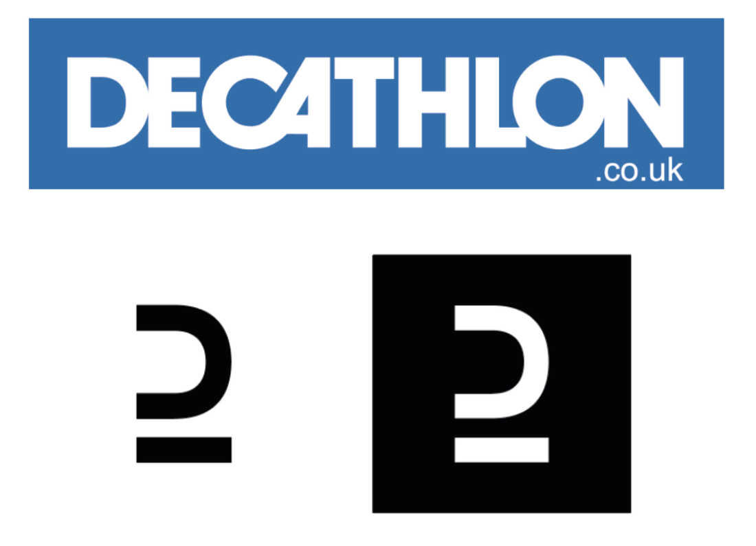
Overall, the line between what is real and imaginary is exactly where most narratives sit; our reality is sometimes falsely expressed or not exposed in its entirety and imaginary spaces will always reflect parts of the real world. The creativity and scope of imaginary worlds can engage and motivate us in ways the predictability of the real world expressed in visual media most often cannot, offering greater chance for growth and mitigation of future scenarios. However, in the present, I think that honest stories have immense power to activate positive change that will last, both within individuals and communities across the world. Baumartner, J. (No date) Imagination Is the Root of Innovation. Available at: https://www.creativejeffrey.com/creative/imagination_innovation.php?topic=creativity Domingo, M. G. (2020) Dieter Rams: 10 Timeless Commandments for Good Design. Available at: https://www.interaction-design.org/literature/article/dieter-rams-10-timeless-commandments-for-good-design Dunne, A. And Raby, F. (2013) Speculative Everything: Design, Fiction and Social Dreaming. Cambridge, MA: The MIT Press. Hawkins, Alex. (2021) What’s Driving Squid Game’s Success?. Available at: https://www.stylus.com/whats-driving-squid-games-success O’Brien, J. M. (2021) ‘Welcome to the TikTok Economy’, Fortune, (October). Scrypto (2017) WaterAid Promotion | Donate Now! No Choice TV advert. 14 August. Available at: https://www.youtube.com/watch?v=xdJeCefyGMY Studio Guerassio. (No date) Inspiration vs. Motivation. Available at: https://www.studioguerassio.com/inspiration-vs-motivation/ WaterAid (2021) The Girl Who Built A Rocket. 8 February. Available at: https://www.youtube.com/watch?v=lmBp2-t38Mw Ariel Tong, BA Graphic and Media Design, Graphic and Internal Communication Designer at Decathlon Anti-Design can be seen as a growing trend over the past few months. To understand more, I will be talking about where anti-design stems from and how our society is influenced by it and how it is reflected by our drive for it. Decathlon’s branding will be my case study of the post and will show the influences that the design industry has over their branding and visuals.
Art and design have always been a reflection of society. The futuristic style emerges in the early 20th century, most works conveys and portrays an importance of speed, energy and movement. It reflected the introduction of industrial machinery to the world. When the art movement DADA was coming up it was based on World War 1 and the rejection of a capitalist society. Anti-design is an uprising trend popular among many younger designers. It is a way for designers to revolt and create some change from the consequences of COVID-19. Anti-design is a balance between the rules and experimentation of design. It’s seen as “anti” now because it is different from what we are used to. The key aspect of anti-design is the drive from young designers. These are the new batch of designers coming into the professional industry. Anti-design appeals to the younger audience and is the main contrast between the current and future set of designers. The current designers of the industry are looking to implement a minimalist style. This can be seen with the change of logos and branding and much in the creative and corporate world.
Design is constantly changing in synchronisation with society. The simple design we know today will become an image of the past soon and the emerging young designers will be brought up to create change and make a difference. I believe anti-design will become a constant style in the future, but what the style itself is, is hard to define. Anti-design can be seen as a cycle within the design industry, with the future batches of designers always wanting to make a difference to the past trend/style. Seeing how the future designers take on their perspective to the industry will be an enticing journey. This journey is important as it pushes, expands and further explores the boundaries of design. References:
Decathlon.design. 2021. Decathlon Design System. [online] Available at: <https://www.decathlon.design/726f8c765/p/71b8e3-decathlon-design-system> [Accessed 3 December 2021]. Graphics, S., 2021. Will ‘ANTI DESIGN’ Takeover The Graphic Design World!?. [image] Available at: <https://www.youtube.com/watch?v=Bv7a3TcxugQ&ab_channel=SatoriGraphics> [Accessed 3 December 2021]. Jamieson, R., 2021. The New Wave of Anti-design Magazines Will Question Your Sense of Taste—and That’s a Good Thing. [online] Eye on Design. Available at: <https://eyeondesign.aiga.org/the-new-wave-of-anti-design-magazines-will-question-your-sense-of-taste-and-thats-a-good-thing/> [Accessed 3 December 2021]. Johnson, M., 2021. Coping with irrelevance | Johnson Banks. [online] Johnsonbanks.co.uk. Available at: <https://www.johnsonbanks.co.uk/thoughts/coping-with-irrelevance> [Accessed 3 December 2021]. Medium. 2021. Less Is More, or How Minimalism Changed Graphic Design. [online] Available at: <https://medium.com/@AprilHQ/less-is-more-or-how-minimalism-changed-graphic-design-b079a6bbb107> [Accessed 3 December 2021]. |
AuthorWrite something about yourself. No need to be fancy, just an overview. Archives
March 2022
Categories |


 RSS Feed
