|
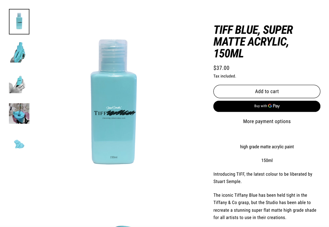
Ke Yue BA (Hons) Graphic and Media Design Since the global outbreak of epidemics around March 2020, I have been back in China and taking remote courses. For my DPS year I am now working at a small studio for media and space design in Shanghai as a graphic design intern, and even though I haven't been working too long, I have found that for today's market, minimalism has really come to be defined as a symbol of premium and luxury. I am currently working on a project for an exhibition which BURBERRY cooperates with several avant-garde artists. My colleagues are mainly designing the space design and curation, while I am responsible for the VI design of this exhibition. As an intern who joined the project halfway through, I needed to design the logo and layout that could satisfy with as soon as possible. Based on the artists' works provided by the client, I discovered that almost all of the artists I was working with were known for their bold and avant-garde surreal style, and there are also some of electronic and futuristic works. I used this as inspiration to design the logo for the exhibition using pixelated styles and exaggerated colours, and it fitted in well with the design of the space provided by our studio. However, after the presentation with the BURBERRY team few days ago, they didn't like this version of the design and requested to change all the wall to white with black letters. Personally, this kind of change this exhibition from a special one to an ordinary exhibition which I didn't really understand their thoughts. So I wanted to explore the question, does minimalism represent premium? I don't think so. Minimalism is a popular and safe style for design. Nowadays, even some brands which with unique style in the past are starting to come up with minimalist products. Why has this change occurred? Because for a brand, a design that is easily accepted by the public and less prone to mistakes is the perfect design, and minimalism is the perfect style of this, so this trend of minimalism has grown so strong that it has become a stereotype of design. Actually I don't hate the minimalist style, because I know it is what the public likes, but there can't be only minimalist design. But nowadays, this style is really taking over the whole market and is wearing down many designers who use to have their own style and ideas. Like all resistance movements, anti-design symbolises the embrace of freedom and ideals, the breaking down of stereotypes and traditional rules. Design and anti-design are battling but also rely on each other, and when a phenomenon takes over a large part of the market and gradually becomes taken for granted, then anti-design needs to emerge. It adds new blood to the field of design and opens the eyes of the public and designers to more possibilities. I know that Neville Brody, who organised the Anti-Design Festival in London in 2010, said in an interview "The London Design Festival has been going on for 9 years. More broadly, the ADF is a response to 25 years of cultural deep freeze in the UK. hitherto deemed out-of-bounds by a purely commercial criterion" (Neville Brody, 2010) and Stuart Semple, one of the participating artists in ADF, is a very typical artist against rules and injustice for art&design area. He was a persistent and successful resister in the revolution against Anish Kapoor's monopoly on Vantablack and Tiffany's monopoly on Tiffany Blue by inventing a similar colour for all to use. For anti-design I also thought of a strange design style that became popular a few years ago, called the New Ugly, which is popularised by Japanese designer Yui Takada, this style is the exact opposite of minimalism. The sloppy, distorted typefaces, crude images and careless layouts are not to be associated with Japanese design in the usual sense. This graphic designer's works are a break with the existing design paradigm: complete and meticulous. Instead of this taken-for-granted design style, Yui Takada's graphic design is a unique interpretation of Yui Takada's style, with seemingly crowded and cluttered typography, highly saturated colours and exaggeratedly simple graphic designs. But is this style not capable of high-level design? I know of a series of posters for the 10th Beijing Film Festival in China, which designed by Chinese designer Zhizhi Liu and his team, it used the New Ugly style as well. As the festival is also a public and authoritative event, so this design could be considered premium. So for me, anti-design is positive, exited, and inevitable for current design areas, design cannot and will not be uniform, it always need to be different, recognisable and interesting, even if I am not as a designer, as an ordinary person, I'm tired of seeing minimalist brands and advertising everywhere, it's time to break this quiet and boring minimalist world with something different. It's time to break up this quiet and boring minimalist world with something different.
Bec, A., 2021. Neville Brody: The Anti-Design Festival. [online] Itsnicethat.com. Available at: <https://www.itsnicethat.com/articles/2931-neville-brody-the-anti-design-festival/> [Accessed 1 December 2021].
1 Comment
Robert Urquhart
1/7/2022 12:08:58 pm
Wow -working on a project for an exhibition which BURBERRY that cooperates with several avant-garde artists sounds exciting - you have an interesting take here - luxury defining itself through 'anti' culture is an interesting take - thanks for sharing this, it's great to be able to put into context professional practice - will really help your future career - excellent! Leave a Reply. |
AuthorWrite something about yourself. No need to be fancy, just an overview. Archives
March 2022
Categories |


 RSS Feed
