|
I am Mara, User Experience Design student, which is why I wanted to explore the topic of Anti-Design on the web, primarily. The movement known as Anti-Design first appeared in France in 1966, the movement created designs which were weirdly sized, weirdly colored and weirdly shaped, whose main aim was „to create objects and living quarters that were unique rather than embracing style, mass production, consumerism, sales and greed.“(1) Even thought that movement ended in 1980, it is still more than ever present today. Unfortunately (in my opinion), we still live in the time of mass production of both material and immaterial (by which I mean information overload). Most actions and activities we do are connected to the Internet, so most websites are focused on users and appealing to them, so they can profit from it in various ways; from users paying for products, subscriptions or just being attacked with ads. That need for a simple, easy to navigate and also fast to make website, gave birth to templates. So, similarly to the movement in 1966, Brutalist (Anti-design) websites started emerging, in contrast with the minimalist designs and layouts. Example of an engaging website I most recently came across is Doja Cat's website(2), which lets you code her music video as you watch. It has its limits in terms of users creating their own code, but still it is unique and far more memorable than most other music videos or websites. 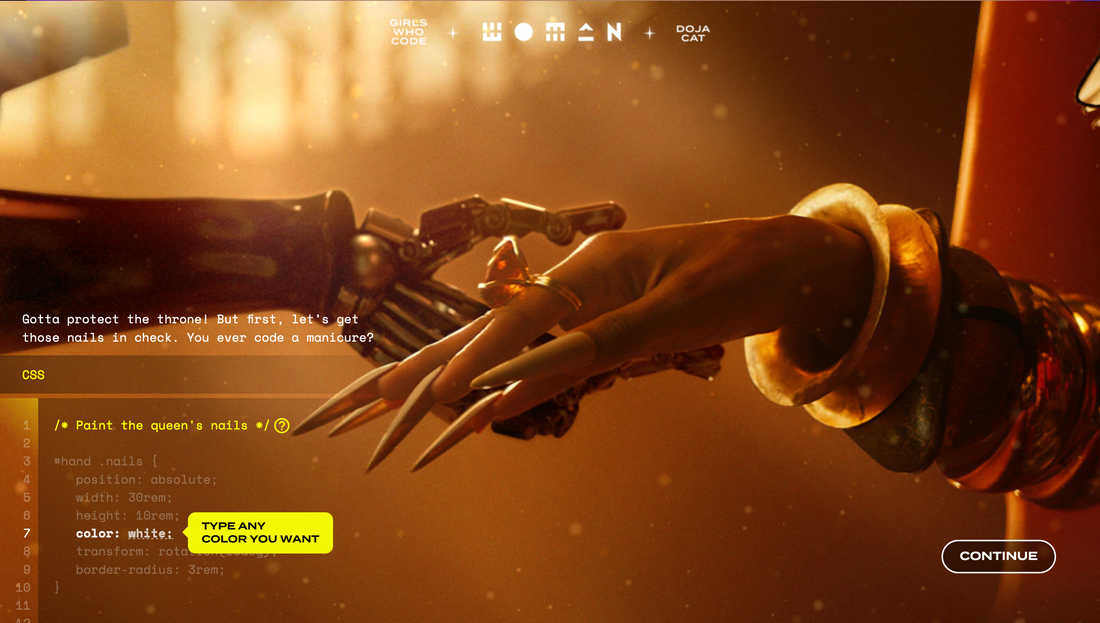 Doja Cat website/music video Somewhat interesting, most businesses want to surprise people and achieve that effect of being memorable, but are uncomfortable having a brutalist style website. At the start of this year, while trying to find a job, I came across many companies looking for a UX designer, wanting them to create a „great“, easy to navigate and to understand website for their users (it was easy to see they didn't want a creative employee). As finding a first job is pretty hard, I decided to apply to some of those positions, even though they weren't as appealing to me. When I sent my portfolio to apply for a UX position in a company I won't name right now, they replied with: “ Thank you for sending over your portfolio. Great works! Love it personally. But as you say, very creative and therefore quite far away from what we do here right now professionally. I am a bit worried that your style is too creative for us right now / our current „branding“ is too far from being creative.“ I didn't take that job, obviously and ended up working at a far more creative place, but what surprised me is some people think design can be too creative and therefore lack professionalism. Moreover, I don't like creating minimalist, simple web content because you wouldn't be able to tell the difference from it and a layout with which you can create a website in only a few minutes. I like brutalist design and had my attempt to create it for my portfolio and for my studies. While making the websites, I was surprised how hard I found it to make a good brutalist website, even though it has no rules. That is when I realised, to be able to make a brutalist website you should know classic, minimalist web design, something like: „know the rules so you can break them effectively“ (Dalai Lama XIV), for example many artists first learnt to paint realistic to later be able to paint abstract, like Pablo Picasso or Oton Gliha (famous Croatian painter).  Picasso (first and last self-portrait) Interesting online gallery featuring all kinds of brutalist web designs(3), gave me the opportunity to understand what the brutalist design means to other creators. Next to each website link there is a short Q&A with the website owner, one question they were all asked was:“ Why do you have a brutalist website?“, the answers were very interesting, but mostly varied from either wanting to be able to create a unique, self expression website or on the contrary, create a website which had bigger clarity and focus on the content rather than the layout. I guess the magic in brutalist websites is uniqueness and freedom of both users to explore and creators to create whatever they want, as one person said they created a brutalist website because they like large buttons. Bibliography: http://www.arthistoryarchive.com/arthistory/antidesign/ (1) https://dojacode.com/ (2) https://brutalistwebsites.com/ (3) https://www.youtube.com/watch?v=s1CLA2MgvrA
1 Comment
Robert Urquhart
1/7/2022 12:13:40 pm
Sounds like you had a narrow escape with an uncreative place - thanks for sharing your experience and great to see an interesting link between your view of creativity and anti-design, being able to write and provide context is a great asset! Leave a Reply. |
AuthorWrite something about yourself. No need to be fancy, just an overview. Archives
March 2022
Categories |
 RSS Feed
