 My name is Annika Hueffer and I study Design for Art Direction at LCC. Art Direction includes a broad spectrum of different art fields that can be explored in collaboration with various artists. I focus on Photography, Graphic Design, and Video making which gives me a good “in”, to the social media world of today. Since starting at LCC and doing DPS, I found my perception of Design changing in many ways. Going into my course I did not have any prior technical skills and thought that made me less of a professional artist. But since developing as an artist throughout these 2.5 years I have realized there is no definition of good or bad in art. So what I created before starting with DPS was following the principle of Anti-Design more than Design itself. In some ways it made me feel liberated even though there were certain constrictions from assignments and deadlines, I was able to experiment a lot and not follow certain guidelines for my work. Since starting DPS I quickly learned that in a professional environment, there can be much less space for this “rule-breaking” of Design principles. Therefore I am questioning Design for the real world vs. a “fantasy” world through the lens of Design/Anti-design, positioning myself towards the Anti-Design realm. While listening to Daniel Kalick’s presentation at the AIGA design conference in 2017 I could look at the beginnings of why Anti-Design even exists (Kalick, 2018). And one of the points he made was about how designers get bored of design rules and the younger generation tries to rebel against those, and create “shocking” visuals without coherent color palettes or using illegible typography. He also discussed that with the increase in the availability of design software, anyone can design. I believe that since the pandemic and other recent events struck, there are people that are simply angry with the world and the change in society or within the country they live in. And I can very much understand and relate to that over these past years. Also being stuck at home for a long time has let artists come up with creative and innovative ideas digitally and through design, without any rules. Sharing their knowledge through social media platforms like short videos on TikTok made it more accessible for non-professional artists to rise. And since Art has always in some ways been a reflection of society, it is clear that since 2019 there has been an increase in the Anti-Design discussion. Looking at design for the real world vs a fantasy world can very much be applied to the pandemic because life didn't feel real and everything was put on pause. Thus the rule-following of design principles, at least for me, seemed less relevant. The satirical women's magazine ‘Mushpit’ is an example of this counter-design approach where Charlotte Roberts and Bertie Brandes parody the industry and provide an alternative and honest voice for young women (Jamieson, 2016). So relating this to art revolting against societal issues, they went against the design rules of fashion magazines to make them more humorous and memorable.
“Anti-Design Trades Simplicity for Complexity” (Glover, 2022) In my practice in the professional industry, I have seen the need for guidelines in Design and how there are specific business needs for it. It communicates on a human-centered level and its purpose is to be fast, frictionless, and easy. So, in the discussion of design for the real world vs a fantasy world it is clear that both need to exist. The “real” world can be seen as the commercialized and taught way of interacting with design whereas the fantasy world can be whatever it wants to be, making its main focus complexity instead of simplicity. Concluding my argument that Anti-Design is what is more dominant and communicates in the “fantasy” world, which in my opinion is necessary for innovations in the real world, I also see that design with guidelines is also just as necessary. Thus both cooperate in the learning of new and existing artists to challenge design which continues the evolution of design principles. References Jamieson, R. (2016) The new wave of anti-design magazines will question your sense of taste-and that's a good thing, Eye on Design. Available at: https://eyeondesign.aiga.org/the-new-wave-of-anti-design-magazines-will-question-your-sense-of-taste-and-thats-a-good-thing/ Kalick, D. (2018) User experience | the rise of anti-design, YouTube. AIGAdesign. Available at: https://www.youtube.com/watch?v=s1CLA2MgvrA&t=1072s Glover, E. (2022) Anti-design is intentionally loud and messy, Built In. Available at: https://builtin.com/design-ux/anti-design
0 Comments
Holly Ford-Hunt Graphic & Media Design Revolution: The design and anti-design discourse is something that is altered with the ever-changing world. The pandemic acted as a catalyst for the way society perceives and how designers design. The anti-design discourse is about exploring alternate approaches and creating discussion where organisations speak louder than ever before. Proposition: The governments ‘look them in the eyes’ campaign used design to communicate the importance of staying safe during Covid-19. By photographing patients, it was thought that more people would listen. These posters promoted Stuart Hall’s representation theory; by constructing ideologies viewers had perspective of negative positions hence the posters being a success in making people wear masks.  Figure 1 (NHS Posters: UK government: ad has a shift in tone from its previous communications) (Magee, 2021) Despite the success of the posters, once the world got back to normal the Government rapidly chose anti-design but not in the sense we’re talking about. They released a poster dedicated to the idea of ‘Rethink. Reskill. Reboot.’ This poster was immediately plastered over social media.  Figure 2 (Government Rethink. Reskill. Reboot. Campaign edit & Responses from public to campaign) (Cookson) (Birks, 2020) Design is everywhere. This poster would have been designed by someone who has a job in design, the image was photographed by a photographer, the layout was formed by a graphic designer, the list is endless. A simple campaign of which the Government thought would get great response was then scrapped. The communication was non-existent in the formation of this poster but communication in response was colossal and formed change. Identification: Social realism is about using art to highlight political and social issues. An artist whom reacts to this well is Banksy. The artist creates a form of anti-design in the form of graffiti work in order to say something in response to problems and to get people talking. It could be said that Banksy took to the topic of anti-design on a personal level; altering the way they worked during Covid. We weren’t allowed out so the artist showcased pages from a sketchbook instead of usual work. However, I had to search for this piece of his work so that questions whether a change in design is always right when what was done before was so successful… Figure 3 (Banksy – London Underground Undergoes Deep Clean) (telegraphtv, 2020) In July 2020, the artist took to London underground. This was a first piece on public transport which proves consideration of alternate techniques to create impressions. A video of this work ‘if you don’t mask you don’t get’ (figure 3) is a contribution to the desperate need to wear a face mask. The use of the final statement in the video ‘I get Lockdown, but I get up again’ with song changed the emotion to those viewing making it more light-hearted. The choice of substance to create the design being cleaning fluid was extremely impactful of time, one of things I remember most about Covid is cleaning constantly. This craft is particularly clever as it suggests this idea of nostalgia and moving past time. By using design, Banksy did more than just tell, they showed and dedicated themselves to this project. Promotion: The establishment of credibility for a business is one of the most important factors and should that decrease, a great drop in sales would result. It is said that ‘any publicity is good publicity’, during the pandemic Corona beer saw a decrease due to conspiracy stories linking between the virus and drink. Once this was being gossiped and then proven incorrect this news was being shown everywhere from television to socials; so although it was linked with a negativity, the brand was being viewed much more than usual.  Figure 4 (Corona beer in plentiful supply, Marc Duffy) (Richardson, 2020) This anti-design form of advertising, from my perspective, had a great response. When people were allowed to gather again, people had Corona parties where the drink was at the centre of the table, this wouldn’t have been the ‘case’ (pun intended) pre-pandemic. As well as being humorous, the brands name was at the forefront of consumer’s minds whether they wanted the drink or talking about the virus, the term Corona was used by everyone. Solution: Communication is a topic I believe is taken for granted. Design is a form of expression and by expressing in different forms a different approach is created; we have to move alongside this ever-changing world and whether that is admired or disrupted remember, Art is subjective. Bibliography
Bakare, L. (2020) Government scraps ballet dancer reskilling ad criticised as 'crass', The Guardian. Guardian News and Media. Available at: https://www.theguardian.com/politics/2020/oct/12/ballet-dancer-could-reskill-with-job-in-cyber-security-suggests-uk-government-ad (Accessed: January 12, 2023). Banksy sprays coronavirus-inspired artwork on to London tube (2020) YouTube. YouTube. Available at: https://www.youtube.com/watch?v=5YrQbM5lMHU (Accessed: January 13, 2023). Birks, G. (2020) “Rethink. Reskill. Reboot.” Available at: https://twitter.com/GregBirks/status/1315623955991080961?ref_src=twsrc%5Etfw%7Ctwcamp%5Etweetembed%7Ctwterm%5E1315651327352090624%7Ctwgr%5E65d18693471bb5e6c6711961ed746cfc669093d0%7Ctwcon%5Es2_&ref_url=https%3A%2F%2Fwww.thenational.scot%2Fnews%2F18791537.tory-chiefs-torn-apart-twitter-mocks-fatima-retraining-campaign%2F (Accessed: January 12, 2023). “Cases in England” (2023). Available at: https://coronavirus.data.gov.uk/details/cases?areaType=nation&areaName=England (Accessed: January 12, 2023). Cookson, G. (no date) Fatima, Cyber, and the Graphic Designer: Loving Useless Art. Grant, K. (2020) Corona beer sales soared by 40% in 2020 despite Covid Association, inews.co.uk. Available at: https://inews.co.uk/news/consumer/corona-beer-sales-soared-2020-covid-association-supermarket-sales-latest-799853 (Accessed: January 13, 2023). Magee, K. (2021) Will the government’s new emotive covid AD make people obey the rules?, Campaign Live. Available at: https://www.campaignlive.co.uk/article/will-governments-new-emotive-covid-ad-people-obey-rules/1705634 (Accessed: January 12, 2023). Richardson, H. (2020) The foods no one wants in lockdown, from sprouts to Corona Beer, Daily Mail Online. Available at: https://www.dailymail.co.uk/femail/article-8159689/The-foods-NO-ONE-wants-lockdown-sprouts-Corona-beer.html (Accessed: January 13, 2023). By Maria João Magalhães As a Graphic and Media Design student, the first thing that I was taught was the principles of design theory. Hierarchy, color and white space, balance, contrast and repetition (I risk saying these are the basic principles of graphic design). The obvious would be if you follow these rules at risk you can become a great designer, right? Not so easy. “Learn the rules like a pro, so you can break them like an artist.” words from the master Picasso, and it’s basically it. Although, we are taught the rules, we are always encouraged to break them in order to find our own style. My working method as a graphic designer is very sensorial and experimental, I particularly like to get out of my comfort zone and explore the most unlikely techniques, sometimes breaking the rules. Therefore, I see anti-design as a vast space of possibilities and creative opportunities. First, Anti Design is a movement similar to post-modernism that began in the 1960s as a reaction to modernism’s long puritanical reign. Anti design rejected the righteous values of modernism and expressed growing social dissatisfaction through irony. This term often emphasizes the chaotic and the random, to create something unexpected or confrontational. It can also be used to push formal boundaries and challenge accepted norms. To capture a more modern look of the movement, we can have a look at the studio Solid Dogma work for Iminente festival. Solid Dogma is a creative unit aimed at activating brand and cultural power through art. Solid Dogma overcomes media boundaries and focuses on consumer and social value by creating seamless communication projects and powerful branding tools. The Iminente festival emerged in 2016 and since then brings together emerging and renowned artists with varied backgrounds, it is a union of cultures, languages and styles, condensed into a unique and intense collective intimacy experience. Supported by core values such as diversity, inclusivity, equality and visibility, it is a celebration of creativity. The festival graphics, every year created by Solid Dogma, are renowned for its bold visuals, using strong and striking typography, bright colors and the avoidance of conventional grids. Even though we see this style as probably a trend now, the history of the Anti-design movement goes back to the 1960s. Grapus [ \gra-´pUEs] is a French graphic design collective founded in Paris immediately following the student protests of May 1968. The group saw life as a field for experimentation, putting the new political, social, and cultural debates into graphic form for public discussion. This collective first work was a graphic response to a political movement, where they used their artistic practice to show where they stand and their beliefs. They were very notorious as their work broke the rules and the modernist vision. They appealed to images, bold colors, collages and irony to break the standards of design and be disruptive.  Grapus Collective Poster  Grapus Collective Poster 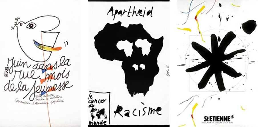 Grapus Collective Poster  Grapus Collective Poster With these two examples, we can see that Anti-design is a cyclical trend. Just as in fashion there are clothing trends that come and go, in design it is the same. In this way, most trends appear with a purpose, as a response to something, be it a political or creative need. With the Corona virus pandemic, our society has been presented with a totally new and uncertain reality. We have changed our perspective on many subjects and found importance in things that were previously indifferent to us. It was an important moment of experimentation and a shift in creativity. After so much time locked away and banned from the world, there was a need to step outside the box and follow new paths and take risks. It was the opportunity to, as in the 1960s artist freely express themselves and be different.
For many, Anti Design may be seen as wrong or even ugly, however in my opinion it is a free space for creativity and sensory experiences. I like to think that my favorite design trend is Anti Design and that some of my works can be integrated in this category. "We have forgotten why we are here. We have lost touch with what makes us tick, what drives us." words of Neville Brody. Although it is quite comfortable to stay in our safe zone and not take risks, I always try to go further in my projects and challenge myself. By risking we learn, with the mistakes or successes. However, a question that puzzles me is, "if anti design is a movement of reaction to the previous style, will the movement that comes after AD be itself considered Anti design too? Is this a vicious circle? Bibliography https://www.soliddogma.com/ https://www.iminente.org/pt/festival/ https://fkwartin.medium.com/anti-design-what-why-698bff0d4c9d https://www.northeastshop.com/products/what-you-dont-know-grapus https://www.itsnicethat.com/articles/2931-neville-brody-the-anti-design-festival/ By Eloisa Godfray I studying User Experience Design BA and am currently interning in UI Design at PUMA in Germany. It is through these environmental factors that I have developed a greater focus on user-centred design. From this perspective lens, I have evaluated the concept of “Anti-Design”. “Anti-designer”, according to Johnny Levanier it is defined as someone who creates a “digital design that rejects convention and traditional aesthetics in favour of challenging, innovative layouts”(Johnny Levanier, 26 /03/22). From this definition alone, I do not think that anti-design is inherently negative. As a UX/UI designer, the empathises is really on whether these innovative designs are still user-centred design. As long as the priority is on the users and how they interact with the design, then I would refer to these designers as experimentalists, not anti-designers. This is because design is an agile process, so, therefore, we need experimentalists to trial and test new designs. If the new design proves to be effective when A/B user testing, then it would be defined as innovation which is needed in an ever-developing industry. Particularly during the pandemic as we became ever-reliant on technology. However, when designing for different users, there are different limitations. For instance, Kate Moran refers to anti-design within design portfolios as anti-design (Kate Moran, 2017). We are able to be more experimental and, in turn, break industry standards within design portfolios because people within the design industry have a greater understanding of technology and the design industry. To stand out, it is beneficial to be experimental with your designs; however when doing this, we are still considering our users and their knowledge. Though as there is not a strict definition, this allows interpretation Johnny Levanier also defines anti design as wanting to create “experiences, meaningful interactions, mystery, the unexpected. When users think back on their most vivid memories, “simple” is the last word they’d use to describe them.”(Johnny Levanier, 26 /03/22). Similarly, I again would question if these designs have been created with users in mind and how much weighting was given to the personas in the design process. Design isn't always about creating a memorable experience sometimes, it is about being predictable and as a result some would perceive as boring. When designing the UX/UI at PUMA our overarching aim is to create a website or app that is easy for the user to navigate around and make purchases. Therefore, the purpose isn’t to be a memorable experience when navigating through the purchasing process; instead, we base our design on what scores highly when user testing factors such as checkout time or an average number of items purchased. The memorable experience is what you have with the product you purchase. Johnny Levanier has referenced some examples of “anti-design”. Unless the design is anti-user, I fully support the movement's strive to be innovative. For instance, Utrecht’s website (ユトレヒト / Utrecht, no date) has been referenced as anti-design, although I would instead define this as anti-user. Having all the text on the website in red is not innovative or meaningful because it is not an inclusive design. When designing for the web, you must consider accessibility as a top priority, one of the most important industry standards is to meet industry minimum contrast. Red text on a pure white background is low contrast that strains the users eyes over time. Why would you design a website that is not accessible unless you aim to create a hostile environment.  Fig 1 Screenshot of Utrecht Website (ユトレヒト / Utrecht, no date)
Therefore, depending on your definition of anti-design, it can either be innovative if user-centred or a failure if anti-user. This is supported by the quote, “One still needs a serious understanding of design concepts and principles to pull off a good piece of anti-design artwork. Or it will just end up a ghastly mess.”(Kavita Khode, 2022) Bibliography Johnny Levanier (26 /03/22) ‘Anti-design: the anti-rule book redefining digital design’. Available at: https://en.99designs.pt/blog/design-history-movements/anti-design/ (Accessed: 6 January 2023). Kate Moran (2017) Brutalism and Antidesign, Nielsen Norman Group. Available at: https://www.nngroup.com/articles/brutalism-antidesign/ (Accessed: 26 January 2023). Kavita Khode (2022) Everything to know about the anti-design movement, 9Works. Available at: https://www.9works.co/blog/everything-to-know-about-the-anti-design-movement (Accessed: 26 January 2023). ユトレヒト / Utrecht (no date) Utrecht. Available at: https://utrecht.jp/ (Accessed: 26 January 2023). Since the pandemic struck in 2019, there has been growing evidence of critical writing on the subject of “anti-design”. With reference to your own experience and three sources, what is your perspective on the Design/Anti-design discourse? Shenyue Jian BA User Experience Design What is anti-design: “Anti-design is a digital design approach that rejects convention and traditional aesthetics in favor of challenging, innovative layouts.”, anti-design does not meaning produce ugly design but exploring new design styles, creativity and progressive sprite are part of design’s nature. Anti-design seems to be tangible in different contexts. The article: Anti-design: the anti-rule book redefining digital design (Levanier, 2022), mentions the comment design concept for great user experiences is that, the whole experience needs to be continuous, the user can make simple and unconscious decisions without any obstructions. However, anti-design designers think that unconscious, easy experience is not what people want.  Image 1: from Urbane Künste Ruhr In my experience of designing website, yes, there are certain rules and structures, that have been used for years with small amounts of changes or adjustments. For example, most websites using grids, have a menu bar, banner, hero image, about page…. By learning from predecessors’ experiences and wisdom, a flow to build a website has been summed up, with the purpose of efficiently deliver accessible, accurate information, as time goes on, the design could get boring, and maybe one day AI would be able to replace web designers. The article: The New Wave of Anti-design Magazines Will Question Your Sense of Taste—and That’s a Good,(Moran, 2017). Anti-design is a “clean, oh-so-tasteful design”, which got a bit “cliche”. One sentence to express the effect of anti-design is: “In a sea of minimalism and luxury, these doing-it-wrong mags are the ones that stand out.” To be “anti” designers need to know what is “design” first then be able to change it, just like Picasso’s process of from realistic to abstract.  Image 2: from AIGA On other hand, anti-design is full of artistic, but often has accessibility and readability issues, which are the fundamental things that we “traditionally” want to avoid. For example, the image below from Eye Magazine, has inspiring design. But when I see the upside-down “design” as a must-read title appearing in the focal point, I subconsciously feel that this is very complicated information, then want to skip the poster straightaway. Anti-design wants to create an experience that is impressive, involve thinking. But, our end user has been so used to “good design”, any interruption, obstruction during the experience, would cause intense discomfort, which I am not sure if that’s what an-ti design wants to deliver.  Image 3: from Eye Magazine In the article “Brutalism and Antidesign” (Moran, 2017) a quote from uxdesign.cc: “[…] throw elements on the screen, without worrying too much about how they work together. Who are you to define hierarchy anyway? Let each element fight for the spotlight.” The formation and development of UX are all in response to the needs of society and users. The whole thing about UX design are learn from users' psychology, conscious/ unconscious behaviours… so that create fluent, immersive, accessible design for user to complete what they want to do quickly. What anti-design is doing is the complete opposite, no information hierarchy, no accessible colour consideration, no grids…which is brutal. In my opinion, anti-design is not anti-user, the truth of design is to serve. In the path of avoiding traditional style, layouts, rules... As a design style, it's still important to keep it accessible and readable. All in all, it is not about how we designers judge it, but at the very end, the users, the customers would give it a ruthless judgment. Reference List:
Levanier, J. (2022). Anti-design: the anti-rule book redefining digital design. [online] 99designs. Available at: https://99designs.co.uk/blog/design-history-movements/anti-design/ [Accessed 4 Dec. 2022]. Moran, K. (2017). Brutalism and Antidesign. [online] Nielsen Norman Group. Available at: https://www.nngroup.com/articles/brutalism-antidesign/ [Accessed 4 Dec. 2022]. Ridpath, J. (2016). Should we take the Anti Design Festival as seriously as the LDF? [online] Eye Magazine. Available at: https://www.eyemagazine.com/blog/post/up-the-ante [Accessed 4 Dec. 2022]. urbanekuensteruhr.de. (n.d.). Stream - Urbane Künste Ruhr. [online] Available at: https://urbanekuensteruhr.de/de/stream/all [Accessed 4 Dec. 2022]. Since the pandemic struck in 2019, there has been growing evidence of critical writing on the subject of anti-design. With reference to five sources, what is your perspective on the Design/Anti-design discourse? Introduction. The subject to debate in this essay is Anti-Design, given the rise in its recurrence since the burst of the pandemic. When looking into the subject on recent times, such as articles or any other form of informative documents, you come to find the availability of these on the internet and other media forms is scarce; there is a beyond satisfactory amount of Anti-Design content but not in the context the brief suggests. After reading on Anti-Design, I came to realize that it is more a philosophy rather than a movement inherent to a certain discipline or time. In this essay I will expose Anti-Design as a discipline, provide a variety of contemporary examples which I will ponder upon to finally conclude with a solid, personal statement. Anti-Design as a philosophy. Anti-Design emerged as a movement in the Italy of the 60s, and it was a response to the 20th Century’s first five decades design which spoke the modernist philosophy vocabulary. It was the vanguard, the avant-garde in the discipline that aimed to renew the cultural and political role of design. Anti-Design in the 60s was a criticism of consumerism, capitalism and excess. This early stage of Anti-Design was characterised by an acid irony on proportions and the sense of beauty and functionality. Like every philosophy applied to a discipline, if successful, it branches to other fields of study and performance through time, due to an urge for expression, demand or experimentation. Anti-Design in contemporaneity has seen changes from its roots – the changes in society, culture and politics have reshaped the concept through a handful of additions – the philosophy now seeks for transgression, disruption and the audience’s “shock”. In current times Anti-Design performs as in its early stages only the philosophic taints have been pushed into the background. These movements possess a dichotomic nature, the philosophical trait that characterise them is only required for ignition and once it has become a mainstream and well-known to the mass trend, it strips off the deeper meaning and boils down to the basics in the surface; take for instance Grunge in the 90s. Contemporary examples and implications. In the current Zeitgeist Anti-Design is ubiquitous, indeed, the web Anti-Design proposed in the brief is an example of it; ironically, it is more consumed and in demand than ever before. Anti-Design examples, as a philosophy, can be seen in a wide variety of fields. Thereupon I will tackle three cases which belong to different fields and industries, yet they share the same backbone which they spin around on. Balenciaga. I start off my exposure on contemporary examples with the fashion industry, concretely Balenciaga, the renamed haute couture house. The firm was founded by Cristóbal Balenciaga, a Spaniard 20th Century designer worldly known for the fineness, elegance and sophistication of his garments construction. Despite the designer’s death in 1972, the brand went on producing and selling garments, accessories and perfumes up to current days. Disregarding its refined birth, Balenciaga vastly differs from its roots’ essence. Now it produces outrageous, out of shape, disproportioned and provocative pieces that seek for the shock of the audience and uniqueness in the market. Imagery:  Balenciaga Fall 2018, Paris Fashion Week   Balenciaga SS 1967. / Balenciaga SS 2020. In the last image provided above, the drastic contrast between the designer’s vision and the brand’s current confection is blatantly exposed. Design and Anti-Design respectively. Celebrity Magazines. Magazines can be considered both a piece of art and design. When constructing a magazine, a handful of influencing factors come into play: the cover, the paper’s stiffness and texture, the binding, the template and ultimately the construction, all among other aspects that contribute to the final composition as a whole. “Closer” is a celebrity magazine highly popular in the UK. This, as any other celebrity magazine you might find at a kiosk, works as a perfect medium to showcase cultural media idols in between publicity and announcements. These come in thin, oversaturated glossy paper held together by staples. The content spins around public sphere characters and their tensions between one another, or a close-up on the life or details of a given celebrity. Imagery:  Closer, issue 913.   Pleasure Garden Magazine SS 2018. / Closer Magazine January 2018 issue. The two images depicted above, once again, prove the gap between design and Anti-Design. Pleasure Garden is a British Magazine released on monthly issues, gently standing on firm covers which among contain high quality paper printed with beautiful imagery and writing on the cultural meanings and context of the garden. Music. As Plato said: Music is for the soul what gymnastics to the body. Music is beyond an art and form of expression; music ignites soothing, raging, grieving, happiness or melancholy in the depths of the self. Anti-Design is present in this form too. Lately the trend of pre-cooked rhythms, ambiguous and unsubstantial lyrics have experienced an arousal. Reggaeton, extremely present and popular – especially in Spanish-speaking countries – is the best example of it. This genre vastly dissonates from the rhythm and lyricism present in rock, contemporary electronic, flamenco, folk or reggae among many others. Conclusion. Design and Anti-Design, despite pertaining both to the same discipline, each it’s meant for a different use and function. Whilst design and art perform in the sake of beauty, functionality or aesthetics, Anti-Design plays a ludic role. The word “function” falls deep into the silk of contemporary society’s subjectivism. Anti-Design has the function of entertaining and shocking us but differently than how design does – and, from my viewpoint, in a less cultural and artistic enriching way. We, as a society, must be able to differ between enlightenment and leisure, between cognizant and nonchalant, between design and Anti-Design. https://www.creativereview.co.uk/anti-digital-graphic-design/
https://www.nngroup.com/articles/brutalism-antidesign/ https://www.widewalls.ch/magazine/anti-design-italian-movement https://www.statista.com/statistics/321518/women-s-celebrity-weekly-magazines-ranked-by-sales-volume-uk/ https://magculture.com/blogs/journal/pleasure-garden Alongside fellow course mate, Akanksha, I am writing a twenty-twenty-something coming of age short film, chronically a stressful morning of a young woman, where she is forced to confront the trivialities and difficulties of romantic relationships, parental expectations, personal autonomy and general societal connection in the 21st century.
Our research regarding the topic has been generally quite organic. We wanted to keep the story rooted in reality as much as possible as to make it relatable and believable. We carry the belief that cinema can be a form of therapy, as well as a way to confront things we tend to talk about but never think about too deeply. A lot of the “research” of this project has been use sharing personal stories and experiences, and those of our immediate peers. Using these real experiences has helped us with writing dialogue in particular and has made sure that the themes we’ve covered have been relevant to the experience of the character we’re wiring and who she represents. Another form is research has literally just been watching films that cover similar themes or that have inspired the aesthetic of the film. A particularly valuable watch was Shiva Baby, a Mubi release that featured an interview with director/writer Emma Seligman. This film was a good reference for creating the everyday chaos that we wanted to embody in our short film, and Seligman’s insights into modern sexual politics proved to be very inspirational, and on some level changed the direction of the script, opening our eyes to themes adjacent to those we’d already realised, helping us to round out the story much further. At the moment I’m really unsure how this project will influence my future practice. As it is fairly removed from my current practice as a graphic designer, I’m mostly grateful for the opportunity to work on something new and exciting, as I’ve wanted to explore filmmaking for years but always gave into apprehension or complacency. I would like to be involved in filmmaking more in the future, despite it not directly feeding into my practice as a graphic designer, and have already started talks to be involved in the writing and co direction of another friends’ upcoming project. Despite the differences however, there are definitely transferable skills that I recognise between scriptwriting and graphic design. For the story in particular, we’ve really had to analyse human behaviour and try and make sense of it, something that is very important when designing practically anything, as everything we design is made to be interacted with by other humans, so having a decent sociological knowledge is important. I think have a strong level of literacy is important as a designer also, and that’s something that I have had the chance to practice here, particularly in a narrative sense. Also, on a more personal basis, it has been an interesting experience to navigate my own thoughts and feelings in this script, despite me baring little resemblance to the lead herself, parts of the script are definitely shaped by my own experiences and views, which has felt rewarding and fulfilling to be able to address these. This is something I hope to do more of in the future, in Kaufman-esque fashion. By definition, Anti Design is design that rejects the clean minimalism of traditional Modernism, instead taking a more brash and maximalist approach. It’s roots can be traced back to Italy in the 1960’s, but a notable graphic reference would be David Carson’s work for Ray Gun during the early 1990’s. Carson had very little formal graphic education, but knew enough of the rules to know how to break them, this is important when making Anti Design in my opinion. Carson captured the spirit of the alternative music scene and created a graphic representation that essentially became the house style of the 90’s counter culture scene.  “Magazines don’t get produced in a vacuum - they refer to their predecessors but also other media” - Jeremy Leslie Magazines are almost always about other forms of culture, they don’t exist for their own benefit, but rather to talk about other topics. So as Leslie states, it is inevitable that they’ll garner influence from other forms of existing media. So when talking about the rise of Anti Design in the contemporary graphics scene, we need to consider other media that has rose in prominence over the last few years. Meme culture has had a huge impact, for better or worse, on Graphic Design. The way we consume media has been potentially irreversibly changed due to the meteoric rise of social media over the last decade, so this has naturally affected the way designers work. They’ve had to adapt, or at least acknowledge the change of pace media has undergone as attention spans have invariably slumped due to the constant bombardment of new media online. A designer who I think has incorporated elements of meme culture into her practice in an interesting and thoughtful way is Charlotte Rohde. Pictured here is a typographic piece she designed for her 2021 show Hot Mess.  “I like to play with masculine materiality such as metal and wood, while expressing flirty vulnerability in words.” - Charlotte Rohde Rohde uses her formal tuition to create playful and irreverent work that encapsulates the current internet zeitgeist while referencing societal issues within her field, specifically female representation and femininity within Graphic Design. Apart from Rohde’s obvious intelligence and personality, I think the reason her work is as interesting and conceptually strong is because of her formal tuition. As I touched upon when talking about Carson’s work, you need to know the rules if you want to break them. In a recent YouTube video, Satori Graphics breaks down why were seeing such an increase in anti graphics, and if it will become the prevailing form of Graphic Design. He talks about the availability of software meaning people without formal design education can make graphics. The accessibility of the practice has lead to a lot more young people becoming practitioners, which I think explains a lot. Anti design seems to be a youthful practice. As a side note, the rise of Y2K aesthetics seems nearly indistinguishable from the rise of anti graphics, particularly in independent print publication. Amelia Thorpe writes “there is an undeniable childish aura to this trend, which explains why many Gen Z’s might adopt this style due to the nostalgia that surrounds this era…” Although she’s talking more about fashion in this article, there has always been an intrinsic link between fashion and Graphic Design, and the point she makes still stands. This element of youth has triggered a real sense of sometimes false nostalgia for the youth of the 2020’s. Maybe it’s an antidote to a troubled time, recalling memories of a ‘simpler time’, (although most people who indulge in the aesthetic probably aren’t old enough to properly recall the early 2000s), or a more cynical view would be the graphics world is following the repetitive drumbeat of fashion’s cyclical nature. Anti design may have started as a form of rebellion, but what happens when it’s commercially fetishised? In summary, Anti Design is neither good nor bad. It’s a style. I think in the 21st Century it’s definition has changed, and it’s too commercially viable to be considered truly ‘rebellious’, however this isn’t necessarily a bad thing. Ultimately people rebel against systems that need to change, and because of designers’ rebellion against traditional Modernism, there is now a viable place for Anti Design. However, like all styles and genres there’s a time and place to use it. Anti Design is based on what were once considered ‘distasteful’, however this doesn’t mean that anything goes. There’s a definite difference between intelligent irony and bad design.
Alisa Paykina BA Graphic & Media Design For my Self Initiated Project (SIP), my aim is to develop a clothing brand that incorporates elements of graphic and social design into fashion. I want to position this brand as one that builds a community and grows through responsiveness and collaboration with other creators - it is never stagnant, always changing. For the SIP outcome, I want to create the branding along with designs for a small first collection. When starting to think of my brand’s identity, I though of naming it ALIAS (an anagram of my name ‘Alisa’). Alias is defined as a “false or assumed identity; or a misidentify introducing distortion or error” (Oxford Languages, 2022). In my eyes ALIAS does not fit under one identity. The purpose of my brand is to collaborate, explore different practices, mediums and disciplines. After conducting initial idea generation and research for my brand, I came across the concepts of Generative Design and Evolving Branding. In these two fields of design, the outcomes are centred around the user, this inspired me to make my brand be adaptable and constantly changing in response to the society(ies) around me. I plan to develop every collection in a way that is always different to the previous, responding to the changes in the world. Hence, to be more adaptable, during the initial branding explorations for ALIAS seen below I chose with two serif and sans serif minimal logo choices, giving the brand’s design have as little restrictions as possible to ensure the possibility for evolving branding and adaptivity.  Fig 1. ALIAS Logo Explorations In most common examples evolving branding “key visuals change in real-time by reacting to the user” (Generative Design, 2022). For ALIAS, key collections will change in response to society. By creating this unrestrictive and identity I intend to challenge the standard ideas of brands and position ALIAS as a social innovator in the fashion industry. As my brand is society-centred, I want to make sure that I am building my practice in a sustainable and inclusive manner. I want to take my sustainability practices I have established at my placement over to my brand as well. At BDB I have been encouraging for such practices in briefs where I lead the design. For example, for a Clarks gifting brief I designed a snow globe shoe box out of sustainable materials, that instead of being thrown out, can be repurposed as a display box or decoration. Additionally, I have been encouraging inclusive design solutions at my job, in terms of colour choice. By using the WebAIM (accessibility in mind) contrast checker, I compare colour combinations to identify accessibility for visually impaired people, to make sure our digital outcomes are accessible for everyone. I want to carry over this my learnings from these first hand experiences of sustainable and accessible practices to my brand when presenting my collection online. 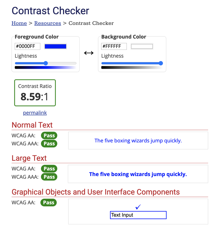 Fig 2. WebAIM Contrast Checker (Web Accessibility In Mind: Contrast Checker, 2022) When conducting further research on fashion sustainability approaches I was reminded of an iconic fashion designer - Virgil Abloh. His work is centred around community, collaboration and sustainability. Virgil adapted his works to the ever changing environment issue and job crisis, giving opportunities to young designers creating societal sustainability. “Virgil was driven by his dedication to his craft and to his mission to open doors for others and create pathways for greater equality in art and design.” (@virgilabloh, 2021) Virgil challenged the norm “played a decisive role in developing the Louis Vuitton Upcycling Signal Logo” (Jaye, 2020) . As a result the brand moved to creating products out of upcycled materials or those containing at last 50 percent recycled or bio-based materials.  Fig 3. Louis Vuitton SS21 Menswear: Abloh Promotes Upcycling (theindustry.fashion, 2020) Because of this challenge of industry norms, LV also lead to create their first vegan shoe, made from “recycled polyester corn-based plastic, and recycled nylon. The shoes also come in recyclable packaging” (Ettinger, 2021). This inspired me consider to use sustainable / repurposed materials for my first collection.  Fig 4. First LV Vegan Shoe (Ethos, 2021) Virgil also collaborated with creators on project and gave opportunities to many young designers. Being the first Black creative director for LV, he helped raise more than $1 million in scholarship funds for Black fashion students with the launch last year of the Virgil Abloh™️ “Post-Modern”, and provided a transparency report (guide) to creatives, giving opportunity to everyone (Abloh, 2021). When developing my brand I also intend to use the resources provided to the community by Virgil  Fig 5. Post Modern (Post Modern, 2021) All in all, Collaboration is essential to creative evolution which is the purpose of my brand. Hence, for my first line, I have made plans to create a collaboration piece with a skating brand ‘Slacker City’, and continue to do so with creatives from different fields (expanding the community). Fig 6-8. My Collaboration Design with Slacker City Virgil’s sustainability and community efforts are very inspiring to me in terms of how he positioned his practice - and I want to do the same, and push boundaries with my brand. Another one of my inspirations for my brand is the creative director of Balenciaga - Demna. He is a creative that goes against the rules and breaks conventions. As I am writing my dissertation on Balenciaga, I have documented the evolution of the brand over a year. I have seen Balenciaga respond to social events / issues, particularly one to the horrifying war in Ukraine, a topic that hits close to home. During fashion week many brands were criticised for ignoring or staying quiet about the war. Demna - did not. Balenciaga held a fashion show that paid tribute to Ukrainians. The show set was in a snowy storm accompanied by Demna (Balenciagas creative director) reciting a Ukrainian poem (Cartner-Morley, 2022). Demna stated “Fashion doesn’t matter now” and positioned his fashion show as “a humane and powerful show of empathy, an emotion not often seen on the catwalk” (Demna, 2022). It is inspiring and very important that Balenciaga spoke up, and I want my brand to do the same, speak up and support people and societies. As designers we have a voice that we must use in social issues. Fig 9-10. Images from Balenciaga Show (The Guardian, 2022) Overall, in my research I found that both Virgil and Demna, are practitioners in the field fashion and design that challenged the status quo, and that is how I want to position myself in my industry - being out of the box and disrupting standard practices of fashion / design. Making my voice heard. By conducting this research, I was able to identify a clear purpose for my brand - to react to society and create a community. The ideal outcome for my SIP is to develop the full branding and identity of ALIAS along with a small initial collection design, that is collaborative and responsive and will help position my brand and show what it is truly about. So how will this project position my future ambitions? Starting this brand, will allow me to take the first step into the fashion industry and allow me to empower the notions of collaboration, community, responsiveness and sustainability (showing their importance). By unifying all of the said topics in my practice, and challenging the traditional industry practices of living by the rule book, I intend on creating a brand for the future and for the people, something that is different to traditional fashion giants, something personal and different. Speaking up through my brand. REFERENCES
Abloh, V., 2021. Post Modern. [online] Virgilabloh.com. Available at: <https://virgilabloh.com/postmodern/> [Accessed 9 April 2022]. Cartner-Morley, J., 2022. Balenciaga pays tribute to Ukraine’s refugees.. [online] The Guardian. Available at: <https://www.theguardian.com/fashion/2022/mar/06/fashion-doesnt-matter-now-balenciaga-show-pays-tribute-to-ukraines-refugees> [Accessed 9 April 2022]. Ettinger, J., 2021. A Sustainable Design Pioneer, Virgil Abloh Reimagined Fashion and So Much More. [online] Ethos. Available at: <https://the-ethos.co/sustainable-design-pioneer-virgil-abloh/> [Accessed 9 April 2022]. Instagram. 2021. @virgilabloh. [online] Available at: <https://www.instagram.com/virgilabloh/?utm_source=ig_embed&ig_rid=9c0c3cf0-1d14-4e49-95e5-aa63196e03ba> [Accessed 9 April 2022]. Jaye, M., 2020. Louis Vuitton SS21 menswear: Abloh promotes upcycling and challenges the need for newness | TheIndustry.fashion. [online] TheIndustry.fashion. Available at: <https://www.theindustry.fashion/louis-vuitton-ss21-menswear-abloh-promotes-upcycling-and-challenges-the-need-for-newness/> [Accessed 9 April 2022]. Languages.oup.com. 2022. Oxford Languages. [online] Available at: <https://languages.oup.com/google-dictionary-en/> [Accessed 9 April 2022]. Onformative.com. 2022. Generative Design. [online] Available at: <https://onformative.com/expertise/generative-design/> [Accessed 9 April 2022]. theindustry.fashion, 2020. Louis Vuitton SS21 menswear: Abloh promotes upcycling and challenges the need for newness. [image] Available at: <https://www.theindustry.fashion/louis-vuitton-ss21-menswear-abloh-promotes-upcycling-and-challenges-the-need-for-newness/> [Accessed 9 April 2022]. Webaim.org. 2022. Web Accessibility In Mind: Contrast Checker. [online] Available at: <https://webaim.org/resources/contrastchecker/> [Accessed 9 April 2022]. padlet.com/tiakarisjohnson/q66hcjnjlw6jckac
Blog post uploaded to padlet with images in this link. I am Tia Johnson, a GMD student who wishes to make a positive impact or at least produce discussion through the topics of my work. Since becoming a GMD student, my outcome for university work and goals have changed to becoming focused on theory, social issues and highlighting important topics that have affected myself and others in our lives. For me to have a new agency it needs to focus on a topic I am passionate in and feel not only a need but a connection to the campaign, my agency is towards the rise of ‘regeneration’ in London. Why is that? Well with the cost of living raised everyone has rightfully reacted negatively to this, it’s an issue affecting us all, some much more than others but still affects us all no less; while with regeneration, which I will now regard as gentrification, it is portrait as something positive as it brings people to an area when it’s ‘up and coming’ which will bring more money to businesses; only that is not completely the case. With gentrification comes displacement, old businesses closing because they can no longer afford to stay in an area they have operated in for years, council flats or community spaces bulldozed to make space for luxury housing. This displacement makes many others in London feel uncertain about their future, this topic allows me to explore a new agency of exploration of pros and cons gentrification has; along the lines of primary and secondary research, I can know whether my anxiety is justified or if there is hope for others in this situation. I wish to explore areas close to me as well as areas I am not familiar with, my list of places include, Shoreditch, Hackney, Brixton, Peckham, Elephant and Castle, Nine-elms, and Clapham. With these areas I plan on visiting in person, taking photography to capture what I am witnessing, recording footage, and researching articles based in these areas on gentrification. Since being a student, my interest in print and book production has been stimulated through the accessibility of the workshop spaces in LCC; once known as London college of Printing, printing still holds an important aspect to courses on campus. Design itself is a powerful tool, combining that with one of the oldest forms of mass communication, print, makes it only stronger; traditional print using letterpress, screen-print and other methods hold a place in my heart as being very personal; which is why my outcome for my SIP will be using print and bookbinding to produce a mass copy of booklets on gentrification and why it needs to matter to more people. I have investigated 2 practitioners related to my SIP, my first listed is Anna Minton, the Author of ‘Big Capital: Who is London for?’ The book was published in 2017 and discusses the housing crisis, displacement and housing redevelopments, and people being unable to travel to see family or even attend important meetings like hospital appointments. In chapter 3,’Demolitions’ we looks at elephant and castle and the production of luxury apartments. In the chapter, we see Terry who once lived on Highgate Estate in E&C, which is now demolished to make space for Elephant Park, which included 2,704 luxury apartments but only 82 for social housing, he has since been relocated to Sidcup, he and a significant number of people have become depressed due to displacement and having family and social ties cut off by starting in a new area. Left image: Elephant Springs, part of Elephant Park, Image from ElephantPark.com Unknown. (2017). Elephant Park now open 24/7. Available: https://www.elephantpark.co.uk/about-elephant-park/green-spaces-and-the-park/. Last accessed 15/03/22. Right Image: Apartments in Elephant Park, Image from ChaseEvans.com Unknown. (2017). Elephant Park. Available: https://www.chaseevans.co.uk/Elephant-Park-New-Homes. Last accessed 15/03/22. Since then, E&C shopping centre has been demolished, many working communities (many of those being ethnic minorities) who set up business in the shopping centre were made to relocate. With the destruction of the shopping centre, UAL have bought the planning permission and plan to build a new campus that will replace the current LCC building. Though this plan is a business opportunity, it has highlighted to me how UAL fails to care about the communities and spaces they will shape with this creation of the campus. Image: Concept for development of new LCC campus replacing E&C shopping centre. Image found on UAL. pmaustin. (2015). New UAL campus at the heart of proposals for Elephant & Castle town centre regeneration. Available: https://www.arts.ac.uk/about-ual/press-office/stories/new-ual-campus-at-the-heart-of-proposals-for-elephant-and-castle-town-centre-regeneration. Last accessed 15/03/22. Image: Concept for Elephant and castle redevelopment, Image from Elephantandcastle towncentre.com Unknown. (2017). LOOKING TO THE FUTURE. Available:https://elephantandcastletowncentre.co.uk/looking-to-the-future/. Last accessed 15/03/22. I have enjoyed the book, however one critique I have is that Minton does not investigate the oppositions side, to make my SIP and agency strong, I will need to investigate the opposition's point and come up with counter points to strengthen my cause and show my understanding of the topic. My 2nd Practitioner is Aida Wilde, is an Iranian born but London based artist and designer. She studied surface design and foundation of Applied Arts at LCC and was a Lecturer on that course from 2004 to 2015. Aida has been a professional screen printer for the last 20 years and has produced installations, murals and social commentary posters around London and other city streets across the world such as New York, her work are often a response to issues of gentrification, equality, and education. Aida Currently resides in Hackney Wick, she used to reside in Shoreditch with her own print shop but with the price raise of gentrification she closed shop and moved. In an article written in 2016, she states that her and the community of artists in hackney wick are fighting to stay as the area, quoting “artists grabbed hold of it, pulled it back, stitched the buildings back together, saved the old factories, created communities, created spaces people wanted to come to, creative areas people wanted to live in, the estate agents love us artist types, they use us in their glossy sales brochures, come live with the artists and the galleries, only they’ve priced us all out and knocked our spaces down and made it very clear we are not wanted around here anymore…' Sean Worrall. (2016). ORGAN THING: Gentrification? It was Aida Wilde’s fault! Damn artists, creating a community!. Available: https://organthing.com/2016/05/04/organ-thing-gentrification-it-was-aida-wildes-fault-damn-artists-creating-a-community/. Last accessed 15/03/22. One thing I enjoyed about the article is an artist acknowledging that they have played a domino effect to places becoming gentrified and accepting that they have shot themselves in the foot as they themselves have made a place seem lucrative and exciting, thus driving prices up with the gained interest of property developers. As an artist and designer, I want to make sure my legacy and the way I work does not negatively impact a space and community I have placed myself in. How this topic influences my thesis for year 4 is I planned my work to be about the communication of print and where it began, this topic will relate to this as print will be a tool used to explain my argument and share it with the public, with the process being an experience I can discuss in my thesis. Anna Minton. (2017). Demolitions. In: Big Capital:Who is London For?. London: Penguin. 120-127. Oliver Wainwright. (2016). Gentrification is a global problem. It's time we found a better solution. Available: https://www.theguardian.com/cities/2016/sep/29/gentrification-global-problem-better-solution-oliver-wainwright. Last accessed 15/03/22. |
AuthorWrite something about yourself. No need to be fancy, just an overview. Archives
February 2023
Categories |


 RSS Feed
