|
Oscar Ling-Cottey - Illustration & Visual Media With the ever-growing popularity of NFTs, it is becoming increasingly difficult to deny their importance and validity as a product. Not only are they an exciting innovation in e-commerce, they are also beneficial to creators in the context of sales. Unlike the traditional method of selling your work for a single sum, a percentage of each transaction after the first NFT sale is allocated to the creator, allowing creators to potentially earn more for their work (Chapman, 2021). Based on this notion, for my self-initiated project I proposed to produce a collection of NFTs, but under my personal brand, ONE BAD DAY (Figure 1). While this may look like a cash grab, this project is actually part of a bigger plan as I intend to sell my collection in the hopes of earning the necessary funding to launch my own clothing brand, also under ONE BAD DAY. Creating a clothing brand has been a long-term goal of mine for many years, but funding has always been an issue from the start, and having noticed how lucrative the crypto market can be, it would be wasteful not to seize such a golden opportunity.  Figure 1 - 'gull attack.' by me (2021) Once completed, the collection will comprise at least 1000 NFTs, all of which being unique variations of the character, ‘Obdob’, from my ONE BAD DAY illustrations. While creating 1000 images seems like a lot of work, which it is, the process is not as laborious as you might think. Large NFT collections are made up from hundreds of individual interchangeable images called “assets” that are combined through coding to form whole images. For example, an avatar NFT, such as a ‘Bored Ape’ (Figure 2), will consist of assets such as a base figure, background, eyes, nose, mouth, clothing and accessories. As someone who has never coded before, the idea of coding is daunting, but it is a necessary challenge to overcome as it will make the project more time efficient and adds another skill to my creative roster.  Figure 2 – ‘Bored Ape #6309’ by ‘Seneca' (nd.) Since NFTs are a relatively new entity, with Kevin McCoy of the artist duo ‘Jennifer & Kevin McCoy’ being the first to produce one in 2014 (Wong, 2021), the research I have gathered is strictly from online sources. I found Twitter to be one of the most abundant sources since it is constantly being updated with new information on current and upcoming NFT projects. Based on this notion, I conducted an experiment, where I followed 1 small-scale NFT project on Twitter, ‘Robo Ramen’ (Figure 3), over the span of a week to gauge how often they tweeted (posted to their feed) to understand how it affected their audience growth. The account’s follower count increased from 2,297 to 3,157 (+37.44%) by tweeting 20 times over the course of the week; an average of 2.86 tweets per day. Through this experiment, I learned that having a consistent online presence is a key factor to audience growth and is something I need to implement to my own project to increase my chances of success. However, this does not account for other possible factors, such as Twitter’s recommendation algorithm, where the app will recommend tweets and Twitter accounts based on your search history and who you follow. Unfortunately, it is not possible to go into this level of detailed research as you cannot access Twitter’s algorithmic data.  Figure 3 – Untitled Robo Ramen by @Berkawii (2022) Since cryptocurrencies have already proven to be a negative impact on the environment, it was imperative for me to understand the carbon emissions I may produce through completing this project. For example, the University of Cambridge estimates Bitcoin to consume 126.12TWh of electricity annually (University of Cambridge, 2022). To put this into perspective, if Bitcoin was a country, it would be the 27th largest consumer of electricity in the world (University of Cambridge, 2022). To offset any carbon footprint I may incur, I will donate a percentage of the profits to Cool Earth, an environmental charity funding projects that tackle the root causes of deforestation and protect vital carbon sinks (Cool Earth, nd.). As an additional measure, I also will ensure that each first sale transaction will be made via the ‘Polygon’ blockchain, a far more eco-friendly option in comparison to the most popular ‘Ethereum’ blockchain, which has an estimated annual energy consumption of 106.12TWh (Statista, 2022), compared to Polygon’s estimated 0.00079TWh (Polygon, 2021).
Throughout my research, I noticed that the vast majority of NFT projects I have come across are illustration-based. This alone conveys just how important the medium of illustration is because without it, all of these illustration-based projects would not exist. There would be no ‘Bored Ape Yacht Club’ without illustration, and so having it as a skill gives purpose to my creative practice and makes me a more rounded creator. Bibliography: @Berkawii (2022) Untitled [Digital Image]. Available at: https://twitter.com/RoboRamenNFT/status/1502468545740828677 (Accessed: 5 March 2022). Cambridge Bitcoin Electricity Consumption Index (CBECI) (2022). Available at: https://ccaf.io/cbeci/index (Accessed: 6 March 2022). Cambridge Bitcoin Electricity Consumption Index (CBECI) Comparisons (2022). Available at: https://ccaf.io/cbeci/index/comparisons (Accessed: 6 March 2022). Chapman, A. (2021) ‘How NFTs are Benefitting Artists & Changing the Way We Sell Work’, Urth Magazine, 24 November. Available at: https://urth.co/magazine/how-nfts-are-benefiting-artists/ (Accessed: 3 March 2022). ‘Why We Exist’ (nd.) Cool Earth. Available at: https://www.coolearth.org/why-we-exist/ (Accessed: 4 March 2022). ‘Ethereum energy consumption worldwide 2017-2022’ (2022) Statista. Available at: https://www.statista.com/statistics/1265897/worldwide-ethereum-energy-consumption/ (Accessed: 7 March 2022). Ling-Cottey, O. (2021) gull attack. [Digital Image]. Available at: https://oscarlingcottey.com/one-bad-day (Accessed: 5 March 2022). ‘Polygon: The Eco-Friendly Blockchain Scaling Ethereum’ (2021) | Blog. Available at: https://blog.polygon.technology/polygon-the-eco-friendly-blockchain-scaling-ethereum-bbdd52201ad/ (Accessed: 6 March 2022). Seneca (nd.) #6309 - Bored Ape Yacht Club [Digital Image]. Available at: https://opensea.io/assets/0xbc4ca0eda7647a8ab7c2061c2e118a18a936f13d/6309 (Accessed: 2 March 2022). Wong, B. (2021) ‘The History of NFTs & How They Got Started’, Portion Blog | Blog. Available at: https://blog.portion.io/the-history-of-nfts-how-they-got-started/ (Accessed: 4 March 2022).
0 Comments
The self initiated project, or SIP, requirement of the diploma has encouraged me to focus on something I am familiar with, while trying to sustainably tackle a problem it inevitably poses. For me, this was initially food waste. Having worked and thrived in the hospitality industry for the majority of my young adult life, I was not only aware, but bothered by the waste it incurs. When proposing the ambitious idea of wanting to contribute to decreasing London’s food waste, I was advised by Sarah and my peers to focus in on one of the many categories this issue can be broken down into. Having worked mostly in cafés, this had to be coffee grounds. I knew even prior to my initial research that coffee grounds, which are thrown away just like any other ‘waste’, have numerous benefits, even if it is the second time round. I then took the initiative to research further than what I already knew. Naturally coarse in texture, coffee grounds can work as an exfoliator or scrub, they can also ward off garden pests. The list kept growing so with that I realised there was an untapped potential to reuse coffee grounds, subsequently minimising its contribution to food waste statistics. I saw this an opportunity to establish a movement/brand and learn about strategies business could adopt to minimise their waste output. Thinking minimal With a play on the words ‘after life’ The JAVALIFE Project was born. Having built on my design mindset throughout my degree, I know how important it is to consider every stage of a project with an environmentally considerate/responsible approach. As previously mentioned, there are copious ways to reuse coffee grounds, but my branding/marketing subconscious kicked in and told me that these needed to be categorised.  The three I ended up with were household use, beauty/self care, and garden use, branding them ‘Inside’, ‘You’ and ‘Outside’ respectfully. This has stayed current throughout; however I am still considering the garden use division. This is down to two things, the first being that 21% of Londoner’s don’t have a garden, this practically eliminates a fifth of potential consumers. The other being my desire to keep the brand vegan. Some challenges have already presented themselves, for example, honey being a main ingredient for some of the potential products in the ‘You’ range. Honey is considered animal exploitation by many vegans, so a friendly alternative would have to be utilised here. But returning to the ‘Outside’ range, it would be hypocritical to boast a vegan brand, with one of the products being a potentially harmful pest-repellant. Another minimalist realisation I had at this stage was to make the products multi-use where possible to once again reduce output.  The notes above show how 5 products, with similar recipes and uses could be sold as 3 multipurpose items. At this point I was impressed with my ability to lower costs and outputs which in turn had made feel I had made the right choice with my SIP; as one of my aims was to employ such a mindset.
Progression The next steps for JAVALIFE will be experimentation and collaboration. I have sourced a local café who are happy for me to take their coffee grounds off their hands. With this valuable and paramount source secured, I can start testing formulas and document them on theJAVALIFEproject. Once I’m happy with these formulas I will look into what tests are necessary for new products to pass before being okay for distribution. By this stage, the products will need to be packaged, it is then that I will hopefully be able to collaborate with product designers and potentially graphic branding students to ascertain the best possible branding for this project. I have many ideas of my own regarding establishing the brand’s visuals, but for now my focus must be somewhat limited to the experimentation. Looking ahead, I am in strong belief that if a movement is bound by cohesive branding, it is not only recognisable but easier to promote and have successful outreach. I feel this project will really help navigate what I’d like to focus on in my final year. With elements ranging from, conception, scheduling, branding, testing and establishing, I fell there’s a lot for me to dabble with which in turn gives me good stead for my final major project. Gìgì Gregory / Art DirectionTies; the word itself implies how things can be attached and connected to other matter or people yet can also be used as an expression to when we’re ‘tied down’ with something or someone. My preferred definition of the word entails its function of holding parts of a structure together because in this context it becomes more than just a tie by transforming into a body of connected elements that are able to tell a bigger story. The tie as a fashion garment beholds a history of its own that has been perceived to lack function. Yet, it’s prominent prevalence from the past 17th century up until its position in today’s society is what caused me to explore its potentiality as the main subject of my self-initiated project this year. In this case, the tie worked in stringing my creative identity into its own visual narrative, representing the beginning of my new agency as an artist and the breaking of its own traditional fashion conventions that I have challenged with the task of revolutionising its original design into a symbol that celebrates the art of self representation. My aspiration has been that of using my symbolically existential artwork to eliminate its limitations as a staple of conservative appropriatism and give the tie a new purpose, which is to empower people through the identification of unique status to represent the self with art that interlaces us with reality. My primary research has been centralised around the concept of how to reconstruct the tie with this more evident function, where it may promote a new surface area for unique art to be worn as an affirmation and overall totem of identity that’s able to communicate more that just formality, because the world doesn’t need anymore of that. What we do need, however, is to create more innovative spaces in fashion for tactful communication and individual expression. In this way, the tie can overcome it’s formality and dated designs to reflect the diversity in the world of opinions, people and most importantly, stories. That’s really the art of ties objective. My first step towards achieving this consisted of renewing the tie’s old model with a widened shape that provides more room to serve. During this process, I decided that the tie was going to literally embody the idea of making a point by having one in its sharp geometrical frame. With the opportunity to act upon this initiative, I began to truly believe in the theory and process of this work as I discovered more obstacles surrounding the field of ties. My secondary research in fact, focuses on how the item continues to wrongly be stigmatized by gender. Ties have a history of being worn principally by men and overtime by women that apparently aim to look more professional. Some have even stated that these ladies try to dress like men, which has humoured me for too long as the origin of the ties was nothing that could stereotypically be perceived as masculine today, but quite the opposite. Despite this, I noticed how household fashion names continue to use bi-gendered fashion tabs online, creating a user experience that, in my opinion, doesn’t correctly reflect the gender inclusiveness of their current audiences. According to Gucci, Prada, Paul Smith and other big brands, I have to be a man to even find a tie on their sites or pretend to be one in order to find them. I might even have more chances of finding one online as a boy instead of a grown woman. With this realisation, I decided I was going to make these one-of-a-kind ties with their own online space that excludes bi-gendered fashion tabs in the shopping experience. If clothes are to represent deeper factors of inner identity, then surely gender shouldn’t be an interference to wear your own story. It’s fair to say that my objectives have multiplied since the start of my studies and this sense of urgency to act has enlightened me with the true meaning of new agency. What better practioner of revolutionary tie design is there other than the famous Lifschitz to Lauren example of agency? The inspirational story of a salesman that had no history with fashion design other than selling mens accessories in New York City during the 1960s, that managed to build his own global empire with the idea to create a line of mens ties that were wider and more colourful than anything else on the market. Despite being told that the world was not ready for him, today there are few that don’t recognise the fame that comes with his company’s name. In 1967, Lauren walked through Bloomingdales’ doors holding his first collection of diverse ties made out of unconventional fabrics with the aim to sell them to what was known as the country’s ‘hottest store’ in luxury retail. But who would have known that it was his exit from the same doors that made him what he is today. A decision of action executed in a moment that would change the rest of his life. After denying all negotiations to change his product, his career truly began and his ties were sold under the division name of Polo. That’s the magical realisation of agency, the persistency of choices that create something bigger than ourselves. Today Lauren is a self-made billionaire but the secret of his success lies within the timelessness of his vision, specifically because of the structure in which he built his identity on. He tuned in his capability by embracing it with self-worth and that’s how I aspire to sustain my own. I can create something as much as I can eliminate something and that’s the power of an artist, knowing that you can make something, that may be repeated and sold but not with the same eternalness and story that you can. That’s quality and that’s what sells, which explains why the worldwide luxury goods market has its own ties with art and is worth approximately 283 billion euros. I’ve wondered what would happen if society simply cut connections with ties. If we just eliminated them from the world and ignored their ability to exist throughout the fury of never-ending fashion trends like my secondary case study, Richard Branson, who literally cuts ties from the workplace with scissors of his own. Thus hoping to transform offices into more comfortable environments but I question if that gesture suffices. With the pen in my own hand, I believe that there is radical thinking in ink that is in need of exploration, which is why I have founded my own company.  THE ART OF TIES SURVEY (One minute)
A source of my market research. “Fashion is not necessarily about labels. It’s not about brands It’s about something else that comes from within you.” - Ralph Lauren “Life is so short you can’t waste even a day subscribing to what someone thinks you can do versus knowing what you can do.” - Virgil Abloh Informative Links: The Origin of Ties - Chloe Chaplin (2012). History of Polo Ralph Lauren - Alf- B Dagsvold (2016). Richard Branson cutting ties... - OfficeChai (2016). The Ties is back, but can you pull it off? - Financial Times (2020). Anatomy of ties - Threadcurve (2021) Is Fashion becoming Gender Non-Binary? Vice Asia & I-D (2019) The Future is Fluid - Gucci (2019) Andy Warhol Suit as a Simulacrum - Revolver Warhol Gallery (2020). Value of the luxury goods market worldwide from 1996 to 2021 - Statista Tugba Sabanoglu (2022) Comments are welcomed. @gigigregoryltd Sun Woo Kim. Illustration and Visual Media. @sunwookim.art Hello, I’m Sun Woo Kim from Illustration and Visual Media. I am image creator specialising in multidisciplinary works tackling environmental issues and mental health. For the Self-Initiated Project, I have given a brief to create an Instagram account that introduces endangered birds to social media users. It is my goal to practice skills in visual communication and data visualisation especially in environmental issues, and reach out to wildlife conservation organisations. Therefore, I am creating illustrations of endangered birds that can possibly both raise awareness and deliver key facts. The illustrations will first have a visual impact that immediately conveys a message: the birds are threatened. Secondly, it will deliver information including their habitat, existing population, and the level of endangerment. I have been experimenting with drawing styles and collecting datas. The next step will be to consider different layouts and visuals, such as colour palettes, to effectively combine both factors into Instagram-friendly images. Once the Instagram account is live, I will reach out to organisations to discuss the prospect of engaging in collaborative projects. Examples of visual communications raising awareness about endangered species. Left: 'Destroying nature is destroying life' by Robin Wood with Illusion Studio Right: 'Burnt' by Saatchi & Saatchi Singapore Examples of visual communications delivering datas about wildlife & endangered species. Left: 'Pianeta Terra' by Federica Fragapane Right: 'Good Fish Guide' by Marine Conservation Society Because my project employs artistic techniques to expose the threats to endangered birds, my target audience will be Instagram users who are interested in art but might also be interested in species conservation. There are several tools I am looking into in order to make my posts attractive to them. First of all, I am going to draw the birds myself instead of using photographs. Second of all, I am going to create a video rather than a still image. Infographics coupled with moving images is a very effective way to draw people’s attention and to deliver complicated information while maintaining their engagement. Beyond Words Studio is an infographic studio where they often use motion graphics or projection to effectively convey a huge amount of complicated data to the public. Lastly, I will be managing the information displayed on my images in accordance with Instagram etiquette.    Examples of Instagram accounts introducing endangered animals via art works. From left to right: @ander_animals_paint, @lindarbester, @cole.stirling    Examples of Instagram accounts introducing endangered animals via key facts. From left to right: @endangeredanimals0, @pixelplanettoday, @eanimalclub Using illustrations when talking about endangered animals is very effective. Wildlife conservation organisations and charities have been known to successfully utilise visual communication tools to narrate their stories to the public. This is because such animations are more palatable and they allow users to sympathise with the animals as opposed to just feeling guilty. David McCandless who is a founder of ‘Information is Beautiful’, suggests that visualising data can change people’s perspective when reading uncomfortable information such a political perspective into a more fun activity yet more effective. I feel very positive about the changes we can make as illustrators specially after finding out many other image makers who are dedicated to visual communication. I believe that illustrations can play just as important a role as science in environmental issues. In fact, a book ‘The Power and Influence of Illustration’ by Alan Male suggests that ‘Illustration has a significant role in bridging the gap between the sciences and humanities…illustration provides a significant platform for audiences to be educated and informed.’ I want to become an illustrator who can have impacts regarding social issues via purposeful visual images, especially of endangered species. Hopefully, my illustrations will have 'the power and influence' in the near future.  'The Power and Influence of Illustration' by Alan Male
Ruth Kruger, GMD My SIP focuses on my small business, Sea Jelly, as well as a packaging project called ‘Sweet Memories’. Whilst Sea Jelly is very much focused on the development of the bespoke bioplastic that we are making and how this could help us move towards sustainable fashion; ‘Sweet memories’ is a project based around exploring packaging and branding using foods I was familiar with from my childhood in South Africa. The juxtaposition of both projects allows me to connect with both my past and future self, and has led to introspection on who I am as a designer moving forward. Sea Jelly, 2022. Sea Jelly Original Photography. [Photography]. Sea Jelly Sea Jelly is a continuation of the live brief from last term and focuses on group work to create sustainable accessories. We wanted to introduce our concept to show how the fashion industry should progress. If university students can produce fashion whilst making their own material and branding, fashion companies should have no problem, right? “There are many advantages to bioplastic, …unlike fossil fuels, it is not a dwindling resource. Bioplastics also degrade far more quickly, taking 3-6 months to decompose fully compared to the hundreds of years regular plastic requires. The carbon released by bioplastic as it decomposes is also equal to the carbon absorbed by the organic material it was made from, so the overall impact on the environment is close to zero.” (Wheatland-Clinch, 2022) We were inspired by Phillip Lim's sequin dress which looks almost identical to plastic but does not cause any harm to the environment. However, although students and smaller designers are able to take matters into their own hands, we may not see significant change until mega corporations accept the abandonment of their pollutive process. “As promising and forward thinking as these fashion initiatives are, it will take an adjustment of infrastructure to make sure the environment feels the full benefit of bioplastic.” (Wheatland-Clinch, 2022) For this project’s development, we worked very closely over Zoom and had to consider everything down to sourcing materials, to marketing via Instagram reels. Creating a business from scratch with no experience is a very daunting process but working with other creatives Amaya (also a DPS student) and Sarah (a recent LCF graduate) has led us to a shared sense of agency focused on what we as creatives can contribute to help combat climate change. However it’s not all that serious, an important part of the process has been injecting a sense of playfulness into our branding, something we’ve developed together through illustrations and photography. We want to continue to grow our audience online as well as develop more products in the future.  Lim, P. 2022, Biomaterial Dress. Fashion Item Sweet Memories A second potential project alongside Sea Jelly focuses on exploring packaging and branding of childhood foods I ate while growing up in Johannesburg. Since moving to the UK I have built up a lot of nostalgia for my childhood. The change in the food available was the most significant to me as a child, and I think that many people can relate to nostalgia of their childhood through food. In my rebranding, I was inspired by many traditional South African artists such as Vetkat Regopstaan Kruiper and Esther Mahlangu whose work reflected their community, as well as vibrancy and passion. The contemporary works of Kruiper and Mahlangu both draw inspiration from indigenous tribes, paying tribute to the spiritual and natural practices that were unfortunately exploited by European and British colonialists. After Apartheid ended, they were able to express their work freely and showed the true nature of South Africa's history before it was forcibly converted to fit a westernised mindset. These artists were hugely important for me growing up as they represented the freedom of expression and showed a better future for the country - a strong reminder of my history and my place of privilege that needed to be dismantled for liberation. ( Fine Art Africa, 2003) (Stone,2016) Vetkat Kruiper Joy In North South East and West, Tower of One, Digital scans of Original artwork, UNKNOWN Displayed in Fine Art South africa. Esther Mahlangu, BMW Art Car 12, 1991. © Esther Mahlangu, photo © BMW Group Archives Sketches exploring packaging and artist influences In a sense it has given me agency because it has allowed me to reconnect with my childhood roots. Whilst Sea Jelly has allowed me to work within a close-knit creative team, ‘Sweet Memories’ is a solo project, which has allowed me more time to explore themes that are personal to me and my upbringing, allowing me to be introspective and furthering my skills as a designer. I think my main passion for this project is to make sustainable options accessible, as sustainability has been tricky for me growing up in an immigrant household. It was a luxury I have only been able to afford with age and independence. This experience is heavily reflected in my work not only for ‘Sweet Memories’, but to a certain extent Sea Jelly too. In terms of ‘new agency’ SIP has forced me to look at a specific path I could go down. Where I use my design for progression of society and try to work with like minded individuals or I use my design to communicate themes we can all connect with. Looking towards my final year at LCC, these projects have helped to inform my design and lead me down a more specific path for a final project and dissertation. Now I am much more focused on exploring sustainability and cultural influences in my work. References:
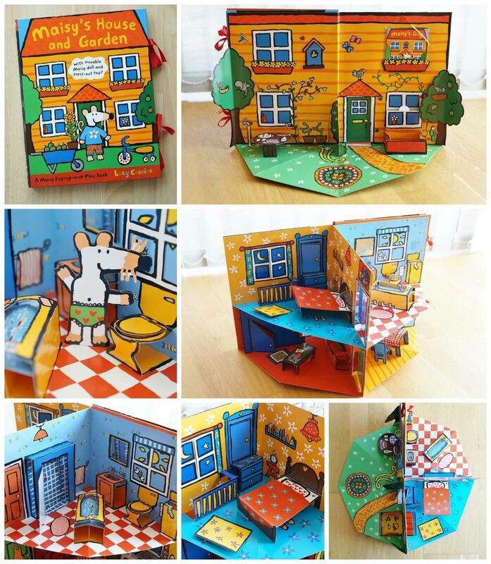
Wheatland-Clinch, E., 2022. How bioplastic could be the future of fashion - Thred Website. [online] Thred Website. Available at: <https://thred.com/style/how-bioplastic-could-be-the-future-of-fashion/> [Accessed 9 March 2022]. Fineart-africa.com. 2003. [online] Available at: <https://www.fineart-africa.com/vetkat-regopstaan-kruiper> [Accessed 03 March 2022]. Stone, B., 2016. Zim Zimma: Esther Mahlangu's BMW parks at the British Museum. [online] Itsnicethat.com. Available at: <https://www.itsnicethat.com/articles/zim-zimma-esther-mahlangus-bmw-parks-at-the-british-museum-171016> [Accessed 3 March 2022]. Megan Cox, IVM -- Designing a children’s book as my self-initiated project encourages exploration into how the children of today’s world interact with both tactile and digital narratives. From traditionally bound pieces of paper, children’s books have evolved to be integrated with pop-ups and paper mechanisms, ’do-it-yourself’ activities and adapted into animated e-books, apps and videos. With factual understanding that involving children through interactive learning and play is the best method of engagement, and with the shifting attention towards screens, I want to compare the possibilities for tactile materials and animated elements within the design of children’s books.
‘Caper Corner’ is a YouTube channel that takes existing published books and animates the characters and objects within the story, in a similar way to augmented reality, also incorporating sound which exposes children to many personalised voices. I think the greatest positive aspects of this example is the fairly straightforward design production and audience accessibility. However, the actual interactivity is lacking by being in the form of a video to watch and listen to only. I think producing an app which allows children to drag their finger across the screen to turn the pages, click to discover how to animate features within the story, listen to a recorded dialogue on command, as well as provoke simple tasks to complete on each page, provides more independency and involvement with children and would therefore be a more engaging experience for learning and play. For example, ‘Anorak’ is a children’s magazine that releases digital versions of each issue through an app. The app includes more scope than what physical paper mechanics can offer for creative moving images, as well as interactive games, activities and clickable treasures to find amongst the pages. I think this form also considers the reduced production cost and environmental impact. However, the major downside of this is the inability to learn and play through tactility or navigate real life 3D forms.
Fabric books, often for pre-3 year-olds, are extreme examples of how tactility is utilised. The textures alone captivate children to investigate and become attached to, amplified by brighter colours and defined motifs. Unique ‘do-it-yourself’ learning and play activities are encouraged on each page, including removable pieces that are less likely to get lost because of secured pockets and velcro fittings. Real world textures and exploration through touch is a distinct piece that is missing from digital interaction. It provokes thoughts about whether technology will evolve towards incorporating tactility into VR or ‘4D’ experiences and eventually into everyday household devices, thus replacing physical artefacts altogether. In my opinion, although it is important for creatives to engage with the ever-changing shift towards digital interaction, the experience of physical books are irreplaceable. I believe that as digital mediums continue to expand, real world experiences and tactility will become more valuable than ever. My SIP Idea: My children’s book titled, ‘A Shelter For 4’, proposes a heartwarming story of unbreakable friendship and self-acceptance of a bear, deer, bird and spider, working together to overcome the rain. My initial storyboard displays the groundworks of the story and moving forward, I am considering ideas about the tactility by testing textures to describe the setting and characters, incorporating mechanical details and the entire book popping up to become a 3D form that reflects the shelter itself.  Storyboard for 'A Shelter For 4' Reflecting on my direction for this SIP and steering my creative practice as an illustrator, animator and designer, I will have the chance to incorporate my interests from these three disciplines into my children’s book: creating the illustrative artwork, incorporating movement to enhance the story and playing with the mechanics and the overall interactive experience. I will also need to consider the production and publishing cost and processes through discussions with production and publishing companies. Dedicating the month of April, to initiate this project, I will begin to reach out to publishing and production companies with the progress of work made. I think my personal ambition to become published will be faced with difficulties in getting a more unconventional design for a children’s book produced on a large-scale. However, I want to keep open-minded and consider the possibilities for adaption of the characters and story across multiple mediums and potential series.
-- Sources: ‘Maisy’s House and Garden’ by Lucy Cousins (Source: Carousell) Link: https://www.carousell.sg/p/maisy’s-house-and-garden-204904995/ ‘Caper Corner' (Book: Nibbles: The Book Monster by Emma Yarlett) Link: https://youtu.be/DtcaeUUfh8U ‘Anorak Magazine App’ (Source: Small for Big) Link: http://smallforbig.com/2015/01/anorak-mag-goes-digital.html ‘My Quiet Book’ by G-Tree (Source: Amazon) Link: https://www.amazon.co.uk/dp/B07QNVKLPD/ref=sspa_dk_detail_2?pd_rd_i=B07QNVKLPD&pd_rd_w=g2Cf6&pf_rd_p=828203ef-618e-4303-a028-460d6b615038&pd_rd_wg=Tc48b&pf_rd_r=9NVP4NV184NS0PMY2YB3&pd_rd_r=2be576b9-894b-4e9c-9ec0-cb89303327ca&s=kids&spLa=ZW5jcnlwdGVkUXVhbGlmaWVyPUEySFlTUlQxUTRNTzY0JmVuY3J5cHRlZElkPUEwNzUzMzE3MUxIT0hPVFMwUTZHViZlbmNyeXB0ZWRBZElkPUEwNTg5ODg0MUJFUkZMNE9UVklDMSZ3aWRnZXROYW1lPXNwX2RldGFpbCZhY3Rpb249Y2xpY2tSZWRpcmVjdCZkb05vdExvZ0NsaWNrPXRydWU&th=1 WOW 2 Digital Portfolio - UAL GMD YEAR 3 DPS Marta Freire - 19021430 Graphic & Media Design It is a fact that with the evolution of technology, human lives got better as our resources to survive, specifically more in first world countries. The modern era has created more job possibilities, easy access to education, equality at work and better living conditions. Easier chances to make dreams come true. The making of our dreams might be a difficult task to do. It can be due to a numeral of factors like lack of confidence, laziness or even the competitive market. Most people don't realise how technology makes the publication of ideas and work so much easier for artists that want to start their careers. For my Self-Initiated Project, I have chosen the publication of my book. I have been writing and preparing this book for quite some time now, and it made me grow not only as a person but also as an artist. The research conducted had a lot of different steps, and one of them is the way of publishing which nowadays is available as a physical book, E-book, and Audiobook. This article reflects how better the world of publishing is nowadays, including its ups and downs. In the past, not long ago, for you to be able to publish anything, it meant you had one of these three things: - You are rich; - You had some connections in the industry; - Someone loved your idea and showed it to the world; These three things are still applicable our days. However, new factors gave new possibilities for many to show their ideas without depending on anyone. These factors perhaps were the creation of the World Wide Web, or as we designate as the online world. The internet, a tool firstly created for quick research, was later improved to be a place where the world is connected. Most businesses expanded their network due to this new world, which opened the doors for ordinary people to become what they aspire to be. The term self-publication is a formula of publishing where its author is responsible for all the processes without the involvement of an established publisher. This phenomenon is possible thanks to some online businesses that create your book as you please, so you can sell on online platforms with the possibility of making contracts with book shops. Such examples are Kindle Direct Publishing, Apple Book, IngramSpark, and many more. The internet has opened new doors for people to show their creativity. Including many other types of businesses such as Etsy, where you can find unique handicrafts, Depop, an app with very specified marketing where you can find people that create their clothes, Youtube, people show specific content to their viewers and make profit out of it. Compared to the present, the past sounds harder in terms of publishing. You would have to show your ideas multiple times to different people, which certainly would decline your art. There is probably a lot of good art that we never had the chance to see because of a lack of interest from the established businesses. A clear example of that is the famous books series “Harry Potter” that at the beginning it was declined for numerous publishers until someone believed in its worth.  Fig. 1 - J.K. Rowling's Original Synopsis for her first book It was stated by Inside – “The synopsis was typed by Rowling in 1995 "to accompany the opening chapters and circulated among prospective publishers," according to a plaque that accompanies the synopsis. The novel was rejected by 12 different publishing houses before Bloomsbury accepted it.” Concluding, the internet was a huge step to free people to be dependent on majors to show off their ideas. Now, is it profitable? It is a reality that it was harder to publish in the past, but it was certainly more rewarding than the present. The reason behind it is that there was much less competition before. We could say that there are too many options now that can affect the value of a product.  Fig. 2 - Self Publishing VS Traditional Publishing Costs Regarding this issue, the modern world of publishing satisfies those who want to accomplish a dream, is even more rewarding getting to know that people love your project. As for me, my plans are heading for a traditional publisher that can guide me since it is my first book. If that does not work, I will choose self-publishing. In other words: I am glad I was born during this modern era where you always have a second chance to show what you can do.
References: Britannica - (Unknown) - https://www.britannica.com/topic/publishing/Advertising Selfpublishing.com - Scott Allan - (05/02/2022) - https://selfpublishing.com/self-publishing-companies/ editable - (2018) - https://www.editage.com/info/book-editing-services/articles/top-10-self-publishing-companies-a-2018-guide-for-first-time-authors.html ResearchGate - Diana L Hart - (21/11/17) - https://www.researchgate.net/post/So-many-people-seem-to-publish-a-lot-quickly-How-do-you-do-it ThoughNickel - Bill Holland - (19/05/20) - https://toughnickel.com/self-employment/How-Hard-Is-It-To-Get-Published-In-The-Real-World Self-Publishing School - Bella Rose Pope - (24/11/21) https://self-publishingschool.com/self-publishing-vs-traditional-publishing/ Quora - (Unknown) - https://www.quora.com/Is-it-easier-or-harder-to-get-a-book-published-these-days-than-before-the-growth-of-the-internet Insider - Alison Millington - (31/07/18) - https://www.insider.com/revealed-jk-rowlings-original-pitch-for-harry-potter-2017-10 Tiffany Hawk - Tiffany Hawk - (Unknown) - https://www.tiffanyhawk.com/blog/self-publishing-vs-traditional-publishing-a-stone-cold-sober-analysis SIP Essay by Kirsty Laidlaw Themes are intrinsic to parties and events. Whether it be halloween, weddings, birthdays. For my self initiated project, I’m developing visuals for a party with the theme of Bond vs Bondage. This is a theme I explored in 2019 under a quick time constraint, hence why I want to work on it again. Revisiting this theme gives me the chance to display my new skills and artistic development. James Bond is a classic example of power, guns and sex. However he’s sexist and privileged, so I’m going to completely contrast this. The idea of bondage is perfect for the dynamic for insinuating the power change. Displaying Bond with a different energy could provide a shock factor for the party-goers. Seeing a man, who is stereotypically manhandling women, become at the hands of women is a fun challenge. If the effect of the visuals suggested they were glorifying the chauvinist attitude that the early bonds exude, I would be really embarrassed. This would be a definitive factor of success, whether I have managed to make James Bond submissive. 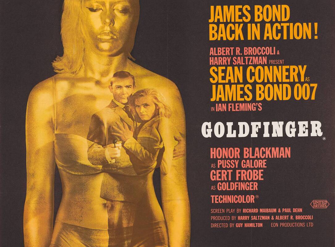 Fig 1. Robert Brownjohn, Goldfinger Opening Sequence, 1964. The artist behind the iconic Bond opening sequences, Goldfinger and From Russia with love, is called Robert Brownjohn. Inspired by Playboy magazines his work is sensual, with motives of legs, breasts, and typography which is a visually interesting dynamic. Specifically compositing them together in the Bond opening by projecting the titles onto Margaret Nolan. His role in those films is an exciting venture for an artist, and as far as video art suggests it’s a root that I’m subconsciously developing. Bondage as a culture is growing. People are starting to understand it as an art form, as a job and as an aesthetic. In London specifically there is a queer fetish club called Crossbreed that has exploded with attention and appreciation. Ensuring safety and rules is vital to the success of these clubs. The bondage community understands the line between pain and pleasure more than the average person, because they have to. Anyone who micontrudes or abuses the act of bondage would be ostracized. A point of action is making the vital distinction between bondage, and violent porn. Bondage revolves around love. A dominatrix will care for their submissive, and be able to control the act as if it's a play. Actors are able to draw the line between real and fantasy which is similar to the fetish world. On the contrary, violent porn majority of the time is non consensual and dangerous. The reason there needs to be a distinction is due to media consumption. Porn is the peep hole that society has into that world, however the idea of filming bondage is not that common. It is normally behind closed doors or in a secret basement, which doesn't give much exposure to how it truly is. They are treated like Berlin nightclubs - stickers over the camera before entry - this makes people feel safe and more comfortable in the environment. In which case how could anyone who has never experienced bondage actually know what it is. It’s similar to reading a book about Spain and then saying you know what the beach smells like. However there is a really fun aspect of this controversy - it keeps close-minded people out. An artist who uses shock culture is Petra Cortright with ther collection “Niki, Lucy, Lola, Viola” which consists of digital environments, like forests or waterfalls, with strippers. The women in the piece are from a windows plug in that generated these digital dancers to prance on your screen. She’s ripped them and put them in different environments, one of the environments is a green screen, which becomes really meta since that's realistically how they were originally filmed. Her experimentation and relaxed way of working is an aspect I’m really endeared by and in terms of practice. She works in a method that comes off really natural, yet knowledgeable.  Fig 2. Petra Cortright, “Niki, Lucy, Lola, Viola” 2015. Creating cohesive and sensual visuals for such a specific theme will help me display my interests of costumes, themes and sensory content. While also showing my skills in the same departments. Being able to develop this practice repeatedly would be really fulfilling and consistently refreshing from combating new themes, audiences and venues. Fig 1. Robert Brownjohn, Goldfinger Opening Sequence, 1964.
https://www.007.com/the-films/goldfinger/ Fig 2. Petra Cortright, “Niki, Lucy, Lola, Viola” 2015. https://i-d.vice.com/en_uk/article/j58dak/petra-cortrights-digital-exotic-fantasyland |
AuthorWrite something about yourself. No need to be fancy, just an overview. Archives
February 2023
Categories |


 RSS Feed
