|
Holly Ford-Hunt Graphic & Media Design Revolution: The design and anti-design discourse is something that is altered with the ever-changing world. The pandemic acted as a catalyst for the way society perceives and how designers design. The anti-design discourse is about exploring alternate approaches and creating discussion where organisations speak louder than ever before. Proposition: The governments ‘look them in the eyes’ campaign used design to communicate the importance of staying safe during Covid-19. By photographing patients, it was thought that more people would listen. These posters promoted Stuart Hall’s representation theory; by constructing ideologies viewers had perspective of negative positions hence the posters being a success in making people wear masks.  Figure 1 (NHS Posters: UK government: ad has a shift in tone from its previous communications) (Magee, 2021) Despite the success of the posters, once the world got back to normal the Government rapidly chose anti-design but not in the sense we’re talking about. They released a poster dedicated to the idea of ‘Rethink. Reskill. Reboot.’ This poster was immediately plastered over social media.  Figure 2 (Government Rethink. Reskill. Reboot. Campaign edit & Responses from public to campaign) (Cookson) (Birks, 2020) Design is everywhere. This poster would have been designed by someone who has a job in design, the image was photographed by a photographer, the layout was formed by a graphic designer, the list is endless. A simple campaign of which the Government thought would get great response was then scrapped. The communication was non-existent in the formation of this poster but communication in response was colossal and formed change. Identification: Social realism is about using art to highlight political and social issues. An artist whom reacts to this well is Banksy. The artist creates a form of anti-design in the form of graffiti work in order to say something in response to problems and to get people talking. It could be said that Banksy took to the topic of anti-design on a personal level; altering the way they worked during Covid. We weren’t allowed out so the artist showcased pages from a sketchbook instead of usual work. However, I had to search for this piece of his work so that questions whether a change in design is always right when what was done before was so successful… Figure 3 (Banksy – London Underground Undergoes Deep Clean) (telegraphtv, 2020) In July 2020, the artist took to London underground. This was a first piece on public transport which proves consideration of alternate techniques to create impressions. A video of this work ‘if you don’t mask you don’t get’ (figure 3) is a contribution to the desperate need to wear a face mask. The use of the final statement in the video ‘I get Lockdown, but I get up again’ with song changed the emotion to those viewing making it more light-hearted. The choice of substance to create the design being cleaning fluid was extremely impactful of time, one of things I remember most about Covid is cleaning constantly. This craft is particularly clever as it suggests this idea of nostalgia and moving past time. By using design, Banksy did more than just tell, they showed and dedicated themselves to this project. Promotion: The establishment of credibility for a business is one of the most important factors and should that decrease, a great drop in sales would result. It is said that ‘any publicity is good publicity’, during the pandemic Corona beer saw a decrease due to conspiracy stories linking between the virus and drink. Once this was being gossiped and then proven incorrect this news was being shown everywhere from television to socials; so although it was linked with a negativity, the brand was being viewed much more than usual.  Figure 4 (Corona beer in plentiful supply, Marc Duffy) (Richardson, 2020) This anti-design form of advertising, from my perspective, had a great response. When people were allowed to gather again, people had Corona parties where the drink was at the centre of the table, this wouldn’t have been the ‘case’ (pun intended) pre-pandemic. As well as being humorous, the brands name was at the forefront of consumer’s minds whether they wanted the drink or talking about the virus, the term Corona was used by everyone. Solution: Communication is a topic I believe is taken for granted. Design is a form of expression and by expressing in different forms a different approach is created; we have to move alongside this ever-changing world and whether that is admired or disrupted remember, Art is subjective. Bibliography
Bakare, L. (2020) Government scraps ballet dancer reskilling ad criticised as 'crass', The Guardian. Guardian News and Media. Available at: https://www.theguardian.com/politics/2020/oct/12/ballet-dancer-could-reskill-with-job-in-cyber-security-suggests-uk-government-ad (Accessed: January 12, 2023). Banksy sprays coronavirus-inspired artwork on to London tube (2020) YouTube. YouTube. Available at: https://www.youtube.com/watch?v=5YrQbM5lMHU (Accessed: January 13, 2023). Birks, G. (2020) “Rethink. Reskill. Reboot.” Available at: https://twitter.com/GregBirks/status/1315623955991080961?ref_src=twsrc%5Etfw%7Ctwcamp%5Etweetembed%7Ctwterm%5E1315651327352090624%7Ctwgr%5E65d18693471bb5e6c6711961ed746cfc669093d0%7Ctwcon%5Es2_&ref_url=https%3A%2F%2Fwww.thenational.scot%2Fnews%2F18791537.tory-chiefs-torn-apart-twitter-mocks-fatima-retraining-campaign%2F (Accessed: January 12, 2023). “Cases in England” (2023). Available at: https://coronavirus.data.gov.uk/details/cases?areaType=nation&areaName=England (Accessed: January 12, 2023). Cookson, G. (no date) Fatima, Cyber, and the Graphic Designer: Loving Useless Art. Grant, K. (2020) Corona beer sales soared by 40% in 2020 despite Covid Association, inews.co.uk. Available at: https://inews.co.uk/news/consumer/corona-beer-sales-soared-2020-covid-association-supermarket-sales-latest-799853 (Accessed: January 13, 2023). Magee, K. (2021) Will the government’s new emotive covid AD make people obey the rules?, Campaign Live. Available at: https://www.campaignlive.co.uk/article/will-governments-new-emotive-covid-ad-people-obey-rules/1705634 (Accessed: January 12, 2023). Richardson, H. (2020) The foods no one wants in lockdown, from sprouts to Corona Beer, Daily Mail Online. Available at: https://www.dailymail.co.uk/femail/article-8159689/The-foods-NO-ONE-wants-lockdown-sprouts-Corona-beer.html (Accessed: January 13, 2023).
0 Comments
By Maria João Magalhães As a Graphic and Media Design student, the first thing that I was taught was the principles of design theory. Hierarchy, color and white space, balance, contrast and repetition (I risk saying these are the basic principles of graphic design). The obvious would be if you follow these rules at risk you can become a great designer, right? Not so easy. “Learn the rules like a pro, so you can break them like an artist.” words from the master Picasso, and it’s basically it. Although, we are taught the rules, we are always encouraged to break them in order to find our own style. My working method as a graphic designer is very sensorial and experimental, I particularly like to get out of my comfort zone and explore the most unlikely techniques, sometimes breaking the rules. Therefore, I see anti-design as a vast space of possibilities and creative opportunities. First, Anti Design is a movement similar to post-modernism that began in the 1960s as a reaction to modernism’s long puritanical reign. Anti design rejected the righteous values of modernism and expressed growing social dissatisfaction through irony. This term often emphasizes the chaotic and the random, to create something unexpected or confrontational. It can also be used to push formal boundaries and challenge accepted norms. To capture a more modern look of the movement, we can have a look at the studio Solid Dogma work for Iminente festival. Solid Dogma is a creative unit aimed at activating brand and cultural power through art. Solid Dogma overcomes media boundaries and focuses on consumer and social value by creating seamless communication projects and powerful branding tools. The Iminente festival emerged in 2016 and since then brings together emerging and renowned artists with varied backgrounds, it is a union of cultures, languages and styles, condensed into a unique and intense collective intimacy experience. Supported by core values such as diversity, inclusivity, equality and visibility, it is a celebration of creativity. The festival graphics, every year created by Solid Dogma, are renowned for its bold visuals, using strong and striking typography, bright colors and the avoidance of conventional grids. Even though we see this style as probably a trend now, the history of the Anti-design movement goes back to the 1960s. Grapus [ \gra-´pUEs] is a French graphic design collective founded in Paris immediately following the student protests of May 1968. The group saw life as a field for experimentation, putting the new political, social, and cultural debates into graphic form for public discussion. This collective first work was a graphic response to a political movement, where they used their artistic practice to show where they stand and their beliefs. They were very notorious as their work broke the rules and the modernist vision. They appealed to images, bold colors, collages and irony to break the standards of design and be disruptive.  Grapus Collective Poster  Grapus Collective Poster 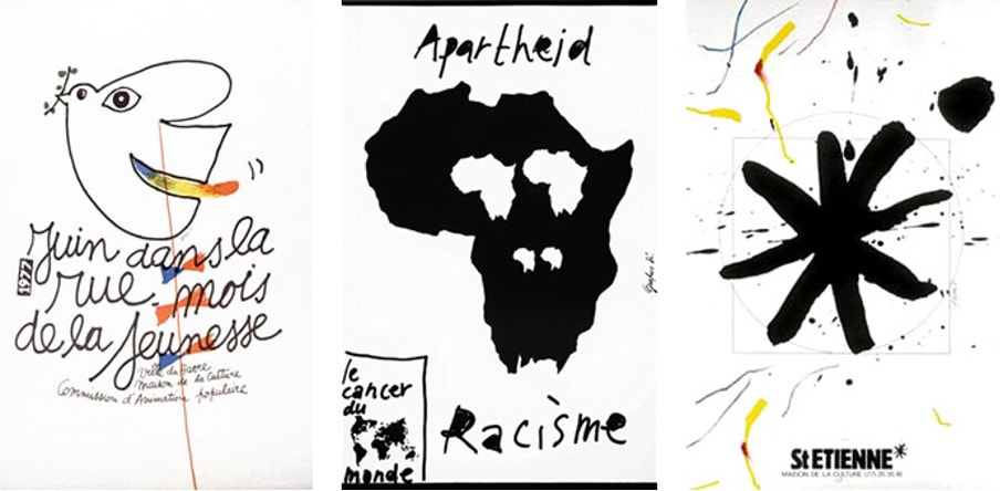 Grapus Collective Poster  Grapus Collective Poster With these two examples, we can see that Anti-design is a cyclical trend. Just as in fashion there are clothing trends that come and go, in design it is the same. In this way, most trends appear with a purpose, as a response to something, be it a political or creative need. With the Corona virus pandemic, our society has been presented with a totally new and uncertain reality. We have changed our perspective on many subjects and found importance in things that were previously indifferent to us. It was an important moment of experimentation and a shift in creativity. After so much time locked away and banned from the world, there was a need to step outside the box and follow new paths and take risks. It was the opportunity to, as in the 1960s artist freely express themselves and be different.
For many, Anti Design may be seen as wrong or even ugly, however in my opinion it is a free space for creativity and sensory experiences. I like to think that my favorite design trend is Anti Design and that some of my works can be integrated in this category. "We have forgotten why we are here. We have lost touch with what makes us tick, what drives us." words of Neville Brody. Although it is quite comfortable to stay in our safe zone and not take risks, I always try to go further in my projects and challenge myself. By risking we learn, with the mistakes or successes. However, a question that puzzles me is, "if anti design is a movement of reaction to the previous style, will the movement that comes after AD be itself considered Anti design too? Is this a vicious circle? Bibliography https://www.soliddogma.com/ https://www.iminente.org/pt/festival/ https://fkwartin.medium.com/anti-design-what-why-698bff0d4c9d https://www.northeastshop.com/products/what-you-dont-know-grapus https://www.itsnicethat.com/articles/2931-neville-brody-the-anti-design-festival/ By Eloisa Godfray I studying User Experience Design BA and am currently interning in UI Design at PUMA in Germany. It is through these environmental factors that I have developed a greater focus on user-centred design. From this perspective lens, I have evaluated the concept of “Anti-Design”. “Anti-designer”, according to Johnny Levanier it is defined as someone who creates a “digital design that rejects convention and traditional aesthetics in favour of challenging, innovative layouts”(Johnny Levanier, 26 /03/22). From this definition alone, I do not think that anti-design is inherently negative. As a UX/UI designer, the empathises is really on whether these innovative designs are still user-centred design. As long as the priority is on the users and how they interact with the design, then I would refer to these designers as experimentalists, not anti-designers. This is because design is an agile process, so, therefore, we need experimentalists to trial and test new designs. If the new design proves to be effective when A/B user testing, then it would be defined as innovation which is needed in an ever-developing industry. Particularly during the pandemic as we became ever-reliant on technology. However, when designing for different users, there are different limitations. For instance, Kate Moran refers to anti-design within design portfolios as anti-design (Kate Moran, 2017). We are able to be more experimental and, in turn, break industry standards within design portfolios because people within the design industry have a greater understanding of technology and the design industry. To stand out, it is beneficial to be experimental with your designs; however when doing this, we are still considering our users and their knowledge. Though as there is not a strict definition, this allows interpretation Johnny Levanier also defines anti design as wanting to create “experiences, meaningful interactions, mystery, the unexpected. When users think back on their most vivid memories, “simple” is the last word they’d use to describe them.”(Johnny Levanier, 26 /03/22). Similarly, I again would question if these designs have been created with users in mind and how much weighting was given to the personas in the design process. Design isn't always about creating a memorable experience sometimes, it is about being predictable and as a result some would perceive as boring. When designing the UX/UI at PUMA our overarching aim is to create a website or app that is easy for the user to navigate around and make purchases. Therefore, the purpose isn’t to be a memorable experience when navigating through the purchasing process; instead, we base our design on what scores highly when user testing factors such as checkout time or an average number of items purchased. The memorable experience is what you have with the product you purchase. Johnny Levanier has referenced some examples of “anti-design”. Unless the design is anti-user, I fully support the movement's strive to be innovative. For instance, Utrecht’s website (ユトレヒト / Utrecht, no date) has been referenced as anti-design, although I would instead define this as anti-user. Having all the text on the website in red is not innovative or meaningful because it is not an inclusive design. When designing for the web, you must consider accessibility as a top priority, one of the most important industry standards is to meet industry minimum contrast. Red text on a pure white background is low contrast that strains the users eyes over time. Why would you design a website that is not accessible unless you aim to create a hostile environment.  Fig 1 Screenshot of Utrecht Website (ユトレヒト / Utrecht, no date)
Therefore, depending on your definition of anti-design, it can either be innovative if user-centred or a failure if anti-user. This is supported by the quote, “One still needs a serious understanding of design concepts and principles to pull off a good piece of anti-design artwork. Or it will just end up a ghastly mess.”(Kavita Khode, 2022) Bibliography Johnny Levanier (26 /03/22) ‘Anti-design: the anti-rule book redefining digital design’. Available at: https://en.99designs.pt/blog/design-history-movements/anti-design/ (Accessed: 6 January 2023). Kate Moran (2017) Brutalism and Antidesign, Nielsen Norman Group. Available at: https://www.nngroup.com/articles/brutalism-antidesign/ (Accessed: 26 January 2023). Kavita Khode (2022) Everything to know about the anti-design movement, 9Works. Available at: https://www.9works.co/blog/everything-to-know-about-the-anti-design-movement (Accessed: 26 January 2023). ユトレヒト / Utrecht (no date) Utrecht. Available at: https://utrecht.jp/ (Accessed: 26 January 2023). |
AuthorWrite something about yourself. No need to be fancy, just an overview. Archives
February 2023
Categories |
 RSS Feed
