|
Bobbi Throw(Yi Liu)
21010680 BA Illustration and Visual Media My SIP was started with a graphic novel series based on original characters, and expected to develop into a brand for myself as an illustrator. Same with the temporary project title “Ordinary Friends”, this will be a series about ordinary people and their stories. Through recording and exploring these unknown people’s stories, reveal the silenced individuals covered by grand narrative. There are two protagonists currently: an Arctic hare and a black cat. As travellers, they may encounter different people and things. All protagonists represent different parts of the same person, and the form of interaction between them is inspired by the moments when we talk to ourselves in our daily lives. By resonating with characters, people may see themselves or those around them. For the first chapter of the graphic novel, I referred to a real-life case to tell the story of a porcupine - who has been forced to become a NEET(Not in Education, Employment, or Training) by suffering from severe mental disorders. The main conflict point in the story is reflected in the fact that the porcupine is a pitiable yet contemptible character setting: he has been abused in the past, but he has finally become the abuser himself at the end. In the context of the story, the characters are usually animals. This is not only because animal characters may have border possibilities in design, but also because I would like to use reader’s association to emphasise characteristics. Maisie Cowell’s (1) comic could be a good example, in her narration, Cowell has blurred the boundary between human and animal and reflected the moral dilemma in human society from an animal perspective. The second challenge I met after storyline and character design was storyboarding and narrative methods. In real life, characters like porcupine are often controversial. During the conversation with the collaborator, we considered that the story should convey an actual stance/value to give this comic a stronger “selling point”. (For example, by controlling the story structure and visuals, clearly express to the reader this is a negative character). However, it seems getting off from my original intention which is “the complexity and conflicts of humanity”. Rather than express a strong trend, I’d prefer reader can interpret the story from their perspective. At this point, I found the works of Chris Ware(2). In his comics, Ware applies non-linear narratives, allowing reader the freedom to make their own associations. He believes that the comic serves as a viewer-driven narrative medium, where the artists formulate design and composition, and the specific storytelling (reading order) will be left to the reader to complete. Ware’s philosophy allowed me to re-examine my thinking and expression habits in my work, and also release myself from rigid order and rules, allowing the random reading experience to exist. Collaboration: How to effectively expand the dimension of brand and narrative For my SIP, I’ve also had the precious opportunity to collaborate with Zhiyan Li, a Design for Art Direction student. Her knowledge and experience in the branding/marketing field bring this project a unique dynamic and professional perspective. As an illustrator, I regularly develop work independently, and this project is also a highly personalised theme in some aspects. I’ve realised that in order to break free from current limitations and to let this project as a sustainable “brand”, it’s essential to have a more comprehensive management awareness. Although we hold common goals in this project, the part that makes me feel the most interested is how our differences derived the process of the project. As we have opposite personalities and patterns, the experiences of staying with her provide a real-life example which inspired me to improve character settings and interaction. Additionally, she has also provided constructive feedback. Her bold and forthrightness shows me the perspectives and thoughts that are different from what I’m accustomed to as someone who is reserved. After working together for a while, we’ve decided to take part in the Not Just a Shop live brief. This is my first time to sell my work. Following previous brand concepts, we agreed to make some practical everyday objects such as coasters and keyrings. This reminds me of William Lazer’s marketing concept of Lifestyle, which may become one of the possibilities for future development – by creating emotional connections and a sense of belonging, allowing characters to become a part of the audience's lives. Overall, the year in DPS allowed me to see my potential career direction for the future, and my SIP has also become a summary of my studies over the past few years. The collaboration with Zhiyan effectively filled the gaps in my skills and allowed me to approach questions from a more diverse perspective. I will continue to develop this project after this year. I see this project as an anchor I made for myself – whether I decide to stay in the creative industry in the future, I can still find my value/sense of belonging in this project. - References: 1. https://www.itsnicethat.com/articles/maisie-cowell-the-bad-thing-illustration-030123 2. https://www.tcj.com/i-hoped-that-the-book-would-just-be-fun-a-brief-interview-with-chris-ware/ 3. William Lazer. (1963) Life style Concept and Marketing Towards Scientific Marketing
0 Comments
by Fawnia Cahyani BA (Hons) User Experience Design – An Indonesian designer living in London and going through the ninth month of placement year as a Design Intern at IBM iX, London. In my professional practice, I have been improving digital prescription experience for British citizens on the NHS App. In the past eight months, my evenings have been a place of passion, where I can let my ideas, intrigues, and innovation flow without restriction. Professionally applying my discipline, User Experience Design has taught me the importance of side projects, whether self-initiated or externally driven, to preserve and remind myself the reason I first dive into the world of design: tackling wicked problems with sense-making and through the design of daily interactions. This revelation was probably innate in my mind, but it was made clear when I was developing my Self Initiated Project during this Diploma in Professional Studies year. Finding the topic to explore, keeping in mind that I have no rules to adhere to, was exciting, yet overwhelming at first. In my leisure time, I tend to immerse in multiple interests, whether it be watching the latest series on Netflix or going through critically acclaimed films I was missing out on, scrolling through Pinterest and archiving striking pictures of inspirations into limitless categories, reading through latest design books, or following threads of mobile application developers on social media, like X and Threads – all while scheming that I would, too, do that sooner or later. I have always stored project ideas, digitally or on a piece of receipt when I am sat in a restaurant. This year, I was given the opportunity to choose one, commit, and put in the time to make them into reality. Part I: Defining focusAs a user experience design student, it is a journey towards rediscovering agency to be able to direct a project without any restriction, e.g., marking rubrics or design briefs. For context, having my professional responsibilities as a design intern at IBM iX throughout the day enhances the novelty of this context even more. Defining my own inclination in design means to present my true identity as a practitioner. Consequently, these questions kept my feet on the ground: Where in the sphere of social and environmental context do I want to be in this problem finding process? What kind of user experience designer do I want to be after finding and proposing the solution to the said problem? The answer came to me, as you might expect, at an unexpected and serendipitous timing; stemming from thoughts I have throughout my daily routines. When I commute to and from work using the Northern Line, I have always noticed the polluted air and resist myself to breathe as much as possible, though I can not do anything with my exposed skin. Before buying a new sunscreen, I create a Miro board to compare and contrast the advantages and disadvantages of each option. No matter how dark the day is in winter, I always use the FDA recommended thickness of 2 mg per cm squared (Julian et al., 2022) or approximately around 2 fingers worth of sunscreen. All of this led me to the idea of a project centred around skincare, and specifically, to remind people to reapply sunscreen every two hours with a widget on their phone’s home screen. Part II: Questioning the focus From just reading the previous paragraph, it might seem obvious that there is incoherence in the conclusion of my idea. However, this was not apparent to me, until I discussed the idea to fellow skincare users. I would wear sunscreen before my make-up, but I can’t be bothered to reapply throughout the day because it’s inconvenient and I don’t think I need it. In my one-to-one session with my DPS tutor, Steph McLaren-Neckles, she added a pivotal question: which community am I trying to solve the problem for? Delving deeper into the topic, I found that unless a person is outdoors consistently or is under medical advice to do so, this behaviour is not necessary (Chien, 2022).  Figure 1: A screenshot of my Padlet storing research insights and categorising it into the different dimension of skincare (Cahyani, 2024) As seen on Figure 1, I cultivated more context and dimension to the idea and found myself again in square one: finding a direction. This process is called iteration, as Nielsen amused in the context of user interfaces (2020): “... it is virtually impossible to design a user interface that has no usability problems from the start.” I have now found that besides user interfaces, ideas in itself can go through a refinement process through evaluation methods, such as user testing. Especially, when the intention is to have an idea that speculates what the world needs and future-proof with design. Reflecting back, I recognise two methods to hinder premature conclusion to a solution:
Through a workshop in the BAMBUU incubator program, I stated the big idea to my project as “to protect skin despite climate change and its implications.” Looking back into it, protecting skin can mean different actions depending on the person and climate change in itself is a wicked problem, affecting communities on different levels depending on their personal, geographical, or economical context. Therefore, the consciousness of “who” we are interacting with in the design process is crucial. My observation of the lack of community involvement in the early stage of design aligns with Costanza-Chock’s findings (2020) as Figure 2 illustrates. The diagram analyses eight design projects. In the beginning of the design process, three demonstrate a weak degree of participation, four having mediocre engagement, and only one achieves relatively strong involvement of people from the communities most affected by the design project.  Figure 2: Analysis of community participation throughout the design process (Costanza-Chock, 2020) Part III: Regaining focus Through an online interview with Budi Tanrim, a senior designer who currently focuses on building his own product, I discovered a framework to choose a focus from my extensive idea list: to ask Why? and to test the idea with users as fast and cheap as possible. In the process of answering the “why”, I discovered a deeper sense of purpose and a distinction to my practice, which helps to position myself in the discipline: a designer of experiences to incite climate-aware behaviours. This area continuously grew my curiosity during the process of prototyping the solution as shown in Figure 3, putting together the home page, collocating climate information with skincare recommendation and synthesising its information architecture of which content should go first were challenging. I have now deduced that this was due to the very few examples of best practices in the intersection of User Experience Design and climate change.  Figure 3: A prototype of my Self Initiated Project called The Resilient Skin Project (Cahyani, 2024) There are endless possibilities to the niche, which I observed in at least two practitioners in my field:
Compared to the two practitioners, my practice distinguishes itself by helping people, specifically their skin, stay healthy through the intersection of digital interaction and the display of meaningful data. Within the diverse and ever-evolving field of UX Design, I have found new agency and self-discovery through my SIP. Taking everything into account, from diverse research methods, insights, and most importantly, time management skills, this project has personally contributed to my confidence in pursuing independent research and developing innovative solutions. Professionally, the acknowledgment of iterative design process through empathy and moving through the design process with reflective manner is an invaluable skill set as a designer and innovator. Ultimately, the ability to present a cohesive synthesis of my interdisciplinary interests between healthcare and design will be a crucial foundation in successfully addressing my proposed thesis question: “How can UX design principles and methodologies be applied to improve the delivery of interventions in the preventative, curative, and rehabilitative measures to stunting?” in my final year at LCC. Bibliography
Benson, L. (2024) Studio Pi-A’s breathing app inspired by science and Design, WePresent. Available at: https://wepresent.wetransfer.com/stories/studio-pia-lungy (Accessed: 01 May 2024). Chien, A.L.-L. (2022) Sunscreen and your morning routine, Johns Hopkins Medicine. Available at: https://www.hopkinsmedicine.org/health/wellness-and-prevention/sunscreen-and-your-morning-routine (Accessed: 01 May 2024). Costanza-Chock, S. (2020) Design practices: ‘nothing about us without us’, Design Justice. Available at: https://designjustice.mitpress.mit.edu/pub/cfohnud7/release/4 (Accessed: 01 May 2024). Fessenden, T. (2019) Assumptions: How to track them in the UX design process (video), Nielsen Norman Group. Available at: https://www.nngroup.com/videos/tracking-assumptions/ (Accessed: 01 May 2024). Hale, L. (2024) About, Luke Hale. Available at: https://www.lukehale.com/about (Accessed: 01 May 2024). How to use a sunscreen product: Paula’s choice tips (no date) www.paulaschoice.co.uk. Available at: https://www.paulaschoice.co.uk/how-should-you-use-a-sunscreen-product (Accessed: 01 May 2024). Julian, A.K., Tribby, C.P. and Perna, F.M. (2022) ‘Visual AIDS for Sunscreen Application: A mixed methods study’, Photodermatology, Photoimmunology & Photomedicine, 39(1), pp. 21–26. doi:10.1111/phpp.12794. Lupi, G. (2025) About, giorgialupi. Available at: https://giorgialupi.com/about (Accessed: 01 May 2024). Lupi, G. (no date) Plastic Air, giorgialupi. Available at: https://giorgialupi.com/plastic-air (Accessed: 01 May 2024). Nielsen, J. (2020) Iterative design of User Interfaces, Nielsen Norman Group. Available at: https://www.nngroup.com/articles/iterative-design/ (Accessed: 01 May 2024). Pia health (2024) Pia Health. Available at: https://www.piahealth.co/ (Accessed: 15 May 2024). Fred Marber BA Illustration and Visual Media 54321 for me is a project about collaboration. Illustration is often viewed as a solitary profession, drawing alone in a small studio, but I wanted to do a project that pushes me to collaborate with my friends, with peers and people who I find inspiring. Then to take all that shared creativity and publish it inside of a magazine filled with all the things that people love and are inspired by. Throughout this year I have switched up the way I normally work. When I used to start a project I would work on it by myself, brainstorm it myself and complete it entirely by myself. However, over this year I have started to collaborate and reach out to multiple different practitioners. This has taught me the value of opening up your creative space and sharing it with other people. I have been creating my SIP with a friend called James Milroy, we have both found value in bouncing ideas off of each other instead of the usual way of talking to yourself. I knew I wanted to collaborate on a project since last year when I read an article where It’s Nice That interviewed creatives who collaborate together and I read this quote: “We’ve realised that at times we can be our own hindrance. It’s been important for us to allow one another to fail.” (Goh et al., It takes two: the secrets of enduring creative collaborations 2023) This past year I have had trouble with collaboration. I had scheduled a shoot with a few photographer friends of mine and on the day of the shoot, about an hour before shooting, all my photographer friends cancelled. I spent an hour calling up people I knew who could take their place but most people were busy. In my state of panic I texted James and he agreed to help. For me this was a spark of inspiration into collaboration, as when one collaborative opportunity fell through another one opened up. During the creation of ‘54321’, James and I decided to interview one another so we could understand for future interviews the style and tone of our interviewing as well as to create a layout for future magazines based upon our own interviews. Once we had completed the interviews and had made some form of layout from our respective interviews, we then decided to critique each other's choices. Initially we both found this hard because it feels as if you are making fun or bullying one another’s work but then I remembered a quote I had heard before: “We LOVE bad ideas. We learn from them and they help us identify good ones.” (Keller, A. and It’s Nice That (2017) Creative collaboration: do many hands always make light work? Available at: https://www.itsnicethat.com/features/creative-collaboration-advice-facebook-yawn-glimpse-bread-miscellaneous-010817). After remembering this I felt more open to giving critiques on one another, for example, I thought the text on the cover James did was too small and squished together, so I told him and we discussed typography and we talked about possibly talking to people whose SIP ideas were typefaces. This idea of networking and collaborating with people on my course from multiple fields was exciting as I had never really done anything like it before, this being said, its been found psychologically that teams built up of multiple different disciplines from multiple different people are more likely to succeed creatively (Fay et al., Getting the most out of multidisciplinary teams: A multi‐sample study of Team Innovation in health care 2006).
Recently we conducted our first interview with Harry Simms, he runs a vintage shop on the South Bank. Getting the chance to do this interview was rough. Harry is an extremely busy person, so during the time it took to get an interview James and I pushed one another to try and adequately use our time. We decided to concoct his ‘nightmare scenario’ and book a second interview with a different person as a way to utilise our time and stay agile and adaptable when working. This showed us how capable we are when plans are slow or fall through. This situation showed me what we would most likely have to deal with as collaborators, after we graduate as people are busy and we would have to think about how to approach them and deal with plans falling through. Overall, I believe ‘54321’ has shown me the power of collaboration, and what it means to work with another creative and how valuable it is to have another voice in the room. This SIP has shown me the direction I wish to take after my degree and how collaboration in any regard will be important to me. References: 1. Goh, K., Durimel, Jalan and Durimel, Jibril (2023) ‘It takes two: the secrets of enduring creative collaborations ’, It’s Nice That. Available at: https://www.itsnicethat.com/features/longest-running-creative-collaborations-thematic-creative-industry-260923 (Accessed: 2024).
2. Keller, A. and It’s Nice That (2017) Creative collaboration: do many hands always make light work? Available at: https://www.itsnicethat.com/features/creative-collaboration-advice-facebook-yawn-glimpse-bread-miscellaneous-010817 (Accessed: 2024). 3.Fay, D. et al. (2006) ‘Getting the most out of multidisciplinary teams: A multi‐sample study of Team Innovation in health care’, Journal of Occupational and Organizational Psychology, 79(4), pp. 553–567. doi:10.1348/096317905x72128. 4. Marber F. (2024) Spiderpeople Sketches for Harry Hartex Hi, my name is Zhiyan Li from Design for Art Direction.
This year I am pursuing my diploma in professional studies at the London College of Communication. In this blog, I am going to share my idea of how to link my purpose with SIP practice, and how DPS help me achieve my goal after pre-graduation. As an Art Director Student, I hope that my practice during this year at DPS will lead me into some new areas that I have never down before. Throughout this year's internships, I have been exposed to work in product production and social media marketing. Therefore, I want to collaborate with other DPS classmates and showcase the knowledge I have gained during this year at DPS. I am honoured to have met Bobbi Liu through DPS year. She is a major in Illustration and Visual Media. During our conversation, we were pleasantly surprised to discover that we share many common interests. Therefore, I extended an invitation to her asking if we could collaborate on the SIP project together. She showed great interest in my proposal and immediately agreed to the idea. Initially, our idea was to create two comic stories. The two characters in our original IP are a little black cat and a white rabbit. The personality of the white rabbit is based on Bobbi's own personality. Because she is someone who is more introverted and shy, her way of handling things is opposite to mine. The black cat, on the other hand, is based on my personality. I am more outgoing and decisive. Through these two characters, we aim to express our perspectives and understanding of certain stories. Of course, not all collaborations are smooth go through from start to finish. During our collaboration, we found that balancing our internships with the project led to huge issues of time management. Additionally, due to the loss of my device and resources, we were unable to proceed with both stories simultaneously as initially planned. As a solution, Bobbi suggested I use my experience as an Art Director student to create some IP-related products based on the original story and transform the comics into illustrated books. In this project, I was responsible for the layout design. I chose to utilize my expertise in InDesign for the layout. We also plan to utilize resources from LCC to print the illustrated book. Meanwhile, we decided to participate in the DPS offline store, "NOT JUST A SHOP." Bobbi will be responsible for illustration creation, while I will handle the promotion and product production. In selecting the products, we took into account the practicality based on our previous research on climate justice, which is the main idea of our last wow blog. We aimed to customize products that are commonly used in daily life. After our discussion, we decided to customize coasters and greeting cards for everyday use. Based on my previous internship experience at the gallery, I believe that greeting cards with an independent design can leave a profound impression and impact on the audience. From my observation, the audience for greeting cards spans all age groups from youth to older. Among them, greeting cards featuring unique original characters will attract more purchases, and also convey certain messages through the designs. Currently, our SIP project has entered its final stage. I believe the SIP project is significant for me because it allows me to further reflect on the knowledge I have gained throughout this year. Additionally, it has provided me with clarity regarding my future aspirations and goals. Having a Creative Partner to Rocket Power our Practices. A History so-far of 54321 Magazine.5/2/2024 James Milroy BA Illustration and Visual Media I entered University understanding that it would uniquely serve as a melting pot for creatives in the few years I would spend here before embarking on a future as an illustrator. Thus a key goal of mine has been to seek out collaboration, as a tool to better realise my own identity, and to become a part of something bigger than me doodling in my bedroom. I’ve idolised the collaborative process and creative partnerships for as long as I’ve been around media, and my co-SIP this year has given me the agency to pursue that and fully realise the benefits first hand, positioning me for the future I want to create for myself and others. I’ve always looked to the medium of comics as a great example of what can be achieved in collaboration, inspiring me to reach out for what I wanted with the SIP. Single issues often have writers, pencilers, inkers, colourists, letters and editors who all need to maintain an equilibrium in one product. This is illustrated well in Daredevil, written by Mark Waid and primarily illustrated by Chris Samnee, who have always been vocal on how they achieve more together. In the back pages of some of their books you can see the way collaboration plays out. In volume 5’s behind the scenes we can see how Waid’s scripts are skilfully translated onto the page, with editor Stephen Wacker noting how “Chris usually knows how to nail EXACTLY what Mark is looking for.” (2014). In interviews for ‘The Seeds’ another formative comic for my work Nocenti (2021) talks about how her artist Aja can add so much to her script “simple ideas … drawn by David, become transcendent.” These values are key in a medium where the text and image should have equal importance, and have taught me about the benefits of finding someone who you really understand, and who understands you. My co-created SIP is Five Four Three Two One, an interview magazine I developed with Fred Marber, another DPS student. The collaborative aspect of this project has undoubtedly given more purpose to my practice, giving me a greater insight on others, and helping me to refine my craft for a greater outcome. As I’ve mentioned, a goal of mine as a practitioner has always been to reach a level with a collaborator where we understand each other to such a degree that our work is almost seamless. Fred has been my friend ever since we met in our first year and we’ve bonded over our practise, influences and interests. We have a great relationship which informs the way we work together. In collaboration we have been able to constantly seek peer feedback, hold each other accountable with things as simple as text that wouldn’t translate well to print has greatly benefited the way we both work, bridging the gap from students to professionals. 54321 magazine has been a greatly fulfilling project for both of us and gives us a space to play around with each other's ideas, shown by the ‘nightmare scenario’ premise we build for each guest which has become a great source of creativity for Fred and I, shown by the ‘spider society’ we crafted for Harry ‘Hartex.’ Our SIP has given me the space and agency to shape a project with a real sense of passion and new creativity that’s really valuable to me as a practitioner approaching graduation.  Figure 1: Milroy, J. (2024) Spider World Sketches
As I’ve mentioned, 54321 is an interview magazine, and thus is uniquely able to connect us with others, teaching me more about collaboration and what really goes into a project that needs to consider everything that comes with working for and with others. Issue 1 interviews the owner of a Hartex shop on Southbank, Harry Sims. Introducing another person we depend on for the SIP has pushed us to adapt our project dates, how we conduct our interview, where we can sell our magazine and introduced several other variables that we have to consider. This is really important in preparing us for post-graduation work where artists are constantly working with others, and are often caught up in a complicated web of obligations and deals with others. Here the SIP has greatly helped me gain perspective on what is required to work with others and what I need to begin to consider to fit into the future. Essentially, I feel 54321 and the space guaranteed for us by a SIP has let me grow into the position that I’ve always wanted to have as a practitioner. Working in a partnership and with an outwardly facing project has refreshed my passion for my work and brought me closer to the identity I want as a practitioner post-graduation. Bibliography
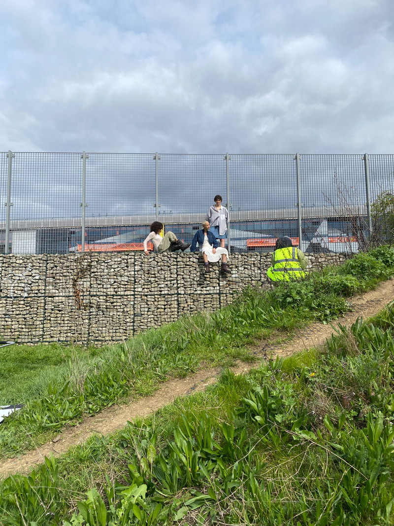
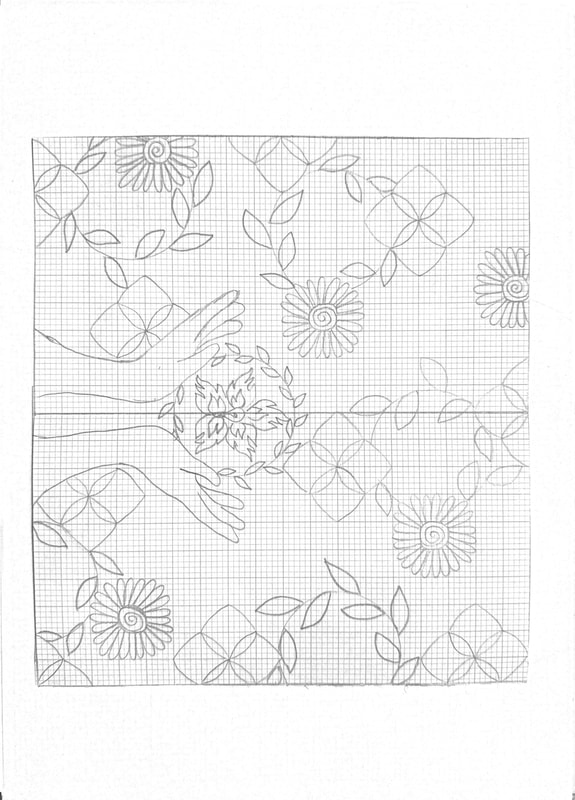
Today, I had the incredible opportunity to work on set with Lock Productions, a wonderful production company known for their exceptional work with fashion brands like Calvin Klein, Louis Vuitton and Gucci, as well as prestigious magazines like Vogue and Re-Edition. Today I was production assistant on a shoot for Dr. Martens worldwide summer campaign. When I arrived on site, I was plesently suprised by the meticulous attention to detail and the emphasis on sustainability. Before diving into my tasks, I received a thorough briefing on how to properly handle waste on set. I found this very interesting and it made me reflect on environmental responsibility and production, which can often overlooked in tthis fast-paced industry. The significance of conscientious waste management became very clear as the day passed. With the frequent use of single-use products on set, it was essential to handle them with care and dispose of them properly. The production team maintained a well-organized recycling system, with everyone encouraged to play their part in ensuring that materials were sorted correctly. Whether it was separating plastics from food waste or disposing of items in designated bins, every action contributed to minimizing our environmental impact. I was also impressed with the company's dedication to using recycled materials for all single-use products. This conscientious choice not only demonstrated a commitment to sustainability but also prompted me to delve deeper into Lock Productions' environmental initiatives. That same night when I got back home I looked them up online and discoverd that Lock is a certified B Corporation. At the time, I didn’t even know what a B corporation was. But I found out that as a B Corp, they meet rigorous standards of social and environmental performance, accountability, and transparency. Looking this up was wonderful beacuse I discovered and understood the company's genuine concern for their environmental footprint and their ongoing efforts to make a positive impact on the world. In conclusion, my experience with Lock Productions today has apart from being a dope shoot and having an amzing time, It. Beyond their exceptional work in the industry, they have demonstrated a profound commitment to environmental stewardship and sustainability. As I reflect on this experience, I am reminded of the importance of being mindful of our actions and the significant role that each of us plays in creating a more sustainable future. Working with Lock Productions has not only enriched my understanding of responsible production practices but has also reaffirmed my belief in the power of businesses to drive positive change in the world.  NEW AGENCY AND THE DESIGN INDUSTRY Being labelled as a "developing designer" rather than a "design student" places significant responsibility on you to meet your targets and take accountability for each step of your design process. This past year (completing my Diploma in professional studies), I have been given many opportunities to work on meaningful and impactful projects that represent my unique identity as a creative to the public. I am passionate about creating spaces that intertwine communities through identity, interactivity, and mindfulness. Through completing a two-month internship with AIR Architects, Valencia, I have gained knowledge and experience on translating concepts into tangible architectural forms, whilst considering the impact this will have on the surrounding communities. This gave me confidence to work with 3D briefs and explore my “new agency” with practical methods I have learnt with professional architects. In relation to design for branded spaces/spatial design, “New agency” is a term that could be linked to create work according to needs/requirements from people, the community you are designing for and the values you want to highlight, all while showcasing your individual style as a creative. “PRODUCTIVE PROCRASTINATION POINT” IN THE MAKING… For my self-initiated project (SIP), I wanted to address the concept of procrastination and introduce that it has the potential to be something positive or creative. Uncovering the issues surrounding this topic has been an intriguing journey as I have had to research into the psychology of procrastination before taking steps to develop my project. The beginning of a design project is always a simple idea that gets moulded into something more intricate as it develops. THE PROCESS With three dimensional installations, the challenge lies within the elements that fill the blank spaces and piece together to address a larger concept. The idea behind my SIP is to allow the public to interact with the space and feel motivated to overcome procrastination, or at least feel like they are using their creativity to participate in something for their community. This will be achieved through the element of interactivity in my design. By creating a mindfulness mural that interests people enough to stop on their way and participate towards the artwork. This SIP has taught me to create whilst being aware of people and their thoughts/interests, and not completing projects based on my personal interests or aesthetic ideas. Learning that “Aesthetics” doesn’t refer just to visual appearance, but also to judgments of what makes a sound, feeling, smell, or taste appealing,” (Gorp, Aesthetics and interaction 2012) allowed me to think from more than just a designer perspective. Reading “Design for emotion” by Trevor Van Gorp and Edie Adams bought my attention to focusing on how I will make interactive elements in my installation cater to a wide range of people. By working out the size of the space to make it accessible to all and the patterns/ themes I use to portray my concept were very key for the final outcome. Having Nicki Deux (an experienced eco-muralist) as my mentor for this project has given me insights on achieving a rhythm between different areas of my spatial design and planning of creating a larger scale model. By simply creating a 3D paper model of the mural within the space, I was able to learn that keeping the outlines bold and uncomplicated will be more impactful in a public scenario. Using core values on making a scale model from the 3 chapter of “Cure-All MurAll” (Deux, 2021), I created a mock-up that gave me a sense of how people would interact with it. This was the first successful steppingstone that allowed me to achieve an idea on how to improve the design and amplify the experience for users. LINKS TO THESIS My thesis will be all about South Asian identity and diaspora, this is something that I believe strongly links to my SIP as a large part of the “branding” of my installation includes hands with henna prints designed by me. This is a link to my values and personal identity as a designer while also being relatable to the idea of mindfulness, it will be recognisable to the public as this is a popular art form of South Asian culture. My goal as a designer is to implement small parts of my identity into the work I create to showcase the beauty of South Asian culture, this is a type of “branding” for me as a South Asian creative in the design industry and something that challenges the stereotypical values of spatial/installation design. Bibliography Gorp, T. van (2012) ‘Aesthetics and interaction’, accessed 29/04/24. Deux, N. (2021) ‘Chapter 3’, in Cure-All MurAll. Yinying Hu Graphic Media Design Introduction As a graphic design student, during my years at LCC, I have continuously explored myself and delved into various new areas, hoping to discover my interests and areas of expertise along the way. In this year of the DPS program, I have been fortunate to have the opportunity to immerse myself in the industry and learn first-hand, shifting my focus towards more practical, rather than experimental, design. During my first and second years of study, I would often conceptualize projects based on my preferences. However, upon entering the industry, I have come to feel more like a 'service provider,' constantly thinking from the perspectives of consumers and brand owners (commonly referred to as the 'second party'), rather than presenting myself as an 'artist' expressing myself to the public as before. Therefore, to continue the experiences gained from this transition, I have decided to pursue brand design, to be my own "consumer" and "brand side", so that I can understand this industry more deeply. In the context of my journey at LCC, this self-initiated project serves as a catalyst for exploring and shaping the "New Agency". Throughout the entire process of self-initiated design, from conception to final outcome, it is not only a part of academic curriculum but also a crucial pathway in shaping our design practice (Walsh, 2019). Through undertaking such a brand design project, I truly begin to grasp the depth of what it means to be a designer: it is not merely about executing prescribed tasks; it is about owning my creative process, embracing autonomy, and acknowledging the responsibility that comes with it. My "New Agency" represents a shift in mindset – from designing for the sake of design to genuinely considering the substantive utility of my designs. Through this project, my aim is not only to redefine my role as a designer but also to understand more broadly what design can achieve. I aspire to shape myself into a forward-thinking practitioner, capable of confidently navigating the complexities of contemporary design with purpose and confidence. And the choice to create a visual identity for a coffee brand stems from my love for coffee and my interest in the various packaging designs of different brands. Chengdu is where I chose to establish the coffee brand. This city is globally renowned for its slow pace and enjoyment of life, while Chengdu locals are beloved worldwide for their easygoing and relaxed nature (Meng 2022).  Gabriel (2022) Evening view of people sitting at an outdoor teahouse in Chengdu, camera destinations. Chengdu has had a tea culture since ancient times, and even now, you can see many teahouses on every street corner, where people leisurely sip tea or play cards and mahjong (G 2022). Coffee, as a global cultural symbol, is also becoming increasingly popular in China. Especially among the new generation of young people, who believe that drinking coffee can help them stay energized to cope with the intense competition and pressure in the workplace. Although there are already many coffee chains in China, such as 'Luckin' and 'Starbucks,' which focus more on low prices and rapid expansion through franchising, over time, this approach will gradually fade away (Jett et al. 2024).  Zhou, J. (2023) Multiple Luckin coffees on the table waiting to be served, XINHUANET. China's coffee market is currently in its infancy, with an annual growth rate of around 30% in coffee consumption, presenting enormous development potential compared to the international growth rate of around 2% per year. Freshly ground coffee and specialty coffee are highly popular among millennials and have been rapidly developing in China in recent years. Although they currently have a small market share domestically, focusing on high-quality coffee bean selection and the dependence of target consumer groups, they are profitable for long-term development (Interesse 2023).  Dufour, F. (2024) A barista prepares drinks at Metal Hands coffee shop in Beijing. The brand I want to create is precisely such a specialty coffee shop, focusing on quality and appealing to the new generation of young people. Therefore, shaping the brand image is not only a design challenge but also an expression of brand story, values, and consumer emotions. Thus, this SIP project is not only an exercise in design skills but also a deep exploration of brand strategy and visual communication, which will bring richer experience and insights to my design practice.  Package design for my coffee brand Here I must mention my employer, who is also my SIP mentor - Haohao Huang. He is the founder of Haohao Design and has provided brand design services for several restaurants, such as DOZO, Singapulah, and YIQI. When I discussed my SIP project with him, he offered me valuable advice, which made me understand how an experienced practitioner starts creating a brand's visual identity - understanding the product story background and market positioning are crucial. Only after grasping these aspects should one begin designing and determining the design style, rather than focusing solely on the visual aspect from the beginning. However, entering the real working industry, one's abilities are undoubtedly important, but mental strength is also essential. In my conversation with another design industry practitioner, Aurora, I learned that confidence is the most important and also the easiest point to collapse. Her friend once went without a job for six months, but she persevered and maintained her confidence, continuously improving herself, and eventually secured the job opportunity she desired. Doubting one's abilities can bring very negative consequences because finding a job is influenced by many factors, so there is no need to doubt one's abilities. This experience has taught me that continuous learning and self-improvement are crucial in the workplace. At the same time, maintaining good communication and interaction with industry seniors and peers are also essential. Bibliography
Walsh, J. (2019) Creating self-initiated projects &walsh, &Walsh. Available at: https://andwalsh.com/articles/all/creating-self-initiated-projects/ (Accessed: 29 April 2024). Meng, Q. (2022) People of chengdu in SW China enjoy life in Slow Lane - CGTN, CGTN. Available at: https://news.cgtn.com/news/2022-10-03/People-of-Chengdu-in-SW-China-enjoy-life-in-slow-lane-1dPaWyJJKeY/index.html (Accessed: 01 May 2024). G. (2022) Chinese tea culture in the fascinating city of Chengdu, Palmera. Available at: https://www.cameradestinations.com/blog/chinese-tea-culture (Accessed: 01 May 2024). Jett, J., Wang, R. and Liu, D. (2024) China’s stressed and overworked youth skip the tea and reach for coffee, NBCNews.com. Available at: https://www.nbcnews.com/news/world/china-stressed-overworked-youth-coffee-market-surge-rcna144402 (Accessed: 02 May 2024). Interesse, G. (2023) China’s coffee market: Production, consumption, and investor prospects, China Briefing News. Available at: https://www.china-briefing.com/news/chinas-coffee-market-production-consumption-and-investor-prospects/ (Accessed: 02 May 2024). INTRODUCTION DPS has provided valuable insights into the challenges faced by emerging creatives in gaining visibility within the industry. Inspired to address these issues, a collaborative self-initiated project, CHEERS, was born. Our team, comprising myself, Justina, and Joe, embarked on a journey to explore the dynamics between the creative industry and emerging talents. CHEERS BRANDING The branding process involved conceptualising visual elements that resonated with our project goals. We opted for circles to symbolise bubbles in drinks, aligning with our brand name, CHEERS. Each team member contributed to selecting coloUrs that reflected cohesion and individuality, culminating in a visually cohesive brand identity. 
PROJECT EVALUATION The project commenced with an analysis of the hurdles encountered by emerging creatives, particularly the lack of response or constructive feedback from agencies and brands. To showcase these challenges, we participated in the DPS Journey’s exhibition. Our campaign strategy involved leveraging drinks packaging space to feature artists' work prominently, aiming to catch the attention of brands and creative directors.
Additionally, we created satirical posters critiquing the unhelpful nature of rejection emails, emphasizing the need for constructive feedback. Drawing from personal experience, we integrated insights from Fiasco Design’s internship application feedback, highlighting the importance of showcasing skills.
(Image 3-5: CHEERS campaign poster at the DPS Journey’s exhibition) Drawing on my own experience, the only agency that got back to be with some sort of good feedback was when I applied to an open internship at fiasco design. One aspect of their feedback stood out to me which is the part about showing of our skills as emerging creatives. They advise to “take every opportunity to flex our skills” such as if we design, our emails should be designed and if we do motion, we should make something move in the email. CHEERS expanded into three segments:
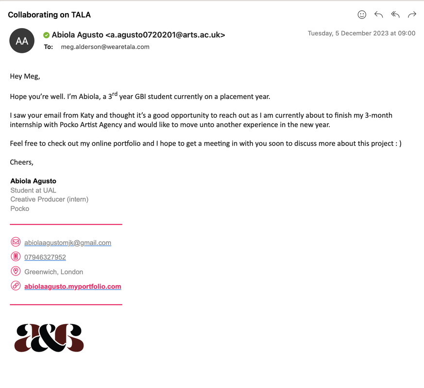
PERSONAL COMMUNICATION KIT (ABIOLA) CHEERS evolved into the concept of curating personalized branded communication kits tailored for emerging creatives, aimed at helping them distinguish themselves during the application process, recognising that "we only have 'one chance to make our mark'" (Toward, 2014). Venturing beyond the digital realm, we delved into the strategy of dispatching tangible printed materials via post to by pas getting lost in hundreds of email competitors. This strategic innovation was inspired by the practice observed among artists, who, in their pursuit of representation or job opportunities, send physical introduction to themselves to agencies like Pocko. Take, for instance, the case of Ema Ferreira, a versatile artist who meticulously assembled an envelope containing an A3 3-fold pamphlet showcasing her portfolio, accompanied by stickers and her business card. (Image 7: Ema Ferreira’s communication kit sent to Pocko) Pocko's agents promptly diverted their attention to her submission, engaging in a discussion about her work and subsequently incorporating her into their alternative roster. This example underscores the effectiveness of physical submissions in leaving a lasting impression amidst the sea of digital correspondence. Ema's approach not only showcased her artwork but also highlighted her distinctive personal brand, showing professionalism while offering a glimpse into her personality and artistic style, characterized by vibrant and bold color palettes that radiate reliability and playfulness simultaneously. This tactic inspired my SIP, fascinated by the concept that physical materials, such as those utilised by Ema, leaves an lasting impression on the recipient's memory, unlike digital communications that often become forgotten within overflowing inboxes. Furthermore, Design Dough advocates for leaving behind memorable artifacts, be it a look-book, a portfolio CD, or even a token reflective of the recipient's interests gleaned from social media interactions. This underscores the importance of creating a tangible connection when approaching creative agencies as an emerging talent (Design Dough, 2024). CHEERS explored the significance of cultivating a personal brand as an emerging creative—a pivotal factor in ensuring one's prominence among competitors. As Alyssa Omandac notes, "A strong personal brand is what tells employers why you’re a beneficial addition to their team" (2023). By crafting a visually compelling brands, emerging creatives are able to make that first good impression and heighten their chances of success. Such branding extends across various platforms, including email signatures, online portfolios, and social media, projecting an aura of reliability and professionalism. (Image 8: Abiola's personal brand)
CHEERS also explored creating a Poster Zine that showcases the artist skills, work, and links to their portfolio. Design Dough advises “don’t spend an absolute packet on getting your work printed…be a bit more inventive, creative and a bit more frugal” (2024), therefore a poster zine is suitable because while it remains cost-effective, it also serves as a lasting decorative piece within creative studios.
(Image 11: Abiola posterzine) Toward studio advises that when approaching an agency, the communication should be personalised and the tone should be appropriate as well, therefore the communication kit will be equipped with a designed postcard, similar to the design of image 12, which feature's the artist’s work on the back and a personalised message with the right tone of voice can be written on it. 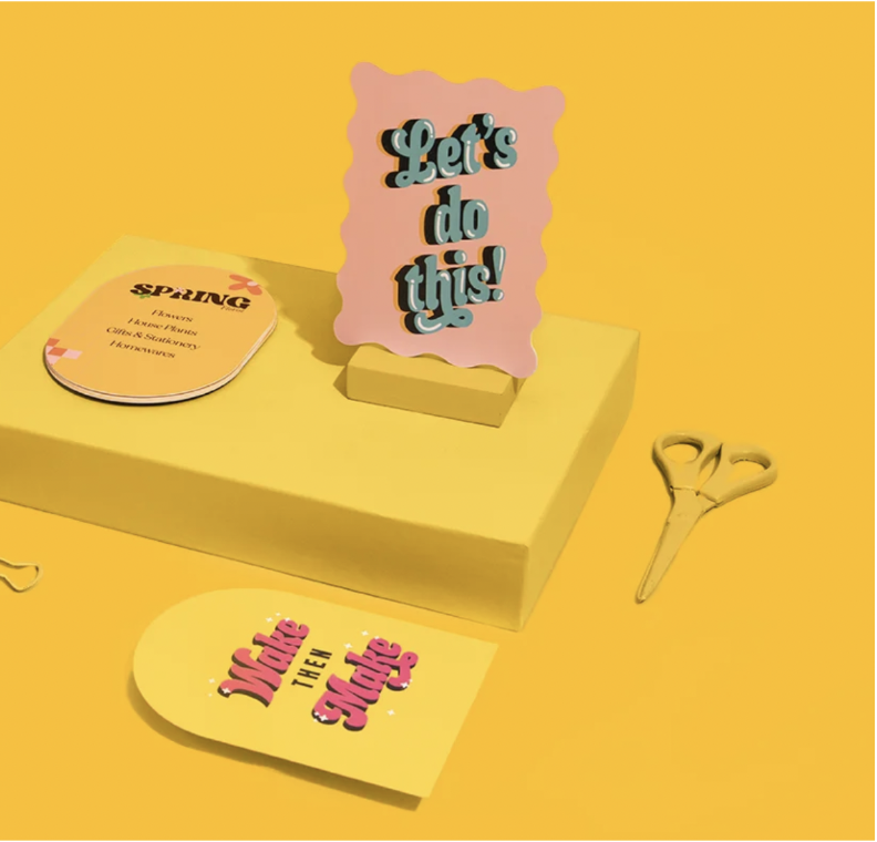 (Image 12: Example from printed.com) And finally for the communication kit, 5x5 cm vinyl stickers of the artist's work will be included because who can resist decorating their laptop with stickers, especially if you're in the creative industry? It's a nice strategy to remain in "arms reach" of creative directors and brands and increase the chances of getting a call back when an application is made.  (Image 13: Example from printrunner.com) WEBISTE AND APP DESIGN AND TEMPLATES (JUSTINA) When brainstorming our website concept, I aimed for a user experience that reflected our brand's essence while maintaining a formal aspect. I incorporated bubbles from our logo subtly throughout, avoiding literal brand placements. The site's color scheme, based on our brand colors, was strategically placed for optimal visibility. While the process is clear, future enhancements can refine user experience. The website design focuses on two stages: browsing packages and meeting the team. Users can view team members' specialties and portfolios, book consultations, and select packages. After selecting a consultant and package, users proceed to checkout, paying a £20 deposit for confirmation. Though more stages and possibilities exist, this UX represents our primary vision. It took time to balance visual elements without appearing childish, but I'm pleased with the result and eager for future enhancements. In line with website UX, I devised Instagram posts introducing our illustration design, team, services, and pricing, linking back to the website. This serves as a small glimpse of our broader social media strategy. 
 CURATED PUBLICATION (JOE) To finalize our SIP, I engaged in interviews with artists, which culminated in a book highlighting their craft and artistic ethos. This book serves as a companion to our project, offering multifaceted support to emerging creatives, while concurrently serving as a tangible embodiment of our ethos and the individuals we endeavor to represent. The publication of these magazines not only facilitates deeper engagement with both internal and external people within the creative industry but also serves as a catalyst for enhancing the professional trajectory of those we represent. Moreover, it affords collaborators a platform to assert their status as bona fide published creatives, a credential of considerable merit for bolstering their portfolios, curriculum vitae, and professional standing. In sum, this publication is meticulously crafted for those seeking insight into the emergent cohort of creatives, curated by and for the next generation to spotlight the luminaries with whom we grow and evolve.  As the contents of the magazine focus heavily on the individual, and how they wish to push their individual talents into the creative industry, I wanted to focus heavily on them more so than any other element, as while it is still a publication, it can almost double over as a catalogue for the new era of creatives. I want to highlight the individualism within everyone I photographed and interviewed, and as I believe personal style represents more than what you just happen to like, it was a definitive factor when doing my photoshoots. All in all, the book will be a stepping stone to help the next generation get their name out there, and act as a professional stepping stone for those who want to be recognised as anything more than a hobbyist, we want to highlight those who are going to be paving the way for the generation after them. REFERENCES Design Dough (2023) How to: Approch an Agency for the first time. Available at: https://designdough.co.uk/how-to-approach-an-agency-for-the-first-time/ (Accessed: 19/04/2024). Toward (2014) How to contact a design agency. Available at: https://toward.studio/latest/how-to-contact-a-design-agency (Accessed: 19/04/2024). Omandac, A. (2023) 'What is personal branding and why is it important?', Brand Fabrik, 30th June. Available at: https://fabrikbrands.com/what-is-personal-branding/ (Accessed: 19/04/2024) These are selected images from the photoshoots I have completed from young and emerging creatives. While Cheers can also be described as an advertising agency for these individuals, I wanted to create a heavily portrait orientated photo series/photobook, as seeing the person behind the portfolio creates a personal connection between creative and audience, which is something we wish to exude for Cheers.
Graphic and Media Design
|
||||||||||||||||||||||||