|
Madeleine Lin Graphic & Media Design 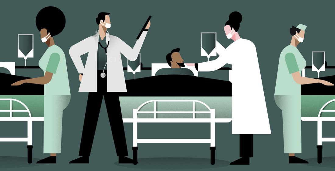 Stay Home, Save Lives by Studio La Plage for Mayor of London The coronavirus pandemic has impacted all industries, including designers and the design world. We in Studio La Plage shifted to remote working 2 weeks before the UK government made the announcement. The ways of working and communication have changed drastically due to the current situation, as well as the design industry landscape. A couple weeks later, I made the decision of leaving London and flying back home. Fortunately I was able to continue my placement in La Plage until the end of the contract as planned. The team decided to use the time difference to our advantage and be as productive as possible, that means allocate the workload effectively and regularly communicate. Below are some notes on working collaboratively from the director of La Plage during quarantine and isolation. - Communicate, communicate, communicate - Be thorough - Be ultra responsive - Be positive - Think of others - Be proactive (if you think a client / colleague needs something, ask - we want to prove that this won’t alter our approach) - Do amazing work (you have an extra hour sleep from your saved commute!) For communication, we experimented with Whatsapp, Google Hangout then finally settled with Slack, as it is the most effective tool and it works the best for managing projects. We have a daily meeting to start the day to ensure every team member’s schedule is organised and aware of any upcoming deadlines or projects. We are fortunate to work in an industry that can operate as normal in a strange time like this with the help of modern technology. Although our ways working and communicating have changed, I feel the team has gotten closer as we check in with each other not just about work, but our personal life as we put a greater focus on wellbeing . In order to keep some normality, we continued our tradition of Friday after work drinks virtually, set fun tasks and challenges for entertainment during lockdown. We also organised a run club on Slack to motivate each other by sharing our weekly goals and Nike Run Club. Writer, Tom May, interviewed a selection of creative agencies on how they’ve adapted new ways of working and habits in the pandemic, as well as their view on what to expect after returning to the office (May 2020). It is interesting to see how other design studios operate, communicate with the team and clients, working collaboratively during the crisis. Although working from home isn’t a new experience for me since in La Plage, we have what we called ‘Work From Home Wednesday’, it took some time for me to balance work and leisure, as well as switch to a new mindset. Sometimes you can get easily distracted as you are in a much more relaxing environment. With the time difference, it was even more important to organise my daily schedule wisely and not to impact mine or other’s work. The experience of working in the pandemic has been great for me as it helps me build self-disciplines and provides an insight on what it is like working from home. I had the opportunity to work on some fun ‘Stay Home’ social projects for La Plage’s sister brand Plates, introducing some exciting vegan recipes to inspire people making healthy food during lockdown.
There is an interesting article I read a while ago, written by senior story producer Diana Budds called Design in the age of pandemics. Budds explores how design and physical living spaces have been used as a primary defense against infectious disease in history through research and case studies. “...with new diseases emerging, like COVID-19, and no vaccines or cures to fight them, one of the most effective solutions is to go back to the physical: social distancing, quarantine, isolation, and, perhaps, adaptations to our cities, neighborhoods, and homes.” Budds researched how quarantine was like in history - For example, Astronauts from Apollo 11 stayed in an Airstream trailer after they returned from the moon; Crew members on ships were required to anchor for 40 days during the Black Death. As Covid-19 continues to impact our lives, design plays an important role on how inhabited physical space will adapt to this new way of living. References
Budds, D 2020. Coronavirus: Design in the age of pandemics, Curbed. Available at: https://www.curbed.com/2020/3/17/21178962/design-pandemics-coronavirus-quarantine [ Access: 18 April 2020] May, T. (2020) What to expect from post-pandemic work culture in the creative industries. Available at: https://www.creativeboom.com/tips/what-to-expect-from-post-pandemic-work-culture/ [Access: 12 April 2020]
0 Comments
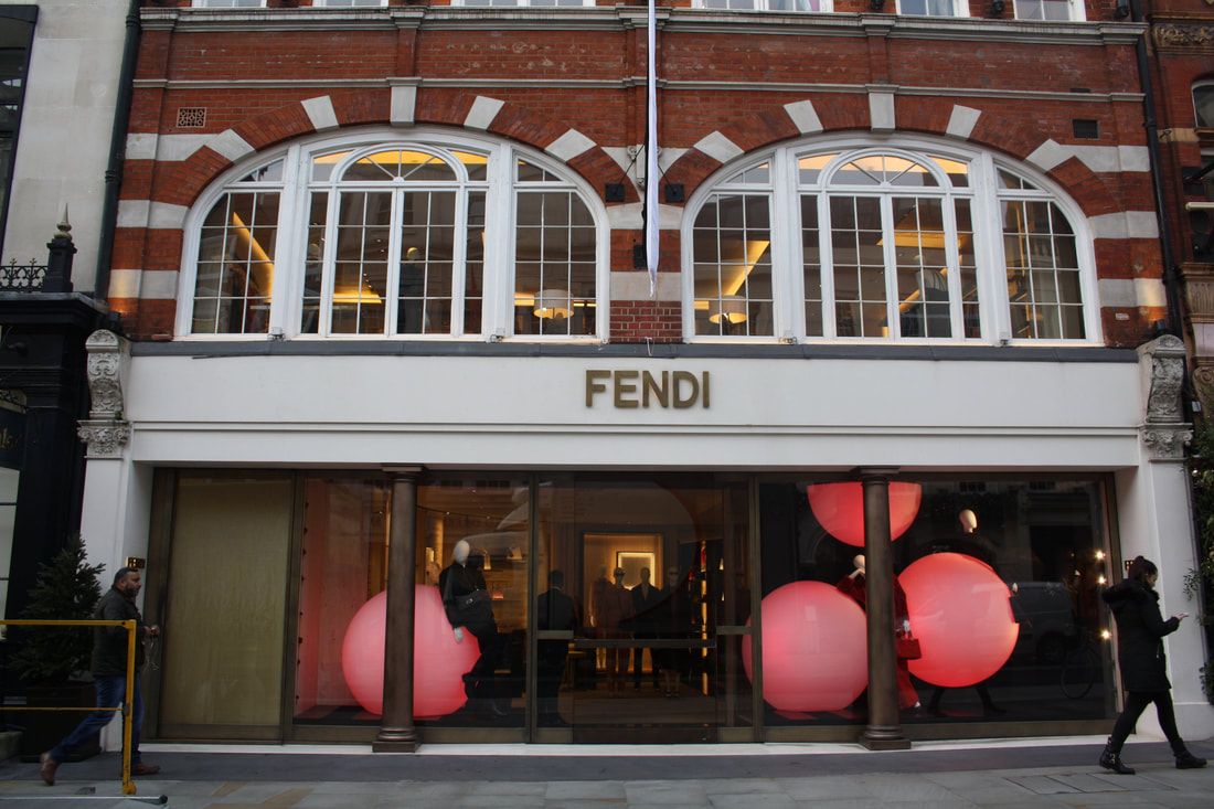
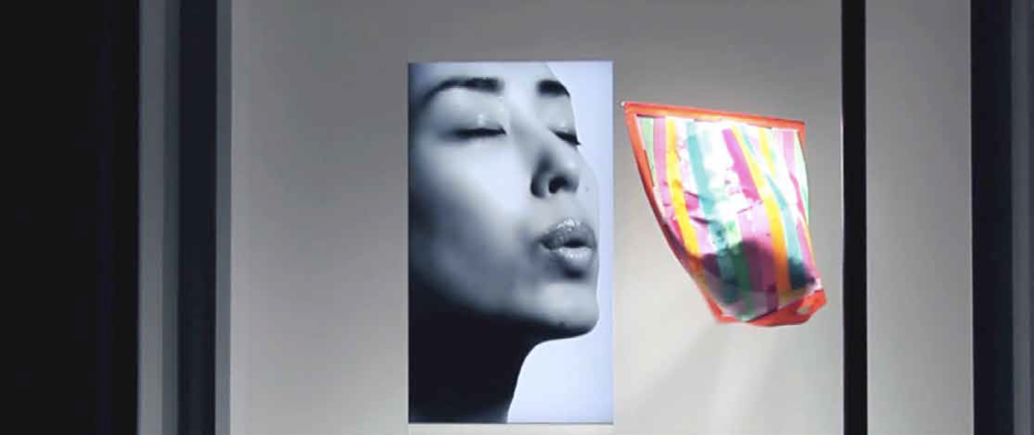
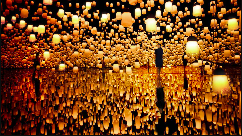
Written and illustrated by Nino Meriano At Sapient Social and Environmental Enterprise, we look to make the future a better place. With this world crisis in the form of a pandemic, now more than ever we need to focus on this goal. There was never a question of stopping our work at Sapient; there was only the question of how we adapt and continue our work. Being part of the design team at Sapient, we have found it easier to work remotely from our own homes, as design work can be largely done digitally. However, it is still not without its challenges and obstacles to overcome. A large part of what we do at Sapient is collaboration; whether that is with other companies or with our internal team, we can only reach our goal of a more sustainable and socially just future together as a nation, a society and human race as a whole. When the news of Covid-19 started to develop, there were concerns about how we could continue to work as a team, while there were lots of people traveling from different parts of Holland. But in Sapient the people come first, so safety of the employees was at the top of the priority list. Gradually the news got worse and the virus was reported to be in the Netherlands. The government instructed a large majority of workers to stay and work from home when possible. The number of cases here started increasing, forcing more and more businesses to shut their premises, stopping a lot of people from working. The office had to close, but everyone in the Sapient team looked to move forward with their work. We all wanted to find a way to continue, however challenging the task. Transitioning to working remotely, it is difficult to synchronise everyone’s schedules and routines, and even harder to keep focus and drive. Creating a system that keeps that sense of community, which everyone at the company loves so much, is also challenging when you cannot speak with your colleagues face to face. Nevertheless, there is always a way to work around these obstacles and adapt to the situation you are confronted with. Eleven o’clock every Monday morning, we have a Sapient assembly with everyone from every department of the company. The assembly starts with a “check in” where we go around each individual employee, saying their name in full an event or task they did in the last week and anything that is on their mind that may take them away from being present in that moment. We then go over the main projects and ventures of each department and any important events, so the whole company understand what direction we are moving and how we are all progressing. We have moved this process to an online Skype call at the same time every week, and then throughout the week we have meetings with our individual departments and any departments that are working on the same projects. Although this is not quite the same, it encapsulates the feeling of community and helps us stay motivated and focused on our work. Starting with this meeting on a Monday helps us begin the working week and get into a routine, while also giving us energy to keep going in such strange and challenging times. As certain aspects of the company involve collaborating in person, it has put a hold on certain projects, but it has also allowed us to find time for things that we didn’t otherwise have the time for. The main focus of Sapient are sustainable and environmental projects. The design team not only create the visual identity and brand of the company, but work with external clients and projects that help fund the amazing work that the team here at Sapient do. As the coronavirus came about, the design team were finishing a big project working on a website for an external client. Learning a lot from this project we have had extra time as a team to reflect on what went well and what didn’t. It’s given us a lot of time to self-reflect on the project, allowing us to create a more efficient and effective way of working in the future to achieve the client’s needs and goals. Looking how the team has adapted, it is incredible to be involved in such a great community of people. A perfect example is how our event and relations team have adapted to creating online and digital events, while also helping other departments such as social media and marketing/talent coordinating. Looking at both ends of the spectrum with the administration of the company and the employees, it has been a great learning process for me to see how we have all adjusted to the new working circumstances. It is also important to say that Sapient is a democratic social business, which means from the newest intern all the way to the founder, we all have an equal say and contribution in the direction of the company. As an intern myself it has been a great opportunity to take on responsibility and show how valuable my insights can be to the company. This is largely down to the fact that Sapient allows for this to take place, trusting and encouraging everyone to step up and listening to every team member’s opinions. Moreover, I believe this is one of the main reasons that we as a company have been able to adapt to the global pandemic.  Alongside working at Sapient Social and Environmental Enterprise, I have been building a business called Corporate Comics. This business is focused on ‘VISUAL SEQUENTIAL COMMUNICATION’. This is a form of communicating and storytelling through imagery. Working on a range of projects alongside my internship, I have had to manage my time efficiently and effectively. Because of the pandemic, now more than ever it is most important to stay focused, motivated and determined so I can meet my goals. To balance and achieve success in all these areas, I have found it beneficial for me to stay active, eat correctly and have a routine. To continue setting high standards for myself while continuing to go after it every day, no matter the obstacle. Emily Hawes Graphic and Media Design My 2nd DPS WOW post shares a selection of my discoveries of playful, interactive design experiences, particularly in retail. As I recently spent 6 weeks interning with an in-house creative team at Hobbs London, a women’s high street fashion brand. Reflecting on design’s purpose I have come to realise it can show the infinite possibilities, transport you to another world with alternative thoughts and feelings, where different rules apply that allow your perspective to widen. In an often unforgiving and inflexible reality, I believe in purpose of showing others a sense of optimism. Play, fun and fantasy. Words typically associated with youth. It is widely believed that gaining an adult status means leaving behind your child-ish behaviour. However, we should hold on to our child-like approach, especially in design. You retain wonderful attributes such as imagination, desire to explore, and curiosity. Additionally a child-like world is viewed with positivity, openness and enthusiasm. These traits are so often forgotten that many have to be reminded to adopt them by searching Pinterest quotes. A person who famously held on to their inner-child was Walt Disney. Reading his biography, I found his aspirations and resilience to provide everyone with nostalgic, enjoyable entertainment during a post- depression society remarkable and I can not deny that his enthusiasm was nothing short of contagious. It reminded me that we crave to be transported even for a moment to that sweet-spot feeling when responsibility meant ensuring that the fort built in your living room was well guarded from ‘pirates’ or that the ‘fairies’ received a prompt letter of reply at the bottom of the garden. During my research of retail environments and art I found I have not always appreciated these display as I hurrying through life. I would be so focussed on buying a particular item or walking as quickly as possible from A to B that these amazing designs become vapours of passing acknowledgment, lingering for a moment but quickly disperse and disappear. However there is a such variety of innovative experiences, all there in forms of “instgrammable” visuals, outrageously ostentatious installations on buildings, fantasy zoos in windows and even a window display vaguely resembling a giant ball pit on the moon. To start off, Fendi’s store in New Bond Street illuminated giant 3-D spheres remind me of a zero-gravity, giant ball-pit or of a hypnotic opening sequence of a spy film. It transports you to another place or possibility in time. As it is abstract, you’re invited to create your own context or simply embrace emotions and feelings felt from the mood lightning. This is beautifully translated on Fendi’s website as an interactive digital experience. As you move your curser the sphere’s respond by colliding and gently bouncing off surrounding spheres. The digital spheres were so memorising I quickly became addicted to popping back to play with the site. edit. Fedi’s store New Bond Street. Hawes, E (2019). and Fedi’s website homepage.Fendi frl (2019) A similar approach can be experimental digital artists like Neil Carpenter whose design , ‘Acii Trail’, produces clouds of code in response to moving the curser across the screen. New possibilities shown through design are not always physical, some require imagination. Selfridges floral window displays promoting Apple’s iWatch encapsulates passers-by with its hand painted and meticulesly sculpted grand-scale flowers instillation. I’m reminded of Lewis Carroll’s ‘Alice’s Adventures in wonderland’, particularly the moment the recently shrunk Alice meets the enormous flowers. There is something about playing with the scale of an object that reminds me of the a child’s perspective in which world appears a much larger place and in that there is a respect for it.  Selfridges’ elaborate window display promoting the release of the Apple iWatch. Klingelfuss, J. (2015) Some retail brands don’t rely on imagination but choose to actually recreate an experience.The Museum of Ice-cream aims for people to feel joy using through ice-cream. Most people have positive associations with ice-cream for a start, but It states on their website that the museum “transforms concepts and dreams into spaces that provoke imagination and creativity”. It is wonderfully refreshing to see design used this way, where it simply encourages you to revert to your youth and give you permission to have fun. Museum of Ice Cream ( 2020 ) Their Instagram page is worth an aesthetically satisfying scroll Continuing the ice theme, Canada Goose’s concept store in Toronto provide a multi-sensory immersive experience combining physical and digital. The Cold Room operates between 0° and -13° Fahrenheit with actual snow and a 360 degrees digital display of the snowy environment with aim to demonstrate the warmth factor of its jackets. All resulting in a physical and emotional connection to the brand. Could this be a glimpse into future of retail? Canada Goose’s concept store in Toronto. Gault, B. (2019) The divide between physical and digital worlds are increasingly disappearing with interactive displays utilising both to create enhanced experiences. Hermes’ collaboration with Japanese designer Tokujin Yoshioka in 2009 produced an installation expressing the natural beauty of the scarf using two videos where each person blows on scarfs in turn to make them flutter. It really demonstrates that entertainment can be wonderfully simple such as the joy felt as child when blowing on a paper windmill. Hermes collaboration with Tokujin Yoshioka stills taken form artist’s YouTube account tokujinyoshiokamovie (2009) Available at: Youtube: https://www.youtube.com/watch?v=gyNHJQzn3pw You can get lost in virtual world of ‘borderless art’ at the digital design museum in Japan. This vast, 10,000 square meter, 3-D world of immersive digital artworks created by ‘teamLab’. You could lose yourself in the ‘Forest of Lamps’, see flowers bloom inside tea cups, be invited to draw in aquarium and virtually feed the fish, or be part of the warp in space and time by jumping or sinking on flexible surface to attract stardust and witness the life cycle of star. I really see this being a great tool for learning, memory, and positively affecting mental health. Top Left: teamLab Borderless(2019)Flutter of Butterflies Beyond Borders, Transcending Space – Floating Nest Top Right: teamLab Borderless (2018) Multi Jumping Universe Bottom Left: teamLab Borderless (2018) Universe of Water Particles on a Rock where People Gather Bottom Right: teamLab Borderless (2016) Forest of Lamps There is much to take from our youth, but the great part of being an adult is you have the tools to visualise your wild imagination. I may have started by looking at retail, but I see so many other sectors benefitting such as education, health or even offices can adopt digital rooms to immerse and relax. The coming together of digital and physical platforms allows this are there are is some exciting interactive and emotionally engaging experiences that prove graphic design can have a meaningful purpose by creating ‘new worlds’ that project optimism, possibility and allows you to embrace your inner-child. Bibliography
Books
Webpages
Trish Phng Illustration & Visual Media This last leg of my DPS year was not how I saw things play out in my plans. The scale of how bad the virus had on the world had taken me by surprise and it to be honest, left me a bit stunned initially. The biggest impact for me was that I had to return to my home country Malaysia, and had to in a way cut my internship at ISCA short, this was quite worrying because it was at this time I did feel very uncertain about how the rest if my DPS year would be like. However, ISCA and I have been keeping in contact with me and had asked me to be on standby with working with their online team once they have everything established, I was assured that I would still get paid. So, the last half of March and the entire month of April I was without any paid work. But because of this situation I had managed to focus more of my energy into my Self-Initiated Projects (SIPs). There were some projects that had to be changed a little, such as creating my Zine with my prints alongside it, because I was unable to pack my press with me, I decided to create some digital mock-ups first, with the texture and colour of how I visualise the outcome will look, and create a digital prototype of the overall zine so people will have a better understanding. Doing this had resulted in me questioning if I am able to create the digital outcome of my image, then why do I need to go through the process of creating physical prints, only to scan them in and format them to the zine layout. But to counter that would be the overall look of my outcome, I feel that it would take away an extra depth to my work visually of it were to be completely digital. Though there is nothing wrong with digital outcomes, as someone who wants to encourage the use of analogue printmaking to future generations, it is important to show how they can elevate your work even if it does take more time to do so. It can be seen as another learning process of how one can manage/ plan their time.
Apart from that, the two other SIPs that I have been also working on are my Impressionist comics, and my bespoke celebration cards that I am planning on turning into a business. The impressionist comic has taken a different turn during this pandemic. As I found out about a short story contest that Webtoon, a very popular webcomic platform, was hosting. The impressionist comic that I had been planning gave me inspiration for what kind of story that I wanted to make for the contest. Story-wise, it has taken a different turn from what I had originally planned, such as we are following a new protagonist in the Webtoon story, and the main cast of my impressionist story has become a supporting cast instead. But I do still want to continue my current storyline once I have completed the contest story. I have been enjoying working on the webcomic, because I feel that it is helping me gage how fast I can complete a comic chapter, without losing the quality of the work. All these information has been helpful for me as I am planning on creating a bespoke card business, where I create personal comics for my potential customers. In this business, I am planning on creating short comics that will cater to short stories that ‘my clients’ will provide for me and I will visually interpreted. To see the full webcomic, click on this link --> https://www.webtoons.com/en/challenge/the-best-we-can-h/list?title_no=429681
I feel that this contest has given me a better understanding of how much work I will need to put in if I am going to truly commit to trying out this business. With this mindset, I have also been gathering more information on other independent creators such as Fran Meneses and Kristyna Baczynski, respectively known as @Frannerd and @kbaczynski on their social media platform, and many other creators, on their ways of working and how they present themselves and what ways they use to sell their works. In this aspect, the lockdown has given me the time and opportunity to push my personal projects forward, and has allowed me to have a better understanding of how much I need to mentally prepare for the type of career I’m pursuing.
During of all this, ISCA had contacted me again and asked about working with their online team. Because I am not able to teach students physically due to the situation we are in, I along with other members of staff, was tasked with finding a good sharing platform online for students to upload their work as a way to connect and share their ideas/outcomes aswe are all separated during this time. Of all the platforms discussed, the two most popular ones were Pinterest and Wordpress. Pinterst being a good platform where students can share ideas and inspirations as well as works they have been making while on lockdown, and all works can be organised in different themed boards, where Wordpress would be a platform where students can give a more in depth reflection on their creative development of their projects and it can also be another platform for them to create their online portfolio, as Wordpress can also a site where you can make your own websites.
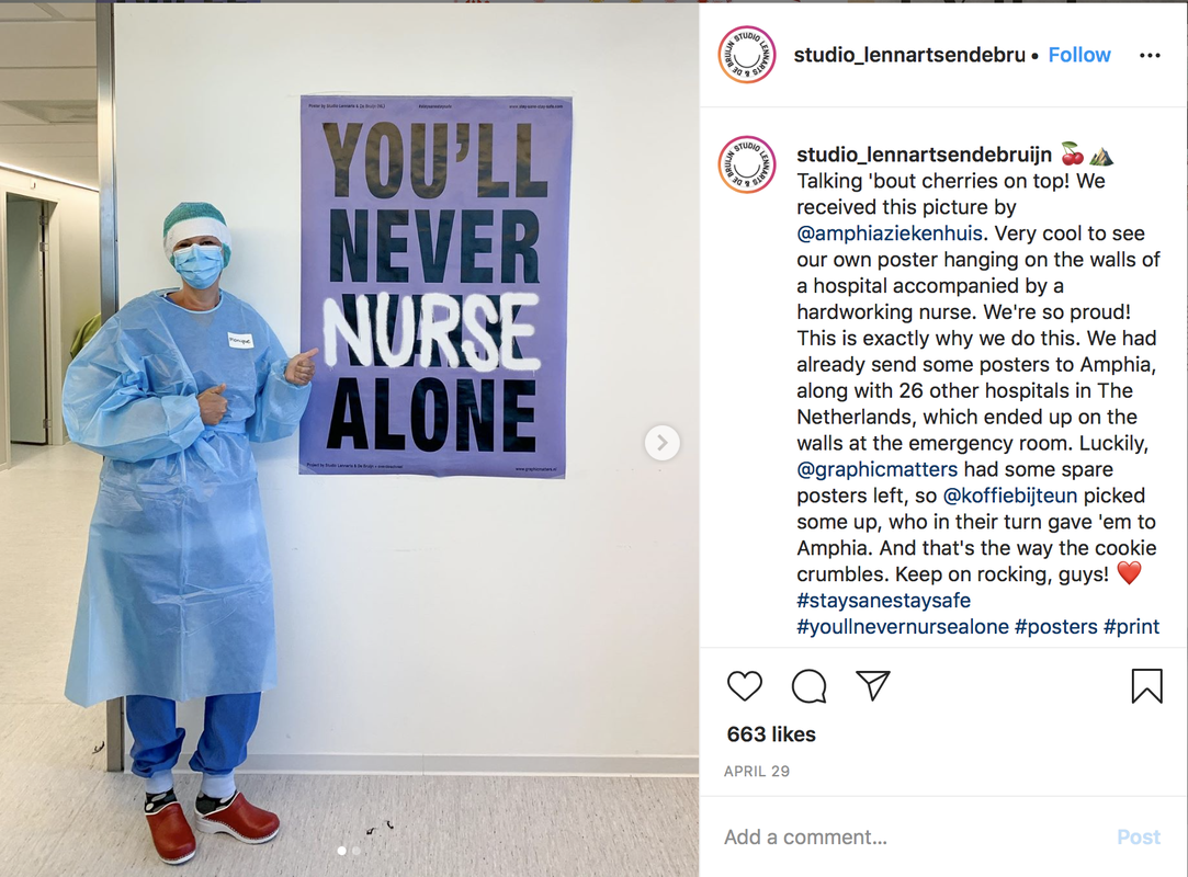
As a member of the online team, what I will be doing is to help monitor what the students post on the platform and make sure it is not inappropriate in anyway. I am happy to be working with ISCA again because it means that I would still be having some source of income, though it is a little less than before. This last leg of my DPS year have taken a huge and unexpected turn for me, and even though I was blindsided but this initially, I am proud of myself for not panicking about it too much and managed to get back on my feet and adapt to the situation. If there is anything positive that I learnt from this situation was my capability of adapting to unexpected outcomes in more ways than one. I had also made me more confident in communicating online with colleagues and has also given me more initiative to check my emails regularly. This may not be how I had planned my final months, but I, along with the rest of my fellow DPS students, will make the best if it. Zen Quek Illustration and Visual Media The coronavirus outbreak has forced the world into a standstill, yet despite such turbulent times, creativity continues to thrive within the design community. Its been heartwarming to observe how creative communities have been supporting one another, resulting in a surge of collaborative projects. The Nationwide Degree Show was one that instantly piqued my interest, as it hit close to home. The project, launched by a trio of London-based designers, is focused on offering this year’s art and design graduates a chance to have their degree show work displayed on billboards across the UK. It’s comforting to know that my third-year peers, and other creative graduates, can still find outlets to have their work appreciated and seen by the public, whether online or in public spaces. Similar instances of mutual support between creatives can be seen in collaborative initiatives like the Indoors Zine, launched by It’s Nice That. The free-to-download publication features works by 20 creatives from across the globe, documenting life in quarantine through humorous and fun imagery. While this project may seem like a lighthearted, casual collaboration, I believe there is a lot of value in documenting individual experiences from this unprecedented time in history, whether that be doodles about awkward encounters with your neighbour or more sombre artwork that captures this pandemic’s grim realities.  Illustration by Tom Guilmard. (Indoors Zine, 2020) Creatives worldwide have also been rallying to create design for the people, and it is now more than ever that we can witness the power of art and design in sparking social change. The Group typeface project for instance presents an interesting way of merging creative output with charitable efforts. Group is a collaborative fundraising project involving 37 designers, illustrators and typographers from around the world. These image-makers have collectively developed the Group typeface, an eclectic display of character and artistry. Funds accumulated from the launch of this typeface will go to the World Health Organisation.  Group’s eclectic typeface (Group font, 2020) Raissa Pardini, graphic designer and coordinator of this project, shared that in honouring the spirit of collaboration, the creatives involved were not given much direction on what sort of aesthetic approach to take when designing their alphabet. The only rule was to avoid using forms that allude to the virus or pandemic in any way. Pardini explained, “I wanted to stay away from that negativity and just highlight the fact that we were working all together.” This project is a prime example of how design can make tangible differences, especially in times of crisis. Other ways that design has proven to effect change is through boosting morale. Interestingly, posters have been popularised as the go-to format for many community design projects, exemplified by the wealth of poster designs shared online. While majority of these designs are circulating digitally, eye-catching posters like this one by In Good Company are also appearing in public spaces.  Morag Myerscough’s billboard display in Leeds (In Good Company, 2020) Perhaps one of the most notable community poster design projects around is the Stay Sane, Stay Safe initiative, the brainchild of Studio Lennarts & de Brujin and overdeschreef. The initiative calls upon image-makers from all over the world to contribute poster designs that are accessible to the public, so that uplifting messages of positivity can be spread to frontline workers and communities worldwide. The project has proven to be immensely successful, with over 1926 contributions from 85 countries. On a more localised scale, here in my home country, design agency Kinetic Singapore has kickstarted a similar community design project titled #ThankYouDeliveryHeroes. The studio released free-to-download posters online, encouraging local residents to print and paste these posters on their front doors as a sign of appreciation to delivery workers who have tirelessly worked through our lockdown. With so many amazing displays of design responsibility, its only natural for creatives to feel the pressure of having to produce outstanding and compelling works, or emerge from quarantine having churned out a mass of creative outputs. These concerns were discussed by illustrators Saehan Parc and Kate Isobel Scott when they spoke to It’s Nice That, revealing ways in which they cope with staying motivated while the rest of the world is on pause. Both artists admitted to feeling somewhat lost amidst shifts in their professional environments, but have found comfort in adopting more relaxed approaches to their creative practice. Reading about these experiences provided me with some reassurance, as I could definitely relate to the anxiety around being productive while stuck in quarantine. Still, I have tried to keep myself engaged in little ways, like developing a series of fashion illustrations inspired by the “covid-19 airport fashion” I observed while in Heathrow.  Illustration of a stylish couple I saw, wearing hazmat suits at the airport. Learning about how other creatives are coping with the pandemic has been inspiring to say the least. Community design projects have served as stark reminders of humanity and the spirit of resilience in these dark times. Ironically, and amazingly, despite being so physically distanced, the design community has united over this crisis in a flourish of collaborative projects across disciplines and across the globe. The amount support and creative outpour is undeniably infectious — as a fellow illustrator, I feel as though I’m being called to my place in this global network of creatives, and who am I to refuse it?
Biblography: 1. Bourton, L. (2020) Does a creative routine matter when the world is turned upside down? Available at: https://www.itsnicethat.com/features/dropbox-creative-routines-kate-isobel-scott-saehan-parc-alexander-coggin-partnership-230420 2. Steven, R. (2020) HOW COVID-19 PROMPTED A RETURN OF THE POSTER. Available at: https://www.creativereview.co.uk/posters-covid-19/ 3. Brewer, J. (2020) The Nationwide Degree Show offers grads billboard space to show their work. Available at: https://www.itsnicethat.com/news/nationwide-degree-show-creative-industry-140520 4. Williams, M. (2020) Designers from across the world contribute to Group, an eclectic charity typeface. Available at: https://www.creativereview.co.uk/group-font-coronavirus/ Media References: 1. Indoors Zine (2020) [Screenshot] Available at: https://www.itsnicethat.com/features/dropbox-indoors-zine-publication-photography-illustration-140520 2. Group font (2020) [Screenshot] Available at: https://group-font.com 3. In Good Company (2020) Available at: https://www.creativereview.co.uk/posters-covid-19/ 4. Stay Sane, Stay Safe (2020) [Screenshot] Available at: https://www.instagram.com/studio_lennartsendebruijn/ 5. Kinetic (2020) [Screenshot] Available at: https://www.thankyoudeliveryheroes.com 6. #ThankYouDeliveryHeroes (2020) [Screenshot] Available at: https://www.thankyoudeliveryheroes.com Daisy Aldridge IVM 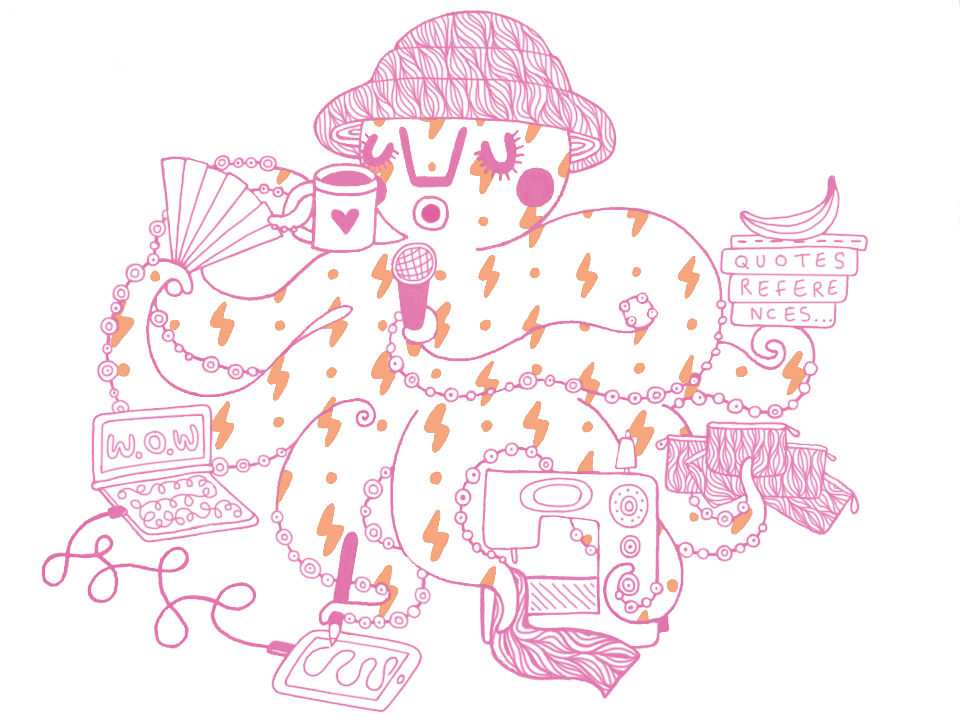 (Fig 1, Aldridge, 2020.) This terms octopus represents me in full panic mode, trying to get everything done at once and sipping on a nice tea at the same time. My plans have changed a lot in this crisis, I had planned to spend these last month’s exploring internships but find myself in a pandemic with 2 highly vulnerable people which effects all of our day to day lives (we have started washing the post). I suddenly have a lot of time on my hands, I have had to close my Etsy store during this time, which means a pause in cash flow but has meant I can focus on reworking products/packaging and looking into how I can be as sustainable as possible, I have begun looking into recyclable and eco-friendly products. A very big interest at the moment is fabrics made of bamboo. Pre pandemic I would find myself going to the nearest fabric store for a cheap metre of something made really badly and of 100% polyester, and now I have been able to save the money I would normally spend on travel or coffees and invest it into more eco-friendly and socially responsible fabrics, 100% organic is the aim now. One of my favourite things to come out of this pandemic is the memes and the street graffiti, my father lives in central London and he bikes around for hours every day taking portraits of the people in lockdown, photos of graffiti and street art, which he documents on his Instagram. (Fig 2 - Aldridge, S, 2020) I made him some business cards to be able to give out, for this project I looked at what makes a person’s card memorable and thought a depiction of the person themselves would make them pretty impossible to forget.  (Fig 3 , Aldridge D, 2020)  (Fig 4 , Baker, G, 1978.) Something a bit more controversial that I have been learning about is the current use of the LGBTQ pride flag. American artist Gilbert Baker was a gay rights activist and creator of the rainbow flag, a symbol used to represent LGBTQ pride. The pride flag is a symbol of lesbian, gay, bisexual, transgender and queer pride and social movements. Baker, who died in 2017 at 65, chose not to trademark the flag, which became key to its circulation to the LGBTQ communities around the world.  (Fig 5, Baker, G, 1978) Its first debut was in 1978, it originally had eight colours each with a different meaning, but due to demand and unavailability of fabrics, two colours were removed. This is how we got the six colour flag that we all know today.  (Fig 6, 1933) The LGBTQ flag was designed as a substitute for the ’pink triangles’, which represented a dark period in the history of same-sex rights. Originally created by the Nazis during the second world war, the pink triangles were used to identify and condemn homosexuals, these functioned as a Nazi tool of oppression. Although in the recent pandemic, the pride flag has taken on a new meaning. Early on in the lockdown people started hanging drawings and pictures of rainbows and in their windows, specifically pride flags. Which was quickly taken on by businesses, using the LGBTQ symbol to show support for the NHS, and to show that we are together and united in the crisis. There has also been a new avenue for revenue for sellers on eBay, LGBTQ flags are being resold as thank you NHS flags.  Fig 7, Milton, J, 2020)
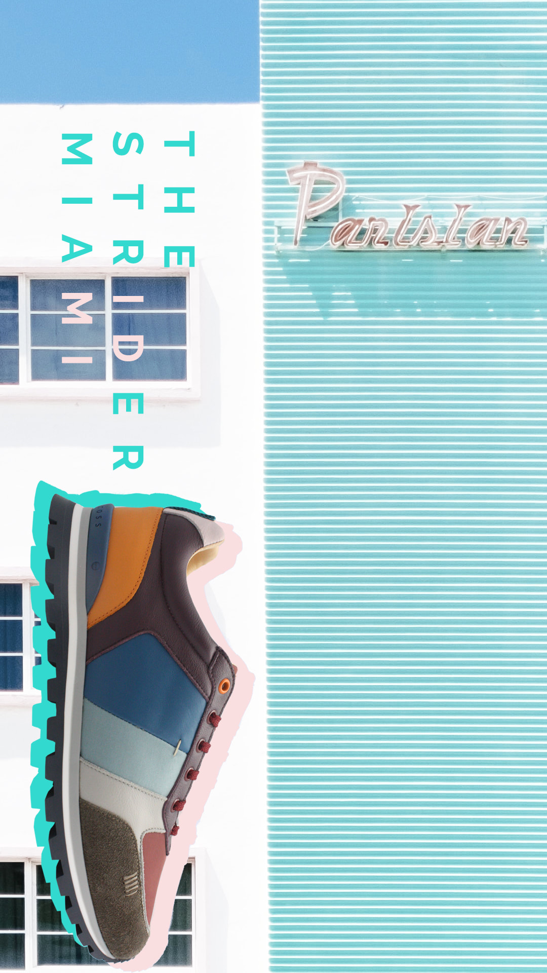
The problem here is that there are now two very different causes using the same symbol, Can it be seen as erasure that a flag that represents years of LGBTQ struggles has been re appropriated for the NHS? Should we be worried that it could be erased of its meaning? Or should it be accepted that the pride flag is being used temporarily for the NHS to represent hope in such a difficult time? The LGBTQ flag has six distinct colours, red, orange, yellow, green, blue and violet- a specific correlation of colours, designed by Gilbert Baker, and a normal rainbow has seven. "There could be so many replacements for what people could use as the NHS symbol. Maybe a blue flag with the letters NHS on it, a full 7 coloured rainbow flag, a white flag with an actual image of a rainbow on it, a flag with the NHS colours (blue and white).’’ (Fig 8, Wareham, J, 2020) Of course no one owns the rainbow, but why is the 6 coloured flag invented for the LGBTQ community being used? Why not the normal 7 coloured rainbow? It is being used for a great cause but this act is leaving some in the LGBTQ community feeling anxious about whether they are losing their symbol. To the LGBTQ community, the flag represents a battle for basic human rights. Daisy Aldridge BA (Hons) Illustration and Visual Media @illustrateddaisy Fig 1 – Aldridge, D, 2020. Octopus number 3 [image]. Fig 2 – Aldridge, S, 2020. Photographs [images] Available at: https://www.instagram.com/r3cycl3r/. [Accessed 13th of May 2020.] Fig 3 - Aldridge, D, 2020. Business Cards [image] Fig 4- Baker, G, 1978. Pride Flag [image] Available at: https://gilbertbaker.com/rainblow-flag-color-meanings/ [Accessed 10th of May 2020] Fig 5- Baker, G, 1978. Pride Flag [image] Available at: https://gilbertbaker.com/rainblow-flag-color-meanings/ [Accessed 10th of May 2020] Fig 6, 1933, The Pink Triangle [image] Available at: https://en.wikipedia.org/wiki/Pink_triangle [Accessed 11th of May 2020] Fig 7, Milton, J, 2020. NHS Flag. [image] Available at: https://www.pinknews.co.uk/2020/05/06/nhs-rainbow-flags-ebay-thank-you-lgbt-rainbow/ [accessed 12th of May 2020] Fig 8, Wareham, J, 2020. [Quote] Available at: https://www.forbes.com/sites/jamiewareham/2020/05/27/petition-calls-to-change-symbol-for-nhs-from-lgbt-pride-flag/#17bc32d23db5 [accessed 12th of May 2020] By Ethan Muscat GMD 2020 was the year I originally thought I had mapped out perfectly, set up for me to stride along the rest of my internship and into my final year of university ready to graduate next year, 2020 had other plans for myself and the rest of the world. The global pandemic has changed the way we view are entire outlook of life, we can no longer see close friends or family outside the household, we are unable to go into a work environment or to go travelling around multiple cities in hopes of gaining that thirst of inspiration that usually is all around us, we are now confined to our electronic devices and the four walls that protect us from contracting the disease, COVID-19. For many of us this will put a dent in our plans we were starting to put together in preparation for our return to university, now we just have to hope that things get better before they get much worse. Being a graphic designer, I am lucky enough to be in a field of work where most of it is digital so since the lockdown happened I have been able to carry on working as normal from the comfort of my bedroom - during the first few weeks of doing this, I definitely was lacking motivation in all aspects, I’m constantly surrounded by the things that I love and interested in, so I felt the distractions were constantly there distracting me from getting work done quickly and efficiently. As the weeks past though I did find myself forcing myself to get used to my new setting as it was pretty obvious that things weren’t looking up any time soon, and if anything, things were getting worse. I managed to be able to fit the working from home aspect into my daily routine, getting on with it because I knew this was going to be the new normal for the next few months at the very least, luckily in the age of the digital we have tools that make it seamless to work from different parts of the world and communicate with your team members quickly and efficiently. Applications such as Teams allow us to quickly send messages in an instant messenger format, share our screens with each other or hold group video calls so we can all be kept in the loop on what is happening with the business – this also allows us to check in on each other and make sure we are all keeping sane and safe during this time. My boss is currently on maternity leave and while she isn’t doing much work, she likes to have final say on designs before they get sent out to our customers to make sure we are keeping in line with brand guidelines and it’s suitable for everybody – while recently giving birth, she can’t be at our beck and call instantly as we are used too, so we can use applications such as WhatsApp to send the designs over to her and get an approval when she has the chance between changing diapers and feeding her new born! Before the pandemic and the strict lockdown rules we are currently facing, my manager and I had been setting out marketing plans based around the launch of our latest 2020 Golf & Lifestyle collection of shoes, we’d initially planned multiple photoshoots that we had starting pulling concepts and mood boards together for that included taking over a vibrant mini-golf course in Battersea, the perfect location filled with vibrant neon lights and bright colours that matched our “Strider” collections, we also planned to shoot the rest of our collection on a golf course in Italy, in which we would’ve had free accommodation, total access to all golf courses and of course, a sunny all expenses paid trip to the Mediterranean island. Of course, we haven’t been able to do any of these plans so we needed to get creative with the resources we had. My living space currently isn’t suitable or big enough to house a mini photography studio so my manager has taken the kit to her house and has been able to create unique shots of the shoes utilising the space around her home and using her flat mates as models for the quick mini shoots – we needed to get extra creative with our thinking in ways to promote the collection, using Teams, we can communicate back and forth on different ideas we have. My manager ended up purchasing sand to match the beach theme aesthetics of one style we have launching and using her coffee table as a space to create some shots highlighting the waterproof aspects of the shoes. Once she had taken the photos, she’d upload them to the drop box available for me to retouch and optimise for use in our marketing strategy. Using this photography I was able to create motion graphics, social media assets and graphics suitable for our website. Looking forward into the future, there is a lot of uncertainty on what will happen in the industry and the ways that we work, working from home has definitely eliminated the need to go into the office to work – this aspect was something that before going into my placement year, I thought would be necessary for me as I like that structure and felt being in that environment working closely with creative minds would be an essential way of communication and passing around ideas, but working from home has allowed me to communicate just as efficiently as when we were in the office. I believe that the way we are heading, the use for office spaces and working in teams will soon be a thing of the past, I hope this is not the case as although yes, working from home is easy and costs less, working in a team and being able to fluently communicate ideas with each other in a dedicated space allows for more unique and experimental concepts to flourish.
During the course of my DPS year I have been researching the effects of generativedesign specifically on typography. I have used my time in quarantine as an opportunity to delve deeper into the historical context, the theoretical groundwork and practical applications of Gerstners teachings. Using a self initiated project as a framework to explore the differences between working parametrically and a more traditional type design style, i’ve been able to refine my practise in a very independent way. Over the course of this post i’ll attempt to highlight some of what I’ve learnt recently in the context of generative design. Kalte Kunst or Cold Art is the title of Karl Gerstner’s first book in which Gerstner advocates for a specific form of rational, geometric and mathematical art with examples from Josef Albers and Max Bill. Gerster later expands on these themes in seminal book ‘Designing Programmes’. The book was released in 1964, but the kind of algorithmic design processes described have never been more relevant or accessible to designers today. The key idea that Gerstner is communicating is about adapting algorithmic systems to the creative process. For instance using Swiss astronomer Fritz Zwickys ‘morphological method’ , this consists of itemizing the essential elements of a problem in logical order. These are then “systematically linked with minimal time and effort and brought together to produce optimal solutions” By using the strict parameters set out by Gerstner you are essentially designing the tool or ‘programme’ instead of a singular outcome. What’s fascinating to me is that both the content and range of your programme’s output has the potential to be far greater than the limits of your imagination. “Give a man a fish he can eat for a day. Teach a man to fish, and you feed him for a lifetime”. One of the reasons this method of working has been so motivating is its emphasis on process, I’ve found myself driven by the enjoyment of the work rather than a final outcome. This style of working comes not only with immeasurable potential but also a switch in mindset that is best summed up by former tutor Paul Mcneil. “Process driven work accommodates chance, error, and failure, there can be no actual risk of failure” By working on systems rather than bespoke pieces it allows me to remove personal bias and extraneous influences. For me It is liberating knowing that my designs are the result of carefully considered parameters and arguments rather than a reflection of me as a person. This point of view is shared by Wim Crouwel in now infamous debate with Jan Van Toorn in which “Crouwel called for the designer as a neutral conduit through which communication should pass” As a result of this objectivity I feel less anxiety over the quality of my work, I am more productive, and my type design has been much more original. Working in this way has allowed for a reflective experience, I am able to recognise changes in my process and its effect on my mindset. I believe this cognisance is a result of the research and implementation of working systematically. In an attempt to better understand how the process of type design could be achieved computationally i’ve looked into the history of parametric type design. There are a number of examples and case studies i’ve looked into and intend to use as part of a potential dissertation. One of the first fonts to focus on a variable set of related shapes was the Univers typeface by Adrian Frutiger. Made in 1954, Frutiger’s approach to the design of Univers was drastically different than that of others fonts: Instead of focusing on the relation between the letters of the same weight, he focused on creating a system of interrelated weights that would function well against each other. This is the first example of a new way of thinking about typography that has become quite prevalent with the advent of variable fonts. A variable font is an OpenType font format that stores information on a font’s entire family including weight, width, slant, and, in some cases, specific styles, such as Condensed, Bold, etc. A variable font is a design system, in the same way my type has been crafted by the adherence to predetermined parameters a user can create new angles and weights of a variable font by manipulating the given variables. Variable fonts are useful for a number of reasons; their accessibility, responsiveness and relatively small files size, but the reason they are quite innovative is they allow users to to pick font styles from a series of interpolated masters. This means people can choose their own style of font with a % more condensed or a % more bold for their specific job. This responsivity is a core feature of generative design. In the case of variable fonts the designer is the conduit, they set up the parameters (the font masters), the variable font is the programme, and the user becomes the editor/ designer. So design systems allow for broader creative potential, efficient production, and can be made quite accessible to non designers. This concept of the user becoming the designer is a contentious subject. in an its nice that article Dalton Maag welcome the control that users have over their fonts.“Variable fonts do hand over more of the decisions to the users of the fonts. Previously, typefaces have been stretched and squeezed if they didn’t fit, or even outlined if the weight wasn’t quite right. With variable fonts, we allow for these things, but on our terms, with a lot more finesse than you’d get if you mechanically alter fonts in creative software” The current rate of technological progression means more people have access design. Automatic logo makers and website templates may suggest homogeneity, but i recon having more creative people designing the systems people use only promotes a more vibrant democratic industry. As the user becomes the designer, the designer must become the programmer. Conclusion/ Reflection. I’ve written this piece as a way of expressing some of my ideas and relaying some research on the aforementioned topic ahead of my dissertation. Whilst writing it’s become abundantly clear i have too much to say on the topic, clearly displayed by the sporadic interjection of seemingly unrelated points and the confusingly abrupt structure of the piece. Oh well, at least i can start to narrow down a diss title. Need to figure out what elements i’m looking at in my title ‘how does a generative approach effect the design of type’ (this needs revising. When i say the design of type do i mean the visual outcome? The application? I need to specifically define generative approach.) Philosophic difference; objectivity(crouwel)/ subjectivity(van toorn) Designer difference; (eg personalities), the process difference; (computationally eg METAFONT / traditionally) The marketability; Do they sell, who uses them the Application; (is the font been made generatively eg. muir mcneil or has it been applied via a system eg. semiotik) the success of the type; do they communicate, The changing role of the designer; (accessibility to non designers)  Lauren West Graphic Branding & Identity Can Graphic Design Save Your Life? The simplest of graphic design can be the most effective whilst informing important decisions in your daily life. This can include the smallest everyday actions, for example, warning signs – this can affect your life in the smallest or most dramatic way. These signs are carefully considered to save millions – using simple graphics to get the message across fast. This is especially the case when considering graphics for medical reasons – this can include, pill packets, hospital signage and condom wrappers. Graphic designers have been involved in generating health campaigns that use formats, such as graphic novels and animation to disseminate information. Graphic design can help people take greater ownership of their own bodies and their health, especially within these trying times. With the current COVID-19 pandemic, graphic design has played an important role of demonstrating how to correctly wash your hands, and provided warnings of social-distancing in public areas.  Dutch studio Lennarts & De Bruijn has been working around the clock, making a selection of posters to send to hospitals as a show of support for the inspirational workers that are going above and beyond to fight COVID-19 and save the lives of its victims. To give everyone access to the posters and the opportunity to make their own versions, the studio has launched STAY SANE / STAY SAFE. The files for the posters are available online to print out, meaning they can be hung in your window or sent to your local hospital, doctor’s office or nursing home if you choose to. There’s a selection of posters to inspire the home-stayers and remote workers too. If you don’t have access to a printer, the files can be downloaded and shared to a social media platform of your liking. After having received an email about this opportunity, I chose to make my own. For my specific poster, I wanted to stay true to the original slogan used, this being ‘Stay Sane, Stay Safe’. The overall design is minimalistic and easy to understand, using the iconic pharmacy symbol as a display of recognisability, which in-turn provides a quick association to health. I’ve learnt a considerable amount during this period in-regards to the importance of design, and our platform during these times of need. Our skill of communicating an important message through design should not be brushed over, but instead, should be used to help save lives or improve the quality of life. Lennarts & De Bruijn have done exactly this through the creation of this project. Using their platform to encourage and unite those who may feel helpless in comparison to those on the front-line. When in fact, their contribution could further improve or save a life. Let’s discuss all things D&AD, and if creative freedom is less achievable when designing for client briefs. Is creative freedom achievable when working within the brand identity sector? Throughout this year, the different approaches and perspectives I’ve taken professionally have contributed to the development of my knowledge within graphic design. The D&AD New Blood Awards in particular, have contributed to my professional approach within my discipline, therefore being applied to my practical, theoretical and technical knowledge. When creating a campaign for the Audible D&AD brief, Sara and myself had to apply the brands guidelines to each aspect of the campaign, taking into consideration the brands tone of voice, colour palette, typography and use of logo. Working with these guidelines proved to be difficult as neither of us had experienced this level of limitation on our course. Nonetheless, having worked with these guidelines in place and the companies vision, I learnt that this is what the professional industry is like within the design world. This realisation was an eye-opening experience as not every brief has complete creative freedom and the ability to adapt aspects you feel should be changed. It’s what the company wants, you have to listen and visualise their needs by taking into consideration the guidelines. This knowledge I would’ve only learnt from having taken the Diploma in Professional Studies year. This experience has taught me that the industry is more commercial than I had previously imagined, and has provided me knowledge that I can integrate into my final year. I will optimise the most of my experience by working on projects with full creative freedom. Allowing myself to build on the experimental aspect of my portfolio before fully immersing myself into the industry as this opportunity may not arise often. This brief further taught me, and solidified my beliefs of, working for an agency may mean an overall limitation on my creative freedom. As I hadn’t managed to obtain a placement this year, my updated plan is to secure an internship once I’m back in London. I need to know the extent of the creative freedom and versatility allowed whilst working for a design studio, and whether or not this would be an ideal route for me to take once having left university. Bibliography
Audible (2020) Audible Assets. International: Audible. Available from https://www.audible.com/about/newsroom/audible-assets [Assessed: 03 May 2020]. Bourton, L. (2020) Not just another project for designers: meet a new poster platform promoting positivity. London: It’s Nice That. Available from https:/www.itsnicethat.com/articles/stay-sane-stay-safe-coronavirus-graphic-design-270320 [Accessed: 03 May 2020]. D&AD (2020) D&AD New Blood Awards 2020. London: D&AD. Available from https://www.dandad.org/en/d-ad-new-blood-awards/ [Accessed: 03 May 2020]. Lennarts & De Bruijn. (2020) Stay Sane / Stay Safe. The Netherlands: Stay Sane / Stay Safe. Available from https://www.stay-sane-stay-safe.com/ [Accessed: 01 May 2020]. Morris, K. (2020) Positive results: uplifting coronavirus posters – in pictures. London: The Guardian. Available from https://www.theguardian.com/artanddesign/gallery/2020/may/16/positive-results-uplifting-coronavirus-posters-stay-sane-stay-safe-in-pictures [Accessed: 03 May 2020]. |
AuthorWrite something about yourself. No need to be fancy, just an overview. Archives
March 2022
Categories |


 RSS Feed
