|
My Self initiated project, Design Liaison - is a sustainability-first digital marketplace for students to buy and sell second hand items, resources and equipment. It leverages UI/UX design to create a platform for the student community to buy, sell, share, re-use and put back into the eco system of my digital marketplace. My intention thereby is to enforce sustainable practices amongst my peers and enforce the circular economy. How so? First, by using location filters to localise the shopping experience thereby reducing CO2 Emissions. Second, enforcing a donate-to-sell ratio of users prevents excessive consumption and sits well with my larger intent of ‘frugal by design’.
Not only does the idea of the Design by Liaison app connect with my degree, it stems from personal and primary research from a key stakeholder - myself. When I was leaving my student accommodation for summer, I realised I had accumulated way too many things. Finding storage was expensive and a local British friend helped me by offering his room for storage. This experience led to the key insight that there would be many other students like myself struggling with accumulation; without storage resources and limited budgets. This insight created both the problem statement and need gap: “How can we help one another out?” - emerged as an essential question. The app in question becomes even more significant because it functions as an aggregator, connecting buyers and sellers in a safe and trusted place of a London student fraternity. Given its key function, it will be an app that students will not hesitate to download ( none of us want yet-another-app on our phones). This forestalls the first objection that app designers are faced with namely the purpose of the design intervention. The problems it solves and the benefits of creating an ecosystem of sharing, makes this so much more satisfying for me as a student of design. Human centricity is a hallmark of design and this intervention will bring young people together for the greater good.
0 Comments
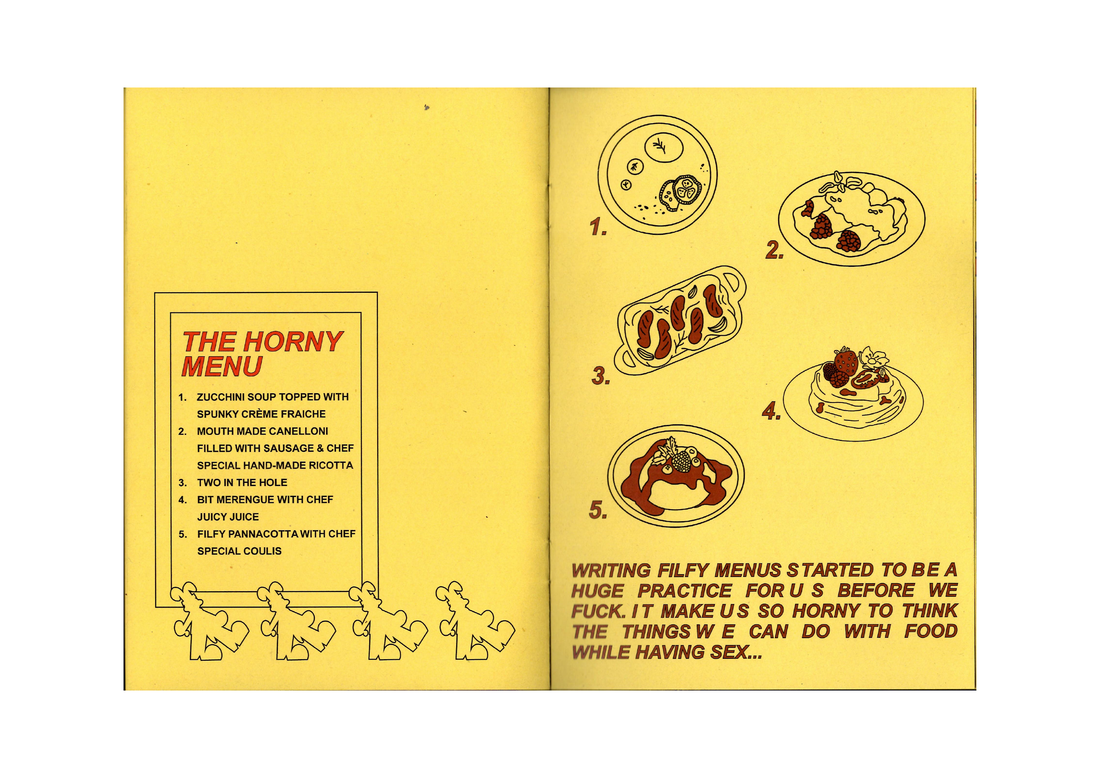
João Pedro BA Illustration and Visual Media Hello, my name is Joao and I’m an emerging illustrator and visual artist from Portugal. My practice focuses on personal experiences, nostalgia, love and the queer scene. Since the last year, I’ve been developing my practice around a more erotic, and sexual approach regarding the gay scene. This came from my urge to be connected indirectly to the queer scene. Since I moved to London, due to my full-time job and studies, I’ve been unable to be present, go out and party that often. I realised that I’ve been missing out on experiences, connecting with other queer individuals both sexually and friendly. Automatically I started to grow an urge to reflect on these experiences within my practice, imagining scenarios of the encounters I’m aiming to experience one day while also portraying my personal experiences. Moreover, through my degree, I came to terms with the fact that I wanted to explore my illustration and design language on a fine art approach. This emerged when I became intrigued with developing works on a larger scale, exploring materials unknown to me that allowed me to see my illustrations in a 3D way. During my time undertaking DPS, I’ve seen my Self-Initiated Project as the perfect time to start refining my fine art skills and exploring this new erotic approach in my practice. My SIP, titled “Sexy Funny Horny Sports”, is a body of work still in development that consists of a collection of art pieces and artefacts. These will delve into the relationship between gay men, sex and the taboos that exist within sports and their respective arenas. Through a fusion of illustration and fine art, I endeavour to craft 3D objects and artworks that will pique the curiosity of queer individuals and sports enthusiasts, by disrupting heteronormative assumptions and stereotypes about sports and masculinity. This idea emerged from my previous project I fell in love with the horny chef” where I explored the correlation between food, sex, and two chefs. However, balancing my full-time job with my placements led me to delay my SIP and not realise my initial plan. Nevertheless, I am proud of the research I conducted and the piece I was able to develop. Fig 1. "I fell in love with the horny chef" work in progress, 2023 I researched gay magazines, documents, and artworks by queer and gay artists for inspiration after briefly mind-mapping my goals for the project.  Fig 2. Mind maps, researching for for my SIP concept, Sexy Funny Horny Sports, markers on paper The artist that I drew more inspiration from was Tom of Finland, a Finnish artist whose work radiates inherent playfulness, despite its explicit nature. His work incorporates humour and irony, which I believe is crucial to explore sexuality. I see his work as an inspiration for me to create a space for sex and sports to intersect in an entertaining and thought-provoking manner. Tom provided visibility to gay men during a time of scarce representation. By drawing inspiration from his work, I aim to bring visibility to the intersection of gay identity, sexuality, and sports.  Fig 3. Untitled (Panel 15 from Circus), 1975, Graphite on paper, 38.1 x 25.4 cm (15 x 10 inches), Tom of Finland Foundation Permanent Collection Another artist who influenced my research was Kidtofer, a Thai illustrator based in California, known for his vibrant, playful, and culturally rich artwork that blends elements of sexuality, colour, and pop culture. His work inspired my project my development in several ways. Kidtofer's dynamic visuals inspired my exploration of gay identity, sex, and sports, while his blending of cultural contexts encourages a critical look at how culture shapes perceptions of sexuality and identity. His style and bold use of colour help set an entertaining and insightful tone for the project. Through his art, Kidtofer inspires a visually captivating and culturally resonant exploration of the current gay scene.    Fig 4. Digital illustrations by Kidtofer Moving forward, I chose basketball as the sport to focus on, with a main emphasis on portraying male figures and their physical interactions. The piece was created using plastic acrylic and combined with a basketball hoop to make it more engaging and interactive. My piece explores the post-game connection between two players arriving at a locker room, a scenario often fetishized in gay culture. I emphasized this by adding a sperm stain on the shorts.  Fig 5. "The fun cums always after the game" plastic acrylic and metal structure sculpture, 2024 Although I did not produce the body of work, I was expecting this year, I am grateful for the experiences my SIP gave me. I had the opportunity to further explore laser-cutting work, collaborate with friends, and learn from their practices. My SIP, while not fully realised, provided me with significant learning opportunities and helped me explore my illustration skills in a fine art context. My plan now with this new agency is to develop more pieces within this theme, exploring my fine art practice and seek for queer spaces where I can hopefully exhibit my work.
Bibliography: The flying fuckers (no date) BUTT. Available at: https://buttmagazine.com/pictures/the-flying-fuckers/ (Accessed: 23 May 2024). The Life of the Artist (no date) About Tom of Finland : Tom of Finland Foundation. Available at: https://www.tomoffinland.org/about-tom-of-finland/ (Accessed: 23 May 2024). Kidtofer (no date) plunge. Available at: https://plungetowels.com/blogs/artists/kidtofer (Accessed: 23/05/2024). Cammi Climaco (2021) Kidtofer - The Ceramics Podcast, Cammi Climaco. Available at: https://www.cammiclimaco.com/theceramicspodcast/tag/kidtofer (Accessed: 19 May 2024). Queer Britain. Available at: https://queerbritain.org.uk/ (Accessed: 20 May 2024). Rohan N | BA User Experience Design I’m Rohan. I’m a UI/UX Designer, focusing on sustainability in fashion, especially with respect to recommerce applications like Vinted and Depop. Think of recommerce apps as online thrift stores, where people can buy and sell second-hand clothes. I became interested in this subject fairly recently, when I grew tired of the amount of clothes cluttering my room. Many of these items no longer fit me or my style, but they were still good quality. I didn’t feel like throwing them away because I knew that they could be of use to other people and was aware of the environmental impact of fast fashion. Eventually, a friend of mine introduced me to Vinted after I lamented about my dilemma regarding storage space versus sustainability. At first, it seemed like a godsend. I was able to declutter my closet while still being “sustainable”. I believed it gave clothes another a chance - a new lease of life. Conversely, it even helped me pick up some more fashion forward pieces at a more affordable price. The success behind Vinted, Depop and other similar applications I feel can be attributed to rising sustainability concerns among consumers, largely driven by the cost-of-living crisis and growing awareness of fast fashion landfills and the exploitation of 3rd world labour. Additionally, the trend cycle of modern fashion is diminishing which means that brands need to change production in the short-term just to keep up with trends (as opposed to just doing Spring/Summer and Fall/Winter). This leaves consumers with an abundance of low-quality affordable clothes that need to be replaced every so often. As an intervention into this problem, recommerce apps make sense. Fundamentally, consumers buy clothes for cheaper prices while allowing other consumers to declutter sustainably. As my usage of Vinted and Depop increased, especially as a UI/UX designer, I noticed how in-app elements support the circular economy behind these platforms. For example, when you first sign up, Vinted prompts you with an offer for free delivery for your first sale. This appears as a banner style notification and in-app. I feel that this helps get the ball rolling with new users. It lets them know that Vinted isn’t just about buying, but also selling.  Figure 1: Vinted Offers on First Sell Additionally, Vinted offers discounts on bulk purchases, allowing buyers to save on shipping charges when they buy a set of items, as opposed to buying items individually. Shopping for designer brands second-hand, especially online was always risky. It was difficult to ascertain authenticity through a screen. Even seasoned thrift veterans could have trouble spotting well-made duplicates. That’s why, Vinted now offers a feature called “Item Verification”. They claim to have a team of experts with experience in authenticity checking. This service is free for sellers and costs £10 for buyers. By offering this service to sellers for free, Vinted fosters trust among buyers, making them more likely to purchase pre-owned designer items. These products are typically made with higher-quality materials, resulting in a longer lifespan compared to fast fashion products. By authenticating them, Vinted encourages the resale and reuse of high-quality items, which would otherwise be challenging without the verification check. However, I did experience some downfalls. While Vinted's platform for buying and selling second-hand clothing promotes sustainability and the circular economy, it also presents a paradox. The abundance of cheap clothes available on Vinted can lead to overconsumption, which is unfortunately something I had a problem with. The psychology of bargains always enticed me to find a better deal or a better item of clothing, which led me to buy clothes that I didn’t really need. To address this, I would like to propose a feature that would allow users to create a lookbook of their wardrobe on vinted, sort of like a digital closet. Vinted would use this list to ensure that users only fill in the gaps in their closet and notify them if they’re buying too many similar items. ![Figure 2: Inspiration for Digital Closet [Lookastic.com]Picture](/uploads/1/1/8/2/118274865/screenshot-2024-05-17-at-03-34-58_orig.png) Figure 2: Inspiration for Digital Closet [Lookastic.com] Additionally, I feel that shipping is where Vinted could make some headway. To further reduce the carbon footprint associated with shipping, Vinted can highlight items closer to the user, minimizing travel distance and emissions.  Figure 3: Mockup of Location-Relevant Products Another feature that I would appreciate is a UI element that that quantifies the environmental impact of each purchase on Vinted. This would help users visualise their contributions better and perhaps gamify the sustainability process by encouraging users to work towards achieving better numbers. Integrating a carbon savings calculator into the app can make the abstract idea of "saving the environment" more tangible and compelling. Many airlines have similar features which can be used as a reference.
In conclusion, the growing awareness of the ethical and environmental concerns surrounding fast fashion is driving the emergence of recommerce apps like Vinted and Depop. As a UI/UX designer focused on sustainability, my work with Vinted shows the importance of refining user interfaces and journeys in eco-friendly shopping. While these platforms allow for sustainable decluttering and shopping, challenges such as overconsumption and shipping emissions still persist. To address this, proposed UI/UX advancements include location relevant searches, a digital closet to keep track of purchases and a carbon savings calculator. These changes can help users of Vinted and other similar platforms make more informed and more eco-conscious choices when it comes to buying and selling second-hand items online. References: https://www.theguardian.com/business/2024/mar/27/secondhand-clothing-on-track-to-take-10-of-global-fashion-sales https://www.vinted.co.uk/help/5/260-bundles-policy https://lookastic.com/ https://www.vinted.co.uk/help/1147 https://www.vinted.co.uk/item_verification My SIP intends to explore intentional technology and online space, through community, identity and give breath to alternative online worlds which uses identity, online community, and non-hierarchical critical theory in research and research-based art. The aim is to blend researchers, artists, online personas, meme-makers, and anyone else who has something to share, and create an open-access forum, giving sustenance to rhizomatic resource/knowledge-sharing and online/AFK community. I am a BA art direction student at the University of Arts London from Northwest London. My practice as a research-based technologist focusing on ideals of how technology can be used through an intentional, holistic approach. This often borns itself in ranging mediums, such as 3d design, sound-making and creative coding with the forefront of all my work being curation and research-based. The ideation of my SIP started with archiving critical theory, readings and media on the are.na platform, along with 3 other practitioners, Ester Freider, a CSM graduate, Sofya Rakitina a Graphic Media student at CSM, and Paloma Moniz, an associate lecturer at CSM and LCC. Together we gathered materials on cyberfeminism and internet culture, proceeding to follow up on Ester’s ideation of a critical forum and quasi-academic index. We manifested this into a collective project called Everyone is a girl, reflecting on the girl online, an idea of a self-surveilled identity, who 'tactically submits to the wills of the digital algorithm' [Ester Freider, 2023]. We take inspiration for our name from practitioners Alex Quicho’s article, ‘Everyone is a Girl Online’. Although this project associated itself with building a critical reader index, we began with building an online community through instagram, where we shared memes, artworks, tweets and articles along this topic, and our instagram began to act as an online archiving and resource-sharing platform alongside other users. When beginning the research process for my SIP, I looked into resources such as Radical Friends: Decentralised Autonomous Organisations and the Arts, which provides collected essays on DAOs, peer-led architecture within the arts and also mentions the intersections of resource-sharing within fields, such as a neuroscientist and interior designer. These systems have manifested themselves in many ways, and can be found in tangible and intangible structures such as a fungi network, and the inside of a computer. This is an approach we took together, with working with each other, and with community-building. Once our instagram was a bit more established, we organised a free event at Pushkin House, where people had the opportunity to share a presentation around the themes of 𝒶𝓁𝒾𝑒𝓃𝒶𝓉𝒾𝑜𝓃, 𝓂𝒶𝓃𝒾𝓅𝓊𝓁𝒶𝓉𝒾𝑜𝓃, 𝓅𝑒𝓇𝒻𝑜𝓇𝓂𝒶𝓃𝒸𝑒, 𝓈𝓊𝒷𝓂𝒾𝓈𝓈𝒾𝑜𝓃, 𝒻𝑒𝓂𝒾𝓃𝒾𝓃𝒾𝓉𝓎, 𝒾𝓁𝓁𝓊𝓈𝒾𝑜𝓃, 𝓅𝓁𝒶𝓎, 𝑒𝓍𝒸𝑒𝓈𝓈, 𝑔𝓁𝒶𝓂𝑜𝓊𝓇, through an open call made beforehand. During the night, we had excerpt and poem readings, video essays, presentations and a live performance. Being our first event hosting, we took on the view of community as autonomous, which encourages resource-sharing and utilises civic engagement to view academics as collaborative work. Sofya, Paloma, Ester and I also collaborated on a risograph zine, which was later scanned and shared through our website. All presentations [with authors permissions] are also free to view on our website. For my SIP, I knew I wanted to work with academics and art and community, yet I was worried as I wanted to explore my own interests in academia. I made a SIP proposal to bring artists together along the route of tech and divination [or techno-divination], essentially exploring tech as magick, the rituals we create around tech, referencing books such as Technic and Magic by Federico Campagna, Myth and reality by Mircea Eliade and Queer Utopia by José Esteban Muñoz. This was a proposal I wanted to carry out into my thesis work, as I wanted to explore my own practise as well as working with others. But curating and hosting events, building community and working alongside others who are just as interested in academia and arts, was also a practise within itself. It took a lot of decision-making, allocating tasks and navigating our own perspectives of where the collective was heading. Introducing this collective, we did not know it would be so community-based, but through peer-learning with each other and people interested in the collective, we were able to build it in a rhizomatic way. I think this SIP aided me in positioning my practise into more communal thinking, viewing academics, art and collaborative authorship as something that goes hand in hand as a means of pedagogical thinking. Kendra Lee BA User Experience Design During my DPS journey, the concept of “new agency” has emerged as a guiding principle in my creative pursuits, especially in my SIP. From the ideation to formulation of my SIP, I was challenged to act on my own and make decisions that aligned with my personal beliefs, shaping my own path as a user experience designer. Delving into the creation of my SIP has significantly impacted how I view UX design in the context of my personal practice and I believe has prepared me well for upcoming challenges in my future prospects.
For my project, I chose to explore the brand and design for a website of a local bakery business, Cakeview Bakery & Cafe. My decision to pursue this project came from two main factors: 1) I wanted to explore the potential of creating my own freelance design business, offering branding and web design services as a part of my skill set after graduation 2) I believe that with my background in user experience design as well as my newfound experience from interning, I was well equipped to defining the scope of a small scale web design process from start to finish, using user experience design principles and foundations I learnt. The initial proposal was to just embark on the design of the website. However, as I began my competitive analysis, on other similar bakery sites, I realised the most successful websites were coupled with a cohesive and representative branding of the business, not just visually but also messaging and tone of voice. “pretty websites don’t sell things. words sell things.” (Miller, 2017) Cakeview Bakery did in fact already have some sort of logo and one defined primary colour usage within their brand, however, I believed that in order to help them create a standout website design, I would have to enter myself into the branding territory and help them expand on their current lack of identity. Through this process, I was able to explore my curiosity in branding apart from UX, which also helped in creating a cohesive final website design, aligning to their target audience. I also had the opportunity to implement many of the processes and best practices I learnt from both my internships. Because I had no previous experience with the branding process, I spent a lot of my time learning from Youtube as well as research. However, once the branding was completed, the rest of the project came to me quite intuitively and much of the processes were similar to any typical UX design project. One insight I do have to note was, having a client following throughout the process was a first for me. I actually learned that having a client sort of acted as a guide on my design decisions. Because my clients already had certain designs and components they wanted or didn’t want included, I found it actually made the design process a lot smoother for me. I realised that having restraints to a project really helped narrow down my outcome, because there are so many things you can do in design! As I’m currently moving into the building stage of the website, I think that with a new website the business can have the potential to reach a whole new set of audiences and bring more traction to the already budding bakery. With an online platform, it also introduces a new way of ordering and decreases the possibility of miscommunication from phone orders. I think that after the build stage and implementing the site, a good way of evaluating its efficacy will be to see the amount of usage as well as convenience it brings to the business within the first three months. After all, there is always time to improve on certain components later on. I think my SIP ‘positions’ me in an exciting intersection between offering services as a freelancer and building a portfolio with real-life client work, which I believe will be beneficial in acquiring future opportunities and roles. Going into the final year of my studies, I hope to continue with similar projects like my SIP and work on solutions for different challenges real-world clients might have, parallel to my university creations. I plan to place the focus of my university projects on more experimentation with various mediums and side projects more on building strategy and trust with clients, in turn, creating a robust personal portfolio of varying projects, ranging from exploratory to more case study structure. I hope to continue building a practice that is a cumulation of what I love to create backed by my expertise and skill set I gained from my discipline at university as well as internships I completed during my DPS year. Bibliography: Erikson, T. (2019). Surrounded by idiots : the four types of human behaviour (or, how to understand those who cannot be understood). London: Vermilion. Miller, D. (2017). Building a storybrand : clarify your message so customers will listen. New York: Harpercollins Leadership, An Imprint Of Harpercollins. Exploring the Intersection of Humanistic Originality and Artificial Intelligence in Art and Design5/12/2024 Zile Peng 21002596 Graphic and Media Design Introduction My SIP is to explore different image production methods to interpret Christmas, and the outcome is a range of Christmas card designs in different visual styles and different making methods including AI generation, illustration, typography, photography, and combinations of these different approaches. My experiments with AI made the biggest impression on me, so this blog is my reflection on exploring the impact of AI in art and design. The new agency I explored in my SIP is: adhering to humanistic originality, embrace the application of AI technology in art and design. This blog explains my new agency by exploring two questions: “Can AI replace creatives?” and “Can AI be a tool used by creators?” Can AI replace creatives? To answer this question, we need to understand where the real core and particularity of creation lies. French philosopher Henri Bergson (1907) argues that the concept of creativity is a vital force inherent in life, intuition and subjective experience are essence in the creative process in his book “Creative Evolution”. Furthermore, according to Margaret Boden's book "Creativity and Art: Three Roads to Surprise"(2012), the essence of creation may not be solely associated with human attributes such as emotion and intuition, since creativity can be understood and potentially replicated through computational processes. She stated that "Computational creativity is the study and simulation, by computational means, of behavior, natural and artificial, which would, if observed in humans, be deemed creative."(2012) However, human creativity requires feelings, subjective experiences, and originality that are difficult for algorithms to imitate. Human creativity is fundamentally influenced by cultural context, intuitive leaps, and artistic authenticity. It is dubious to believe that computational procedures alone can perfectly simulate creativity. "If you want to create something, you need real excitement emotion, not superficial vision.” (Yohji Yamamoto, 2016) The so-called AI art is exactly this “superficial vision”. Based on the above arguments, it concludes that AI cannot replace designers and artists who are really creating. Can AI be a tool used by creators? When I used Midjourney (a cutting-edge AI engine) to do Christmas card design, if I use “design a Christmas card” as the prompt, the images generated are all very stereotypical Christmas illustrations with the most common colour combinations and compositions. It shows that AI understands these words very accurately, but at the same time, accuracy also means the loss of exploration from other angles. This kind of images are visually in line with popular aesthetics and inevitably boring. I wanted to express Christmas from a more unique perspective. Christmas is usually a time for family reunions, but astronauts in space might not have this opportunity to reunite with their families on Earth, so I thought of creating a Christmas from an astronaut’s perspective. I used the prompt: “Christmas, astronaut”. The generated images are very realistic with a combination of astronaut and Christmas elements and express the lonely atmosphere. I didn’t want to show too much loneliness in the greeting card, so I changed the prompt to “design a Christmas card with astronauts celebrating Christmas”. The generated images at this time are getting closer to what I want. I didn't want this image to be too realistic at this point, I wanted it to be more of a design than a photo, but here’s a challenge that at I didn't know how to edit my prompt without that design picture in my mind. If I encounter this problem when I do design by myself, I will do some artists research. At this time, I also did some artists research and directly added the artists’ names in the prompt. The result was not ideal because it was difficult to see the artist's style in the generated images. Then I tried to import the artist's representative work and make Midjourney to refer to this style to generate the images. At this time, the generated images fit the style of the imported image very well. However, it is only a similarity in visual style, it is difficult to express the artist’s thoughts and concepts behind the work. This just confirms the point I discussed in the previous part of this blog: it is difficult for AI to completely simulate the human creative path. However, this experiment shows that although AI cannot replace creators, it can be a tool to help creators create. Different artists use AI in different ways, and these human choices contain human subjective consciousness and emotions. In the above example, this is represented by entering different prompts in Midjourney to generate different images. AI generated image is “super vision”, but artists’ use can inject “real excitement emotion”. AI artist wonder_xin explored many visual possibilities in Midjourney, trying to combine different styles to create a sense of visual strangeness, such as Chinese garden & Disney character(fig1), Western sculptures & Eastern Buddha(fig2), Robots & Wedding(fig3). Pentagram partners Andrea Trabucco-Campos and Martín Azambuja explored "Artificial Typography"(fig4), where they used Midjourney to generate letterforms based on the styles of famous artists like Isamu Noguchi and Hilma af Klint. For example, the AI was prompted with: “Letter B by Louise Bourgeois, crochet.” These artists used AI to create artworks that express their different ideas. The advantages of AI are its speed and huge amount of information. If artists can control it well, AI will be a practical tool that makes creation more efficient. Conclusion: According to the arguments made by Henri Bergson, Margaret Boden, and Yohji Yamamoto, the first part of this article explores the question of whether AI can replace artists, following the next part using my experience of using AI to do design as an example to discuss whether AI can be used as a tool in the creative process. With my new agency to embrace AI and stick to humanity, I plan to combine AI with other disciplines in the following months to explore the possibilities of more new creative methods. Reference List: Bergson, H. (1911), Creative Evolution, New York, Henry Holt and Company Boden, M. (2012), Creativity and Art: Three Roads to Surprise, USA, Oxford University Press The Business of Fashion (2016). Available at: https://www.youtube.com/watch?v=pSJsqYH-hK4 Jana de Cominges Arce 20016654 BA Graphic Branding and Identity From my initial proposal to the completion of my SIP, my ideas have changed drastically. Initially, I thought of designing a branding concept for a Spanish Eco-Friendly Restaurant. However, due to time management but also my growth as a designer and person, I ended up creating a music identity for a musician's entire project. Everything from merchandise, album covers and single covers, to social media posts and reels. The evolution of my project idea was due largely from time constraints as well as the demands of my full-time internship. Amidst the hustle, it dawned on me that I had been doing a SIP all along. Balancing my 9-5 with this musical identity project, I came to realize that perhaps the time scarcity wasn't due to a lack of availability, but rather because I was already deeply immersed in a project parallel to my internship. This SIP not only defined my practice but also provided an important insight into my preferences and collaboration style with fellow artists. My SIP explores the identity of a folk acoustic musician and his latest album release—a perfect alignment with my studies in graphic branding and identity at university. Designing a personal identity, especially for musicians, is uniquely challenging. It extends beyond visual elements like logos and colour palettes; it involves encapsulating the essence of an individual, their evolving style, and emotions. In this project, I aimed to authentically portray the artist's folk acoustic, raw, and emotional music style across various platforms. Alongside the identity, I delved into diverse areas of graphic design, from social media posters to merchandise design, managing social media platforms, and even collaborating on video content creation. My research was based mainly on exploration into similar artists like Damien Rice and Nicolo Fabi, examining both their musical and visual communication styles. Furthermore, I also did a lot of research into printing methods and global suppliers to ensure budget-friendly and feasible outcomes. I also greatly improved my skills in implementation and artworking—areas where my internship at Design Bridge and Partners provided invaluable guidance, as colleagues helped me make sure my files were print ready. This journey not only refined my technical skills but also taught me important lessons in handling external (but crucial) technicians, as well as opening the world of moving media and video editing, an essential skill to have nowadays. Throughout this SIP journey, I gained invaluable insights into time management, project structuring, and the challenges of global collaboration. Juggling my own schedule alongside those of the musician and fine artist required meticulous planning and adaptability, you could argue it was a job in itself. Budget constraints meant we couldn’t always do the most eco-friendly solutions, as otherwise it meant sacrificing the project all together. However, we did manage to make some very realistic choices to avoid over-production and circular design were possible. It’s devastating the lack of interest and the high ignorance in art up to this date, especially in the south of Europe where this project is based. The reduced interest in the project resulted in a lack of investors to keep the project afloat, and we had to rely on our own hard worked savings to even produce the limited supply we did. Applying for grants or government aid in the future could allow for a more environmentally sustainable choice of products and production methods. Yet, even with these challenges, the project's unique collaboration and artistic depth stand out as its defining features. From the artist's emotive paintings inspired by each song to the musician's poignant Italian compositions (one song also a collaboration with a Dutch musician), the project boasts a harmonious fusion of artistic talents. As the project manager, social media manager, and graphic designer, my role was pivotal in orchestrating this partnership, from photographing the artwork to designing cohesive branding across various media.The project's distinctiveness lies not only in its creativity but also in its meticulous execution of every step, setting it apart as a testament to collaborative artistry and innovative design within the music industry. While some artists like Damien Rice have collaborated with illustrators, this project elevates the collaboration to a new level, with two-meter paintings serving as album art, demonstrating a depth rarely seen in music. How does my SIP distinguish and give purpose to my practice? As a branding designer, a well-rounded practice is crucial. While I've worked mainly on packaging and corporate branding, this project marks a start into personal identity design, something previously unexplored in my portfolio. It’s a project that blends our professional practices with the depth of each of our souls. Its intimacy is due to the raw nature of art, and the personal relationships of the collaboration fuelling the art created. Through this project, I've poured my passion and creativity into creating something truly meaningful, setting it apart from my previous work. Representing two years of growth and learning as a designer, as well as overcoming the challenges of separating personal and professional in a project were emotion and connection was key. As I approach graduation, this project serves as a stepping stone, showcasing my ability to bring a project to live across borders and cultures. Its impact has reached beyond friends and family, gathering recognition and interest for its uniqueness and depth across music festivals and the inauguration concerts. This SIP not only distinguishes my practice and portfolio but also sets the stage for the impactful work I aspire to create in my final year and beyond. Have a look at the project on my instagram https://www.instagram.com/janagraphics/ and the musician's instagram https://www.instagram.com/lucacarrubba.music/
Sélina Moussa 20030227 As a Graphic and Media Design student, my practice is quite multifaceted. I relish working outside my comfort zone and pushing my creativity through making work that explores my multiple areas of practice in editorial design and typography; photography and art direction; photography and art direction, videography and storytelling. The scope of my professional practice mostly covers themes of people, culture as well as identity. “It seems that interest in identity is particularly strong in our times, which are characterised by processes of accelerated modernisation and globalisation.” Simon, B. (2003). In today’s world, fueled by the pervasive influence of social media and unrealistic beauty standards, our preoccupation with perception has reached unprecedented heights. We put immense importance to how we are perceived, the judgments others cast upon us, and the image we project to the world, as if the reflections of others shape the very contours of our identity. For my self-initiated project, I wanted to delve deeper into the theme of identity and self-perception, doing so through a series of interviews and experimental portraits that will be presented in the form of a publication. My aim was to curate the photo shoots along with the models to portray their true identity through the images, to allow them to control the way by which they want to be perceived. I was determined to enhance my skills in art direction and photography during my SIP. I seized the opportunity to delve into the comprehensive process of conceptualising, organising, and directing photoshoots. This involved assembling teams, sourcing models, refining lighting techniques, and honing various other skills crucial to my practice. My overarching goal was not only to improve my abilities but also to enhance my portfolio. I initiated the process by conducting secondary research, delving into various sociological and psychological perspectives on the components of human identity and the significance of external perceptions. Among the texts I extensively explored were Erving Goffman's “The Presentation of Self in Everyday Life”, Bernd Simon's “Identity in Modern Society”, Anthony Giddens' “Modern and Self-Identity”, and Richard Stevens' “Understanding the Self”. This research not only deepened my familiarity with the theme but also facilitated fresh insights into various aspects of the subject. Moreover, it played a pivotal role in shaping the questionnaire for the interview phase of my project. I asked each interviewee a series of questions designed to prompt them to define their own identity, essentially addressing the elusive question many struggle to articulate: 'Who are you?' and 'What makes you you?' These inquiries were facilitated through simple exercises that encouraged them to perceive themselves from an outsider's viewpoint. They reflected on how they believed a stranger, a friend, or an acquaintance would perceive them. The interviewees/ models were Lily, Liome, Andrea, Elliott and Alessandro. The interviews provided a platform to delve deeper into the true essence of the interviewees and their perspectives. Even with those I already knew, the process offered fresh insights into their mindset and perception of the world, fostering a newfound understanding of their desires regarding self-perception. Throughout the photoshoots, I noticed a growth in confidence with each one I completed, culminating in finishing the final shoot two hours ahead of schedule. Initially, I had planned to collaborate with a stylist and makeup artist. However, when both cancelled before the first shoot, I saw an opportunity to embrace authenticity. Who better to style the models as their true selves than the models themselves? I turned this unfortunate hurdle into a positive outcome by inviting the models to bring along garments that resonated most with their sense of self. Together, we curated looks that reflected their individuality and essence. Ultimately, each shoot comprised myself and one or two assistants, one of whom was Xiyan, a fellow DPS student. Before the first session, I initially experienced a slight nervousness, grappling with concerns about lighting, colour coordination, and the overall execution of my project. There were moments of self-doubt and intimidation. However, once we arrived on set and started prepping and shooting, I swiftly took action and found my rhythm. It's why I had decided to begin with Lily, a close friend, knowing our mutual comfort would set a positive tone for the project. It was essential to create an environment on set where the models and everyone else felt comfortable and safe, particularly given the sensitive nature of the topic we were exploring. Wanting them to feel at ease to express their true selves in front of the camera. To facilitate this, I curated a personalised playlist for each person, recognizing the power of music in setting the tone. I remained patient, allowing them the time they needed to settle in and find their rhythm. To encapsulate their identity through the images, I opted to experiment with coloured lighting, incorporating hues that resonated with the models' favourite colours and those they felt reflected their aura and essence. Additionally, I employed techniques such as movement and long exposures to add depth and dimension to the visual narrative. I encountered some challenges with lighting, particularly in matching the hues to the models' skin tones. However, through a series of tests and adjustments, I eventually would find the perfect balance. Upon completing all the shoots, I felt a deep sense of pride and gratitude. I was proud of myself for the work accomplished and grateful to the models for entrusting me with their portrayal, as well as to the assistants for their invaluable support. I was very happy with the outcome of the images, glad they required minimal editing beyond simple tone adjustments. I am currently in the final stages of completing the layout and cover design for my publication, while also coordinating the printing and binding process. I am contemplating the title 'Reflet' for my publication, translating to 'reflection' in French. Referring to the concept of perception and the intricate interplay between how individuals perceive themselves and how they wish to be perceived. It's concise yet carries a depth of meaning that aligns well with the theme of your project. After thorough research and reviewing other publications, I decided on perfect binding for the book. Regarding paper selection, my preference was glossy paper to enhance the visual impact of the images. However, sourcing glossy paper within the project timeline has proven challenging, so I'm exploring alternative options. Despite this, I am incredibly excited to see the publication come to life and feel grateful for the opportunity to curate this project, which has undoubtedly contributed to the growth of my practice. Bibliography: Simon, B. (2003) ‘Introduction’, in Identity in modern society: A social psychological perspective. Oxford: Blackwell. Moussa, S (2024) - All images     Ruishan Gao 20005430 BA IVM I am a student in illustration with visual media at the London College of Communication. This year, as part of my diploma in professional studies, I have embarked on a Self-Initiated Project (SIP) that combines my passion for design with my admiration for the global influence of K-pop. Specifically, I have focused on creating a series of culturally resonant keychains for the popular South Korean boy band, ENHYPEN. ENHYPEN is not just a musical group; they are a cultural phenomenon that bridges diverse fan communities around the world. They merge Korean culture with universally popular music styles, providing rich material for design. In designing the keychains, my goal was to use cartoon images to reflect the personalities of the band members as well as the cultural, social, and political landscapes they influence and shape. The design process was deeply influenced by the cultural diversity of ENHYPEN's fanbase, as well as the books and literature I read. Through creating surveys to interview fans and exploring online fan communities, I realized that fans use merchandise as a form of identity and connection. I incorporated elements that resonate on multiple levels, including understanding fan psychology to grasp the various factors why fans purchase idol merchandise. For example, each figure holds an item that is a favorite of the respective member, attached magnetically to the figure’s hand, enhancing collectability, playability, and consumer stickiness. I also designed a set of traditional Korean attire for the figures. The combination of traditional Korean and modern design elements reflects the band’s role in globalizing K-pop, while also respecting and celebrating their cultural origins. Social factors also played a crucial role in the design process. After detailed research, I discovered that K-pop fans are highly engaged with merchandise, often using it to express support and connect with other fans. For instance, merchandise sales are included in the idols' rankings, and fans purchase products to help boost their idols' brand value and market performance. This insight led me to design keychains that are not only visually appealing but also practical and collectible, enhancing their appeal to a global audience. Additionally, merchandise has a strong social aspect; sharing merchandise and discussions among fans strengthen communication between them, adding a method of self-expression. The merchandise purchased also represents one's personality and taste. Therefore, I included many limited-edition regional elements in my magnetic features. For example, when ENHYPEN held concerts in Europe, I designed a Europe-exclusive limited edition magnetic light stick. From a political perspective, the rise of K-pop on the global stage is not just an entertainment trend, but a tool for cultural diplomacy that influences soft power. Therefore, designs need to be sensitive and inclusive, promoting messages of unity and global connectivity. I took care to avoid potential cultural conflicts. For instance, during the Lunar New Year, Korean fans might refer to it as Korean New Year while Chinese fans call it Chinese New Year. To avoid such contradictions, my solution was to refer to it simply as Lunar New Year. During this project, collaborating with other members of the company, I faced challenges like those encountered in international collaborations. These included using sustainable materials and managing the logistics of global product distribution. I proposed using more environmentally friendly materials for the merchandise, but other departments were concerned that this could increase costs or lead to quality issues, which might result in frequent returns and thus higher costs. I am still exploring how to resolve this issue. However, these challenges provided valuable learning opportunities and enhanced my understanding of global market dynamics and consumer behavior. As the project nears completion, I reflect on how this experience has shaped my design approach. It has allowed me to explore the intersection of design and business, preparing me for my future career. This experience has clarified my aspirations to continue working at the nexus of design and cultural expression, but I hope to incorporate more personal style based on my interests. This SIP has been a pivotal part of my educational journey, offering a practical application of my coursework and a clear vision of how I can integrate my skills with my interests in a meaningful and impactful way.
My name is Qiaochu Chen(Chloe), from BA GMD. My SIP project is about the relationship between books and spaces. The outcome will be a black and white litho print publication. The book will be divided into few sections and mainly narrated through images. Images from both library and online resources. This book creating need my abilities on researching, archive collecting, photography, image editing, image narrative, editorial design and book design. As my project is about books and spaces, then book here is no longer just about the content inside, it’s more seen as an object and how this object along with different surrounding environments. So I choose different spaces to discuss and explain this connection. This publication is more like a process of myself discovering this object in different ways and experiment with showing my ideas with photography, image editing and book design. Self-Initial project allows us the freedom to choose the field we are interested in and want to pursue. Book design, image narrative, space and photography have always been areas I enjoy to research in. So, I tried to incorporate these together with this project, using these methods as method to research and explore books. This giving me the opportunity to experiment and research more deeply in these areas. Through this project, I was able to go from conceptualisation to primary and secondary research to production without guidance for the first time. I felt the benefits of being spontaneous, but at the same time, I was also slowed down by the lack of strict time management when I was working on the project at the same time as I was doing my internship. The book starts with I went to people’s home and photograph how they place books in their home. It turns out interesting that books have different habitat in different people’s home. Some stay on shelves orderly, hiding in the closet, on the bed, under the bed, on the language case, as an iPad holder… Books are such adaptable objects. It can support others, and be supported by others. At the same time, the placement of books also reflects the owner's habits and character traits. Another section is about how book display in exhibitions. Normally exhibitions would have a concept, through constructing the concept with installation and curation design. Books appear in that environment as a form of art. Most of them, books are covered by glass display cabinet, open on a representative spread. People are not allowed to flip pages and touch. While the shape of a book can be adapted to any place, the fragility of the paper makes it need stricter protection from time to time. Especially when they are constantly being leaf through in days, books can ‘age’ quickly. Although we know that the tactile feel of holding a book in your hand is an important part of the process, this is the paradoxical and intractable problem of how artists books interact with its audience. Contrary to exhibitions, bookstores are locations that people keep opening and flipping through repeatedly. In this space, thousands of books been systematized, and be placed in colors, in capital letters and in category. This object with same shape repeating orderly and fill the space, forming patterns. They enable themselves to stand by being next to each other, or stacked on top of each other in precarious towers. We can often hear people saying “sorry” murmurous and turning sideways to get through narrow passages. There are only two states of being in this space: walking around looking for a book and standing still reading a book. Including the store owner on the front desk. Other sections include how book been placed in the history and this rectangular object reminds me of the similarities to other objects, such as buildings. Deepening my understanding of the book was the most rewarding thing I did during the research for this project. Because of my love for books and book design, this is the direction I will continue to study. The process of SIP now is more about understanding different artists' understanding of book design, and as I learn more about it, I will gradually develop my own understanding of book design with my own thinking, which is a very important thing. My internship at a studio that has talented book designs has helped me a lot, allowing me to see a lot of fabulous books and to know what the designers think when they design them. At the same time, this year I started to take the initiative to get information instead of waiting for the teacher's advice because of independent study. These are my ‘New Agency’ during SIP experience. |